Play game
Blazing Duel's itch.io pageResults
| Criteria | Rank | Score* | Raw Score |
| VISUALS | #43 | 4.308 | 4.308 |
| OVERALL | #125 | 3.777 | 3.777 |
| SOUNDS | #126 | 3.469 | 3.469 |
| DESIGN | #152 | 3.554 | 3.554 |
| INNOVATION | #204 | 3.385 | 3.385 |
| THEME | #289 | 3.277 | 3.277 |
| MUSIC | #600 | 2.154 | 2.154 |
Ranked from 130 ratings. Score is adjusted from raw score by the median number of ratings per game in the jam.
Leave a comment
Log in with itch.io to leave a comment.


Comments
Super stylish and hectic! Couldn't get very far but I'll be definitely back for more!
great art
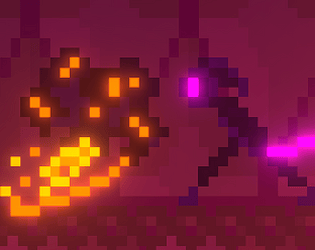
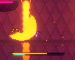
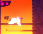
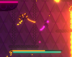
Cool visual design. Really colorful neon lights! I enjoyed the gameplay too. It is challenging and rewards fast reactions!
Really fun to play. Simple but cute design :)
Well done!
Really polished and juicy! i love the art
So polished for a week! Really, great job on this one. My only feedback is I wish the boss had either a visual or audio queue he was about to attack to give time to react.
yo this game is really awesome something i would recommend is that you make the main character stick out a bit it was really hard to see for me. But other then that this game is definetly really good
loved the atmosphere it created with all the sprites lighting and post processing the boss fight is a little too difficult for my skill level apparently so a job well done there :)
not sure how this plays with the theme of the JAM but its definately a good action platformer
Great game, nice pixel art, but I feel like the boss starts the attack way to soon and you dont have time to doge.
An absolutely brilliant game. Add in a second player and you have an amazing local multiplayer game. The game has really good combat system and a lot of potential. You should continue working it😁. Congrats on the submission.🎉🎉
I think you did a great job with the art, even with the minimalistic pixel art all the post-processing and HDR lighting makes the entire thing really pop. The tutorial at the beginning is great at introducing the concepts too (and kudos for not making the player go through it every time they die lol)
I think my main gripe about the game is that the transition between guard and attack feels really wonky. Like, I have the impression there's a window after attacking where you can't guard? Maybe it's just me
The main thing I think could help is making the guard stance more obvious. Right now, it's a stance that's barely different from the default one, and the reflect on the blade takes too long to come out, so it's hard to see in the middle of a fight. Maybe changing the character's light colors from purple to say, blue? That way we can tell right away when we're safe, and it's easier to know when we can parry and when we can't
Also, having the boss' fireballs be homing (they feel like they're homing?) is really harsh when you can't parry in the air lol
I focused a lot on the negative for this one, but even so I actually like this game! I kept retrying after dying at least 20~30 times, so there's definitely something nice going on :) One last thing, adding a pause menu is a small QoL that can go a long way, and doesn't take that much time. Overall, great job :)
Wow, thanks for so much detailed feedback! The reason why blocking is so wonky is because it used to work different early in the development. Originally the reflection would be faster and it'd signalize the parry window. After the reflection is gone you'd just take reduced damage. When I realized that it'd be too precise and difficult for a game jam, I slowed down the animation and made it so that you always parry while in the stance. I didn't have much time left to polish it though, so it's pretty clunky right now. I thought about adding a sound cue when blocking, but the submission period was over, so alas :/ I like the idea of the character changing color! Kinda like Celeste's hair color change. I was thinking about a pause menu, but decided that for a browser game it's not necessary. I could' ve added some way to change the volume, though.
And yeah, the homing fireballs are pretty cheap, could've nerfed those a bit ;)
Kind reminds me of like a 2D sekiro, and I LOVE sekiro! This game was super cool. I think the enemy telegraphing attacks could be a little more clear though. But that's just a nitpick, I absolutely loved your game!
Thanks for feedback! I love sekiro as well, it was the main inspiration for the combat system!
Nice graphics and an interesting theme but not sure how it relates to less is more. Less atks = stronger atks perhaps?
Yep, less attacks - more damage
I've commented it in this stream. From 1:40:00 to 1:55:00
Thanks so much for the detailed feedback! Really appreciate it. The game can be mastered, but I really should've made it easier, so that anyone can finish it without getting too frustrated.
Yeah, it would be a good idea.
But you're atleast tried to make a tutorial, which is a big plus for effort. Not a lot of people decided to create a tutorial.
Also, is it your shaders or something from the internet? Looks great and I want to have it in my collection :)
These are my shaders, but they are very easy to make. There are three properties: main texture, color A and color B set to HDR. The main texture is sampled, then with the "replace color" node I replace color A with color B. Combined with post processing bloom you get a really nice glow that you can adjust as you want.
Well, I surely need to spend some time messing around shaders and post processing, because what you did looks very good and you are saying that it didn't took much time to make it look in this way.
Beautiful game and interesting combat idea. It was really hard though. I think you either should remove the lava wall, or at least make it so the boss does not attack you while jumping to the new area.
2D Dark Souls! Always wanted to make a game like this. My only piece of feedback is that it would be nice if you could face left aswell. Great work!
Thanks! You can actually face left, the character looks at your mouse. Glad you liked it!
Oh ok, I'll have another go at the game then!
EPIC
Kind of tough, but lots more detailed than lots of other games I have played. Well done!
The game looks good , .. but the boss fight is sooooooooooooooooooooo frusturating !!!!!!!!!!!!!!!!!