Play game
High Swipe Cube's itch.io pageResults
| Criteria | Rank | Score* | Raw Score |
| Innovation | #652 | 1.917 | 1.917 |
| Fun | #680 | 1.875 | 1.875 |
| Graphics | #713 | 1.917 | 1.917 |
| Game Design | #734 | 1.667 | 1.667 |
| Overall | #749 | 1.646 | 1.646 |
| Audio | #749 | 1.333 | 1.333 |
| Theme | #859 | 1.167 | 1.167 |
Ranked from 24 ratings. Score is adjusted from raw score by the median number of ratings per game in the jam.
How does your game fit the theme?
in the dark
Did you write all the code and made all the assets from scratch?
most
Leave a comment
Log in with itch.io to leave a comment.


Comments
Good job. The game is worth watching
I agreee with klouk, keep at it. Anybody, please rate my game,at the time of writing comments on my game 2 ratings. And привет(hello) from russia!
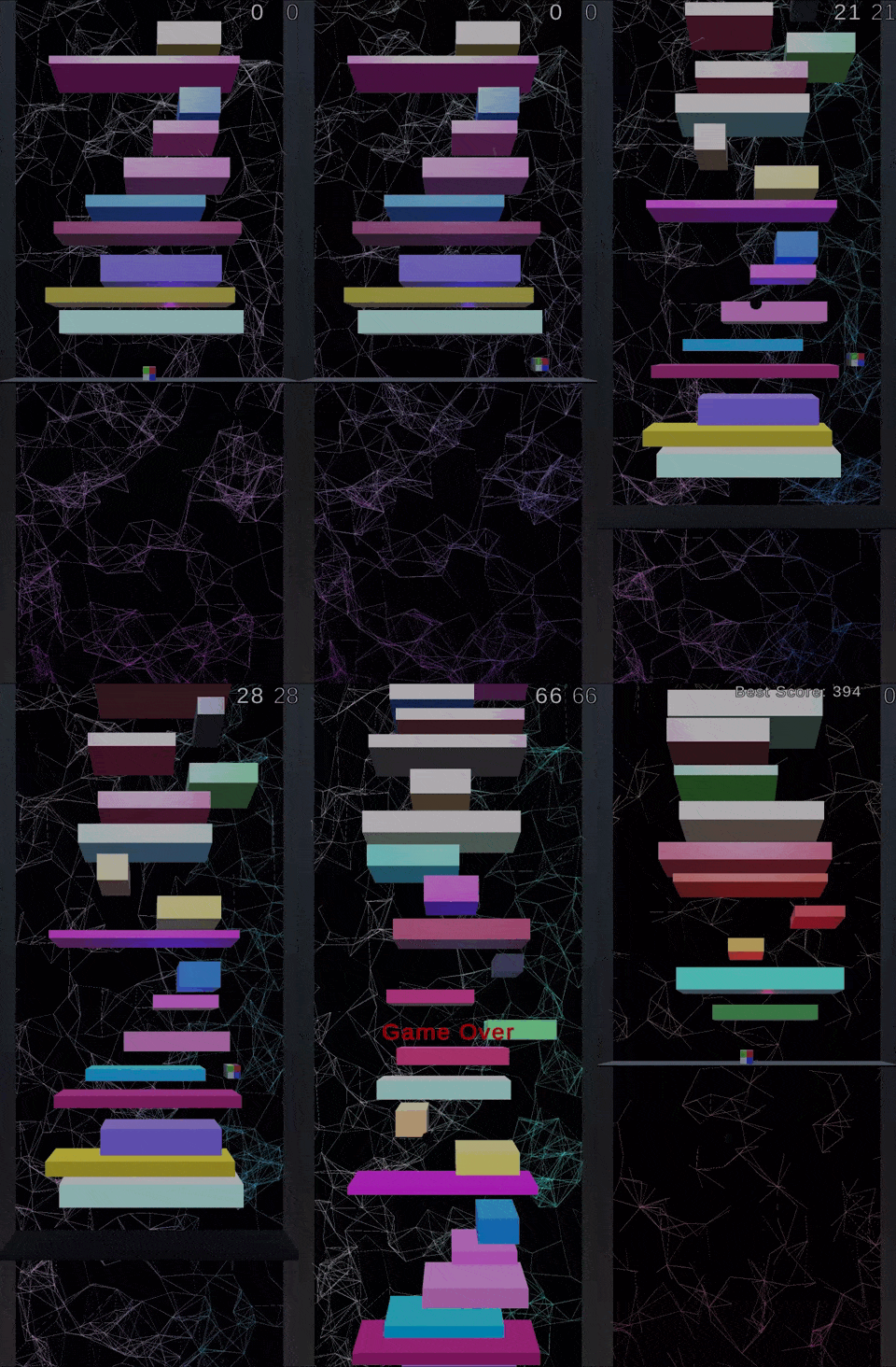
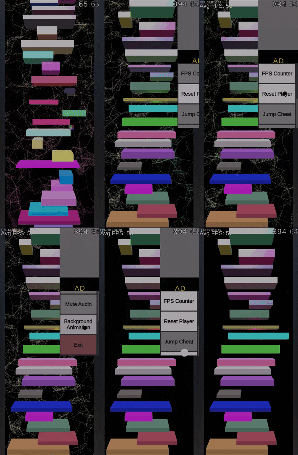
Interesting idea. Unfortunately I just hugged the wall and kept going up - feels like I shouldn't be able to do that. I guess for the theme, you could flip it upside down and have it going "down deeper" maybe? Cool background and I saw you made a build for mobile which is also impressive. Great effort, just gotta fix some bugs and keep at it!
I don't see how this fits the theme and the movement was kinda janky.
Cool game. Good job.
Interesting concept but not really fitting the Jam theme.
I don't really see how this game fits the jam, and I didn't quite understand how the controls worked, I could go up very fast by hugging the wall, and I could stick to walls. However this game would be a great infinte jumper game for mobile, add some powerups and some sound effects, and then that would be a very fun game to play! But anyways, good job!
well ... core gameplay doesn't work well and that's broken on PC :) but you can do better next time ;D
The controls are annoying and it doesn't fit the theme :(
It doesn't fit the theme. This game is all about going higher, not deeper. And it doesn't work well on pc
Hey nice concept, not sure if I'm doing something wrong but on PC you just can go UP non stop. The background was really nice, nice work.
It could really be an interesting game, would the controls be better. I tried both wasd and swipe controls, and they are both pretty janky and unresponsive (also there is a bug where the player can constantly jump when near the side). Also I don't really see the connection to the theme.
I like it but the controls are pretty annoying for PC. Nice job!
The game was playable, granted, but we didn't really get the point. You can jump way too high and sometimes even through the platforms. It also does not fit the theme in the slightest.
the theme was not "in the dark" though
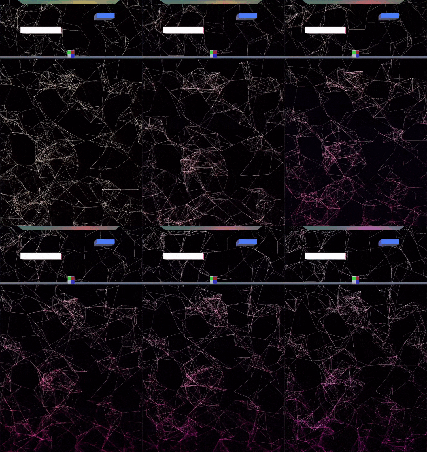
Love the background design and the background interaction. Great job with your game