Play game
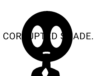
Corrupted Shade.'s itch.io pageResults
| Criteria | Rank | Score* | Raw Score |
| Creativity | #56 | 3.500 | 3.500 |
| Audio | #106 | 2.625 | 2.625 |
| Visuals | #115 | 2.938 | 2.938 |
| Overall | #120 | 2.712 | 2.712 |
| Technical | #137 | 2.313 | 2.313 |
| Gameplay | #144 | 2.188 | 2.188 |
Ranked from 16 ratings. Score is adjusted from raw score by the median number of ratings per game in the jam.
Message from the creator(s):
Rad.
Rule
Rule A
Only used the colors black (#000000) and white (#FFFFFF)
Theme
Yes
This game follows the theme "You only realize the value of something when it's gone."
Original Art
Yes
Created own art
Original Audio
Yes
Created own audio
Leave a comment
Log in with itch.io to leave a comment.


Comments
Really liked the visuals, had some problems with being stuck (in the same point where Galse22 got stuck) but nothing that can't be fixed.
Really funny game! A bit of wonky controls but the game is pretty funny! A strong contribution to the jam - very well done!
PS- I really liked the narrative too! Good job!
Story is cool, font is a litle hard to read sometimes especially not in fullscreen and i also seem to have gotten stuck at the moving platforms (dont know how to get to the higher one).
I thought the story was very interesting. It was already dark, but took a darker turn and I found that very effective. Agree with other comments that a little more work on the jumping would go a long way. I got a little stuck on that tutorial desk at the beginning.
A little confusing, but the story was pretty cool.
I thought the section where you walk through the darkness was particularly confusing.
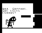
Very simple story game with platformer movement. Not much in the way of gameplay. The use of black and white to create dark areas that were hard to navigate was very clever. The ending is creepy! An overall nice little story that works well.
Check out and rate our game too
Hey!
I have some feedback for your game.
Firstly, when making a 1-bit game, I *highly* recommend making the background out of the darker ( black ) color, not the brighter ( white ). That makes the game so much easier to look at.
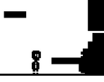
Secondly, I'm not very sure as to the why, but I got stuck here:
You probably forgot to add colliders there.
Thirdly, the jump feels pretty floaty. I *think* you can make gravity bigger to make the jump feel less floaty.
Furthermore, I wish I could use WASD to move.
Lastly, the game is kinda confusing. Especially because sometimes you made me go through walls.
( Edit: making the text bigger and adding SFXs would be nice too )
I ( think I ) still beat the game though:
Cool concept and story!
If you continue to work on it, it would be good to try and get the control a bit slicker. I had a lot of trouble, especially jumping from moving platforms.
I like the story you were adding behind this game, but it was kind of confusing to me. Heres a few things I have to say about it:
This game could become even better with a bit of reworking. But, I liked the direction you were going with this game.
Very interesting game.
Loved the concept of the story and the visuals were really appealing. Maybe try changing the jump movement to something more responsive and snappy. Loved the side controls, really smooth, a little over-frictioned, but alright as a whole.
Good Job :D