Play game
Freebooter of SPLORR!!'s itch.io pageResults
| Criteria | Rank | Score* | Raw Score |
| Technical - Is there a technical achievement behind the making of this game? | #14 | 3.348 | 3.348 |
| Gameplay - How fun is it to play? | #15 | 3.652 | 3.652 |
| Originality - Does the game innovate or try something new? | #17 | 3.739 | 3.739 |
| Overall | #27 | 3.357 | 3.357 |
| Audio - Does the game have nice sfx and music? | #31 | 3.261 | 3.261 |
| Graphics - Is the game aesthetically pleasing? | #57 | 2.783 | 2.783 |
Ranked from 23 ratings. Score is adjusted from raw score by the median number of ratings per game in the jam.
Leave a comment
Log in with itch.io to leave a comment.



Comments
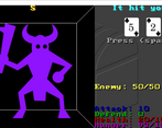
I think, that this is hands down the best map in the jam. I felt the battles dragged a bit too much. Against the green dino like enemy, I had to take at least ten swings, that is a but much. But the idea of the battle system was pretty cool.
the placement of enemies is very very random, and often you can get a harder monster BEFORE you find an attack buff. its a balance thing, and balance usually falls by the wayside under a time constraint.
thanks for playing!
This was fun! Felt a bit more like an endless string of boss battles with not much exploring but I enjoyed the higher/lower battle mechanic.
thanks for playing. i liked yer game show theme.
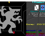
I really liked this entry - I haven't seen a card based battle mechanic like this before and it worked really effectively. It was quite difficult with some of the monsters, but since you could run away and leave those monsters marked on the map it wasn't too bad. I died after only exploring a quarter of the map but took on too many monsters :P
The music and sfx were also simple yet effective, and the simple graphics worked well. Very impressive that you did it all on your own!
Well done
thanks for playing and glad you liked it.
I like how simple and effective the graphics are. It was very nice that enemies which were found but that I had escaped were still marked on the map, so I knew I could come back to them when I felt more ready. The card battle was also a nice choice, being more interesting than just a dice roll. I'm curious if there's an internal deck or are the cards chosen purely at random?
there is a full "deck" of cards that it draws from.
when the cards run out, there is a 1 in 52 chance that the first card of the next deck will be exactly the same card, but that doesn't happen much.
I like it! The card guessing game for combat, as well as being able to bribe enemies and use multiple items gives battles a layer of strategy and choice. I will agree with the one who said maybe you have to press Tab too much, like for picking up items. Also, damage you do to enemies seems to be hard set. I think it may be fun to add a little risk to the mechanic by making guessing lower numbers on the low cards or higher numbers on the high cards pay off more if you turn out to be right, or do double damage if you guess that it'll be a draw. Good game!
there was a suggestion made my a friend of mine to have more damage after a "streak" of successful hits on an enemy. likely i will do something like that.
thanks for playing, batboy.
Very fun game with good resource management.
thanks for playing.
Cool. Realy cool. Battle mechanic is simple but really creative(never seen something like this). Graphics and audio maybe is the greatest part of this game(audio is just great, sprites are simple but also very creative). Great job, especially assuming that you wrote it with no game engine.
i lifted the mechanic from an old game show called Card Sharks (in the US) and many other countries had a similar gameshow.
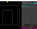
Loved the combat/gameplay, quite addictive. Nice aesthetic. Audio is fine. I think the card combat made it more innovative. Technical work here is quite impressive and where it really shines, the fact that you managed to get an inventory system, automapper, unique combat and a relatively well balanced feel all working together is impressive.
thanks for playing.
My two favorite things are the how much the game evokes the old school, Apple ][ Wizardry and the combat mechanic. Not sure if this is the case but, if the cards you get during combat come from a complete deck which then gets reshuffled, you can really have an element of strategy. Great work!
my two favorite things is that you double posted yer comment, and that you double posted yer comment.
also, i like that yer avatar is Tranzor/Manzinger Z.
My two favorite things are the how much the game evokes the old school, Apple ][ Wizardry and the combat mechanic. Not sure if this is the case but, if the cards you get during combat come from a complete deck which then gets reshuffled, you can really have an element of strategy. Great work!
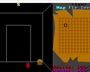
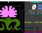
Had a great time with the guessing game combat mechanics. Love the map on the right side of the screen as well. That damned flower is a tough one!!!
pesky flowers!
Congratulations, this is the first game I've rated with a (working) volume slider! I'm so happy.
Frankly I love the style of the main menu, particularly the text, very no nonsense.
The combat system is quite interesting, it's a cool idea to let the player 'pick their doom' as it were.
I like being able to see the whole map, some of these jam games feel a little never-ending, so having a finite 'playing field' gives you something achievable.
Player feedback of health or amount of damage could be better, if the health was represented as a bar or if damage numbers flashed on the screen (-25) or something it might help that bit with knowing you're about to die. Personally I'm much too enamoured with the cards to look at the health number much.
The tab pushing is a little much, you might have been able to put a couple of these screens into the same menu. For instance, the stats page could probably have just been above health and hunger.
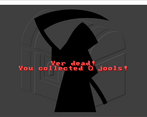
I quite like the presentation and style, the audio is generally quite good, and I like the score you get when you die.
Great job!
the tab thing *IS* the worst feature.
had I not needed to cut a very expensive (timewise) feature of "mouse support" it would not be an issue... everybody would just be using the mouse, and you wouldn't even know that tabbing was a thing.
I liked it, the combat system is really interesting (even though i couldn't defeat that flower with 300hp only by guessing), also the music and SFX are really nice.
thanks for playing. sorry for not including cats or cultists.
I watched some of the dev stream and I'm pretty impressed with the technical achievement behind it. The combat mechanic was quite unexpected and really fun, I enjoyed it!
according to my list (based on submission time), yer entry is due for review on my stream tomorrow.
Pretty good game, sir! I watched your dev stream, and really enjoyed it! I hope I can still keep up my passion for making games at your age. Well done!
"at my age?" (Kappa)
you realize... zooperdan is older than me.
Fun game, if somewhat simple. My main gripe is the constant tabbing between modes, which made it feel unnecessarily tedious.
i was going for simple. i'm more than a bit of a minimalist.
i reckon yer entry to be one of the front runners, though i am only through 14 of the entries.