Play game
Binary Eclipse's itch.io pageResults
| Criteria | Rank | Score* | Raw Score |
| Audio - Does the game have nice sfx and music? | #38 | 3.652 | 4.083 |
| Theme - How well does it incorporate the theme? | #39 | 3.503 | 3.917 |
| Overall | #66 | 3.339 | 3.733 |
| Graphics - Is the game aesthetically pleasing? | #85 | 3.578 | 4.000 |
| Gameplay - How fun is it to play? | #87 | 3.130 | 3.500 |
| Completeness - Is it an unfinished tech-demo, prototype or a complete game? | #124 | 2.832 | 3.167 |
Ranked from 12 ratings. Score is adjusted from raw score by the median number of ratings per game in the jam.
Leave a comment
Log in with itch.io to leave a comment.


Comments
Victory!
I could have died instead of leaving because the description advertises 7 levels so I was trying to gain one more level before leaving the 6th floor.
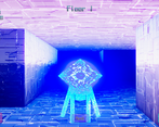
The game looks unique, although the robots are a little too cute and you don't want smash them. The game is well balanced, the parts when you just entered a new level are tense and fun, you really can't make any mistake at these points.
Well done, thanks for sharing.
I like the concept of the game, very cool interpretation of the theme.
The delicate controls are holding the game back however. I often found my self doing a 180° when I just wanted to do a 90° turn or moved far further then I intended to. The perspective could need some work too, I cant see the tile I am standing on, nor if there are walls to left/right from me. The frame rate is okay but could be better.
Other then that its a solid game with interesting ideas. Aside from the haywire controls I had fun, what more can you ask for?
Interesting concept. However, as others have mentioned, you can become a beyblade with a single A/D press. Also, I find your game too bright. My eyes hurt a little bit.
I liked going pew pew on the robo gingerbread men.
So I did.
I wrecked a lot of them.
And the crawler was bright and easy for me to see in.
It was a charming game.
All the stars.
awesome ty for the play and kind words
Pretty solid entry. Good aesthetics, nice build options, combat was enjoyable (although, like everyone else, I really couldn't always tell which to choose even though I read the comments ahead of playing. Could use more obvious tells). Got to floor 5 with a light build, could easily outrest enemies, but it took a long while to kill them.
Good job!
Awesome, Ty for playing and glad you had fun with it.
If/when this gets revisited, more obvious tells are def the 2nd priority.
This doesn't look or sound like any of the other games that I'd played in this Jam.
The gooey circuitry alien like look of the environment and enemies and the soundscape really complimented eachother.
The combat was simple but decent. I didn't get the hang of parrying. Not sure if there was a tell I wasn't picking up on.
And I liked backing into a little nook to rest safely.
I only got to Floor 5 and stopped because of the sensitive the turning though. The snappy motion blur and motion were great, but I'd often disorient myself, making extra turns where I didn't mean to. And with no map, it was very difficult to get a lay of the land and find the exit. (On my first run I was stuck on floor 2 for ages.)
Awesome, thanks so much for the kind words and the play.
The parry "tell" is the enemies eye color/particles. It definitely would benefit from more animation and a more obvious tell though.
The turning and movement absolutely need some tweaking, that seems to be pretty consistent criticism. If/when I revisit this post jam that's the number 1 priority. I also considered adding a minimap when making it, but never got around to it.
I can only add that not many people doing dynamic music transitions in such fast jam projects. It's nice to hear that.
TY, and thanks for playing.
That kinda composing and music code is my jam (if you'll pardon the pun) so I figured I might as well.
I love cyberpunk games. Thanks for making something that's not just standard fantasy rpg.
I felt a bit bad killing the enemies, because the models are adorable, with their big heads.
I wasn't really sure why I should choose the light power-up or the dark power-up.
I liked the graphics and the music.
Like NikaKh, I had some double-turn incidents which were a bit confusing at first.
Thanks for playing it, and the kind words.
I'll definitely tweak the movement next time I make a turn based dungeon crawler/ if I work on this more after the jam.
RE: Leveling up Light Vs. Dark, they do what they say on the level up screen. Light gives defensive stats (parry mitigation, rest hp recovery, more raw hp) and Dark gives offensive stats (Base damage, bonus damage when hitting opposite element.) Going pure dark, its possible to one shot light enemies and two shot dark. Going pure light, you can get to a point where resting in combat heals more damage than enemies do in a turn. It still ends up being optimal to keep the two fairly close to each other though.
The other consideration is what you need more in the moment, if you level up with a bunch of dark type enemies around you, it might make more sense to choose light and vice versa.
Liked the idea of shadow/light hits, though it only came to me at like level 5 that you need to look at their "eye" to get what attack they are doing. Plus sometimes it was glowing too much and was hard to read the cue.
Music was really nice, imo. I was vibing whole playthrough. Graphic was pleasant, though sometimes light was a bit over the top and it mostly gave issues with cue reading to me.
The only real issue (and why game was really hard for me) was that blasted bug, where each of my move-turn inputs would sometimes count as double. Was helping to quickly tap the buttons, but not always would work. I guess it was button-press issue that would trigger for me twice for some reason.
Good fun!
Awesome, thanks for playing it and glad you enjoyed it.
If I had more time, I'd definitely make more of a tell for what attack the enemies are going to use. Probably a wind up/chambering animation with some particles from the hand, and I probably should turn down the lighting on the "light" enemies as well for readability.
The double movement thing is because exploration felt smoother if I treated held inputs as queueing the next action, but given how combat heavy (and turn based) it wound up being that was probably a bad design decision on my part. Definitely something to look at if I keep working on it.