Play game
Monsoon's itch.io pageResults
| Criteria | Rank | Score* | Raw Score |
| Theme - How well does it incorporate the theme? | #24 | 3.727 | 4.167 |
| Gameplay - How fun is it to play? | #109 | 2.907 | 3.250 |
| Completeness - Is it an unfinished tech-demo, prototype or a complete game? | #117 | 2.907 | 3.250 |
| Overall | #117 | 3.011 | 3.367 |
| Audio - Does the game have nice sfx and music? | #138 | 2.609 | 2.917 |
| Graphics - Is the game aesthetically pleasing? | #148 | 2.907 | 3.250 |
Ranked from 12 ratings. Score is adjusted from raw score by the median number of ratings per game in the jam.
Leave a comment
Log in with itch.io to leave a comment.


Comments
Nice implementation of the theme and cool mix of puzzles during the day and combat during the night. Sadly, I was defeated by the pillars with the laser beam since the beam went off at odd angles and didn't seem to hit the other pillars. The more I rotated the weirder it got, to the point where the original beam hit nothing, but I had another two beams bouncing from two independent pillars at odd angles :(
The variety of weapons to choose from seems cool, the use of the theme is good and I'm enjoying the puzzles but the game consistently glitches after I pass through the grid opened via killing one monster in each of the two room, when I either try to open the chest (then the Choose your reward screen appears but I can't choose and the descriptions don't appear) or click on the puzzle board with the 4 figures (then I'm facing big texture problem).
Thanks for sharing.
thanks for the feedback and sorry you had to experience that, truth be told we had some huge issues about 3-4 hours before submission, issues such as having 2 levels but the transition from level 1 to level 2 not working at all... I ended up single handedly copy pasting every element of the first level into the second one, which is why the last part of the game seems a bit more thought through than the first one, it was supposed to be the tutorial lmao
The weird textures at the end are also the result of overlapping both levels when they weren't meant to. We just had too many ideas (rogue like items, combat, cursed items (?), world transitions with changing assets, puzzles, quizzes) and too little time. We'll try to tunnel a bit harder into having a base mechanic next time before trying to expand with our big heads haha
Nice little game. I enjoyed crawling around and I like the puzzles. The movement worked well.
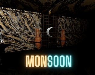
Marble madness! It would be nice with some texture variety :)
Great job, the World was kinna wierd but I liked it. Well played !
An entire world built... from granite countertops.
Some of the things I interacted with didn't seem to do anything.
The monsters just sorta stood there, and I felt like I was fighting a green bar.
But its a solid start.
Great work on this entry!
I loved the overall concept and puzzles.
That said, the camera is a bit stretched out / disorienting.
Thanks for sharing your work :D
Interesting puzzles, interesting concept. There are some technical issues I am sure you are well aware off.
TL'DR
There is potential in here, hope you don't abandon the project.
Really nice variety of items and puzzles. The gameplay is simple but well executed. Realy liked how most of the time there isn't an obvious choice when picking a new item.
Navigation is quite clunky however. The large fov combined with the repeating texture make movement nauseating at times. Missing the options to move back or strafe was also a pretty hard downside.
Nice work overall, nice way to treat the theme while being very faithful to the old crawlers.