Play dodge-the-bomb
Dodge The Bomb's itch.io pageResults
| Criteria | Rank | Score* | Raw Score |
| Controls / UI | #60 | 2.833 | 2.833 |
| Sound/Music | #61 | 2.833 | 2.833 |
| Overall Fun | #63 | 3.167 | 3.167 |
| Art / Graphics | #66 | 2.667 | 2.667 |
Ranked from 6 ratings. Score is adjusted from raw score by the median number of ratings per game in the jam.
If you have competed before, how has your game changed?
I participated in the sixth edition of this game jam that was 4 months ago, with my game submarines, in this edition I am participating with my game dodge the bomb which is improved with the feedback I got in the last edition
Genre #1
Action
Shooter | Platformer | Slasher | Beat em Up | Base Defense | Survival | Racing
Rating #2
Family Friendly
Leave a comment
Log in with itch.io to leave a comment.


Comments
I played this game on stream (VOD).
Overall, the game seems really hard to play and control.. and our best method of survival was actually to do nothing at all.. I think that way we survived 50+ seconds, and if we actually tried to jump, we would die in 20-30 seconds :)
I'd suggest tweaking the difficulty and spawning of the bombs, and maybe start off much easier and slowly increase the difficulty over time?
Thanks for your feedback, i going to fixed the difficulty and spawning of the bombs.
Hello! Welcome to Feedback Quest 7! My name's Hythrain and I'm one of the hosts and one of the streamers for this event! This feedback is being written live as I stream your game! If you're interested in seeing my live reaction, let me know and I can send you a link to the VOD once it's posted to YouTube!
So my normal approach for any game in these events is simple: I get the game, make sure it's not a virus, then play it with as little information on how to play as possible. This way, I can judge how intuitively someone can figure out the game. Only if it's obvious that I need to read more will I do so. I note this so you can get a sense where some of these feedback comes from. In addition, I want to note that feedback and rating are different; don't use this feedback to gauge what I'll rate, nor should you view my rating as entirely indicative of my feedback.
After some mishaps to get it loaded, once it loaded enough I settled myself in t- JEBUS WHAT IS GOING ON?! This really loud, hard hitting music is scaring the faith in the old gods out of me! The music, in general, is just far louder than it should be. I noticed your in-game settings set volume at 50%. Change that to 100% but be as loud as it is now at 50%.
For the rest of this feedback, I'm going to focus on aesthetics first and then gameplay. In terms of aesthetics, the only real issue is how there's this weird gradient over the entire screen that makes the middle darker and thus harder to see. It makes certain screens look weird.
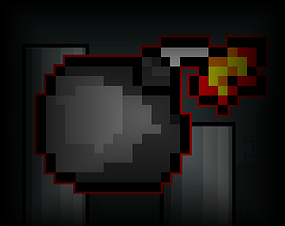
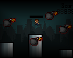
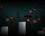
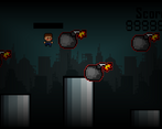
As for gameplay, before I started I had some Flappy Bird vibes from the screenshots. While I can see this present, it being on a stationary screen did change it up. That said, there are a few shortcomings I felt should be addressed.
First, if the player is intended to have a limited number of jumps in the air, this information should be given to them. Nothing sucks more than thinking you have more air jumps only to realize you don't and you're heading straight for a pit.
Second, while floaty controls can have their times to shine, I feel like this game would benefit more from quick and snappy rises and falls. This would take away any feeling of RNG just screwing the player because, theoretically, they should be able to rise and drop fast enough to avoid every attack no matter the RNG.
Lastly, I think some feedback is in order. When you get hit by a bomb, you should go flying. If you don't want being hit by a bomb to be double punishing, you could make it that the player always flies upward in some way. However, if you do want to make it double punishing, you could make it based on the positions of the centre of the bomb and the centre of the avatar to send them flying in whatever direction they would normally fly. Whichever you do, make sure there is a temporary invulnerability so the player can't be chained around.
That's all I got for now! Keep up the work! :D
Thanks for your feedback, I agree with changing the music volume, I'm going to add a simple icon in the UI to you can see how many jumps you have. Sorry for this annoying white fade on the screen . I will use your recommendations for the next version.
I agree with some of the comments below but I wanted to make a specific emphasis on what seems to be an unlimited amount of “double jumps” which is in fact not unlimited. Some indication on when I can double jump and when not would be very helpful.
Thanks for your feedback, Can you tell us a way to represent jumps or how to improve them?
Maybe a simple icon on the UI will do. Or take a page from Celeste’s book and use some attribute in the character like their hair changing colors or some animation.
I'm going to go with the simple icon option in the UI.
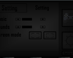
Interesting little arcade platformer/flappy-bird-eque game. The moving platforms limiting how low you can go helps shake up the gameplay a decent bit. The biggest feedback I would give similar to some of the other comments is that the UI could use a bit of work. It's really hard to tell what option on the menu that you have selected so having a bigger difference in color/brightness between selected and unselected elements would go a long way to improving that.
Thanks for your comments, I will improve the UI for the next version and I will remove those white borders that appear to improve visibility.
Very fun! Maybe the player's movement needs some adjustment, but the most important thing I can point out is to clean the UI in game and on the menu so it stands out better against the background.
This is a fun little title! It's definitely a little undercooked but it doesn't treat itself as anything bigger than it is.
The jumping physics did feel a little weird, I would sometimes just fall straight into a pit after jumping a few times, though I'm not sure if perhaps there's some sort of mechanic preventing you from jumping for too long without landing on a platform?
My biggest criticism is the UI. The menus appear to only be activated by clicking (I could be mistaken for reasons I'll elaborate on in a sec), and the game stopping dead in its tracks to ask you to type in your name for the high score was pretty irritating. The gameplay loop on this is super fast and short, and when I die I want to get right back into it, so the entry window appearing halts all momentum. If you click cancel on that window, it inputs the name entry as a blank instead of just skipping entry altogether. Since this window appears in the browser, it also means you have to click back into the window to take control of it again (hence I might be mistaken about the UI requiring mouse input).
The music is pretty nice, and the sounds work for what they are. It is a little barebones and gives me the vibes of a student project, but it all works for what it is.
The graphics are very mixel-y, with lots of pixels of different sizes occupying the screen. The mixels make the game look especially amateur and unpolished, and the lack of animations on the playable character adds to this.
With that said, the core gameplay is very fun and it's relatively easy to get the hang of. I especially like the warnings on the right of the screen telling you when a bomb is incoming! This was very fun, but very unpolished.
Thanks for your comments, I will change the start menu to make it easier to understand, I should also make it so that when the player dies it gives you the option to play again or save the score.
I think those changes would help a lot, yeah!
You are right and excuse me for the strange white effect, I made the wrong effect but I will correct it for version 2.1