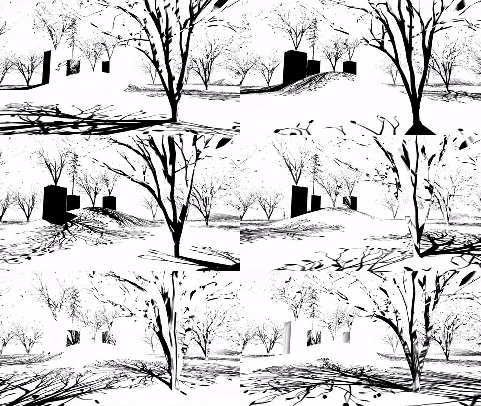
Play game
SHADOWS's itch.io pageResults
| Criteria | Rank | Score* | Raw Score |
| MOOD | Did this game have atmosphere, or did it make you feel something? | #4 | 4.133 | 4.133 |
| IDEA | Was this game innovative, or did it use interesting mechanics? | #7 | 4.133 | 4.133 |
| VISUALS | Did this game have nice graphics, art or design? | #18 | 3.933 | 3.933 |
| Overall | #18 | 3.573 | 3.573 |
| AUDIO | Did this game have great music or sound design? | #48 | 2.600 | 2.600 |
| FUN | Was this game satisfying to play or did it bring you joy? | #49 | 3.067 | 3.067 |
Ranked from 15 ratings. Score is adjusted from raw score by the median number of ratings per game in the jam.
How long has this Project been going?
4 years ago I started the first version for Ludum Dare 30. Have redesigned it countless times and worked on it on and off. I have abandoned it and came back to it over and over. This version is sadly extremely incomplete (because there was no more time left for this jam), so I would honestly like to "finish" it more :D
Leave a comment
Log in with itch.io to leave a comment.


Comments
Very nice atmosphere and mysterious world. Reminded me a lot of the Witness. My only small problem is that it was a bit fiddly to control sometimes, so a few times I had figured out the puzzle and the correct path, but I'd just be slightly in the wrong place and fall off. It's a very nice idea though
Thanks!
Nice game. I really like the concept. I do wish we could have more control over the sun (make it go directly overhead for example) as some of the invisible platform parts are really hard to judge, even though it was mentally "solved". Interested to see where you go with this.
Thanks for the feedback!
Wow, really impressive! Nice mechanics and I love the aestetics!
Thanks for playing!
Astonishing idea and execution. Congratulations...
Minor complaint: man...this quite heavy! My machine began to spin it's fan like crazy!
Thanks! What are your PC specs? Did it run smoothly?
Its a Core i3 with 4GB RAM, Intel Graphics and running Ubuntu. It played ok, with some ocasional mild stutter - nothing serious (its computing a lot of shadows, after all)
Thanks for the info!
Absolutely loved it. This is my favorite submission in the game jam. It reminds me of a game called Echochrome for PlayStation. A couple things I'm going to be really critical of: the text should show onscreen so you can't miss it and so it doesn't need to be repeated over and over. "The shadows tell the truth" is so cool and it made me smile when I fell through the floor, but it being plastered on several walls lessened its first read. The ambiance was an excellent touch, the world felt really mysterious. I think I loved it so much because it was just so damn simple! Solving the puzzles required you to strategize and like watch the shadow of the friggin capsule collider against the shadow of the ground and line it up perpendicular to the walkway, hahaha! 10/10!
Thanks a lot for playing!
The only comment I had that hasn't already been brought up is I would have been nice to see some text that only shows up in sun/shadow rather than the text changing color to be visible.
Thanks! "Hidden" messages would be a cool addition
Very cool, disorienting in a good way. I may come back and try to get them all I think I got to 11. I have a few ideas for you.
(1) As others have said, a player model would really complete the immersion.
(2) It would be really fun and even more disorienting if you added color suddenly. You get so used to the stark black/white that if the scene changed suddenly to some different color pallet (maybe when you pick up each orb, but only for an instant) it may be really satisfying and shocking. That also could give some rewarding feedback when succeeding. You could also use different colors to cast shadows from a different source. I don't mean that you should add color in a way that would totally change your art style, just shift the white/black and use it somehow as a mechanic.
(3) I would prefer if each test was setup in the portal style, i.e. each setup/test is self contained and you are ushered off to the next - that way you are never left wandering aimlessly.
(4) The general mechanic is fun but I'm not sure how much farther you could take it without some additional creativity - though I was surprised by how you used it as is, so maybe their is a higher ceiling than I am assuming.
cool game!
Thanks for the suggestions! I really like number 2 (the sudden color change)!
Looks very cool and I like the idea of the changing lightsource but I didn't find myself using it all that much and when I did, I just held mouse button down. I love the idea in general. I could see it in use in some sort of puzzle system or something.
Great game! I really like the visuals...Initially I didn't use the mechanic too much...Maybe it would be cool if the player was forced to use it earlier in the game. I think it's a cool idea overall and you should definitely keep at it, I'll check the project out from time to time!
That is weird indeed. Did the same happen with the Web version? Do you have any controllers plugged in (Xbox Controller Input is enabled in the game to a certain degree)?
The web version was just a little laggy, but it was fine. I wanted the full experience haha. No controllers, nothing but a mouse and headphones. I can try with an xbox controller.
I would advise to add hints on control on the screen and remove shadow from your protagonist oval object :-)
Aside from that it is very aesthetically pleasing!
Thanks a lot for the feedback! I left the player shadow in intentionally so that you can get a better grasp on where you are (although it would be a good idea to use a better player model)
Cool idea! Sounds would be nice (other than trees rustling). Needs polish.
Thanks for playing and commenting! Could you elaborate on which aspects would need more polish?
Are a few things you could do off the top of my head.
Thanks a lot for the suggestions!
This is an excelent art project
Thanks for playing and commenting!