Indie game storeFree gamesFun gamesHorror games
Game developmentAssetsComics
SalesBundles
Jobs
TagsGame Engines
A jam submission

Alpha vs. ZetView game page

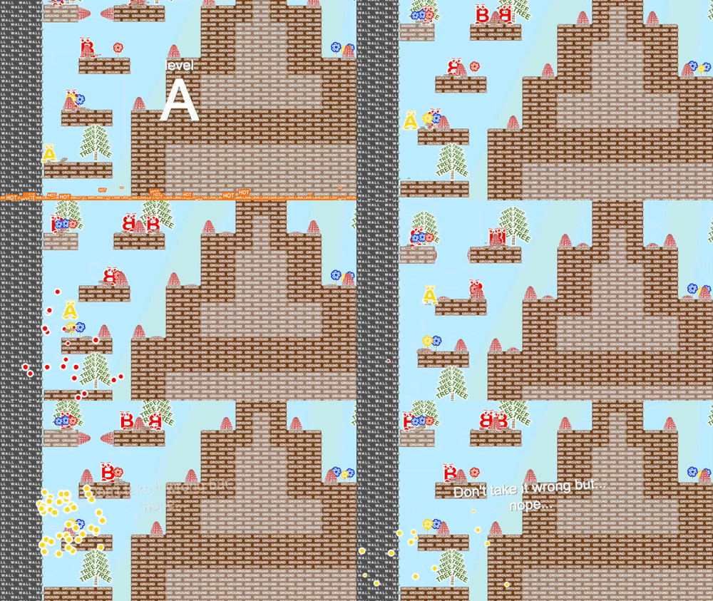
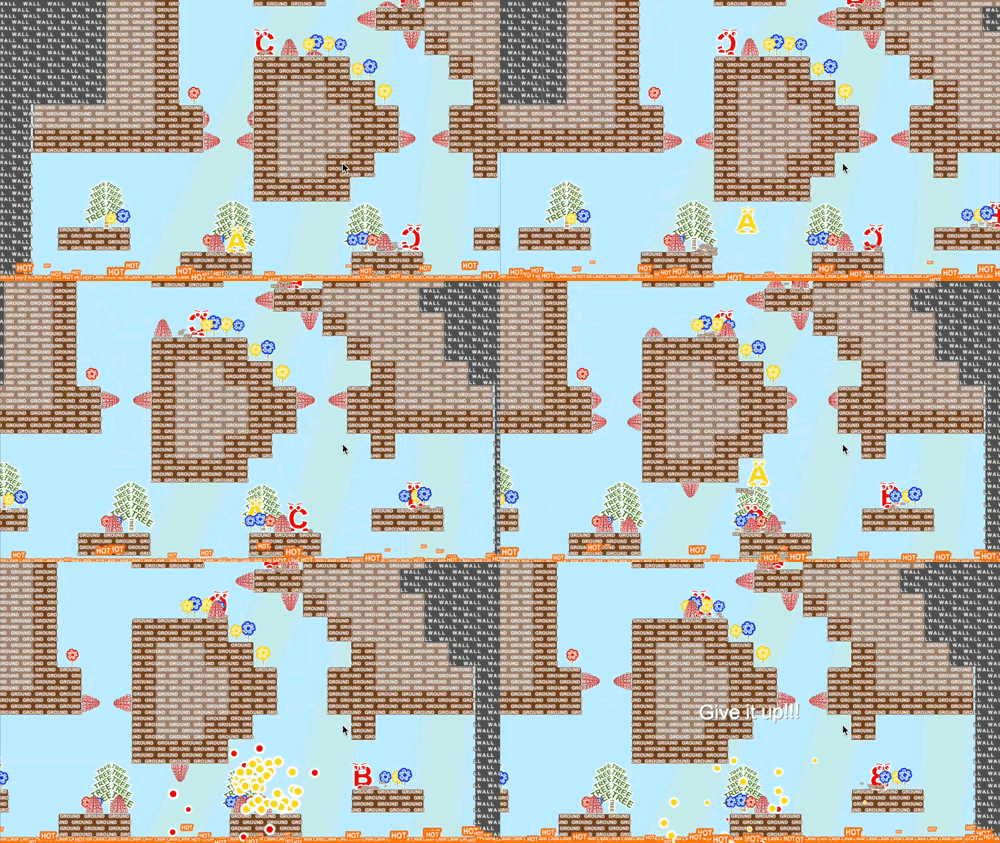
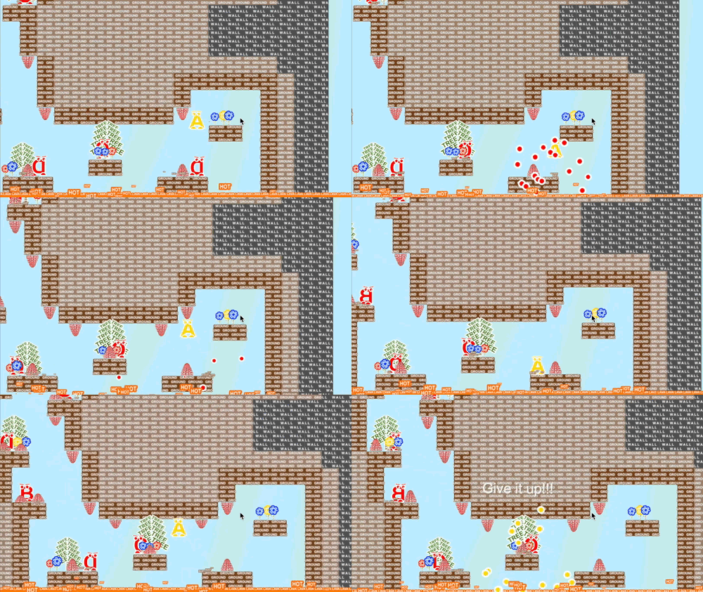
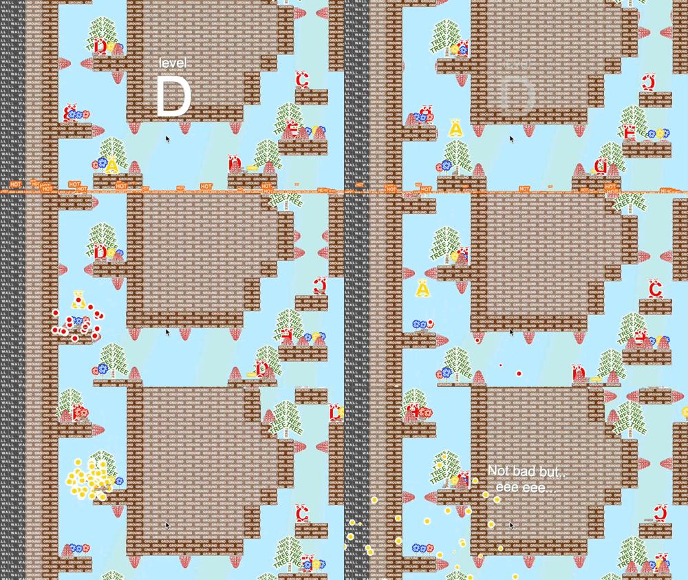
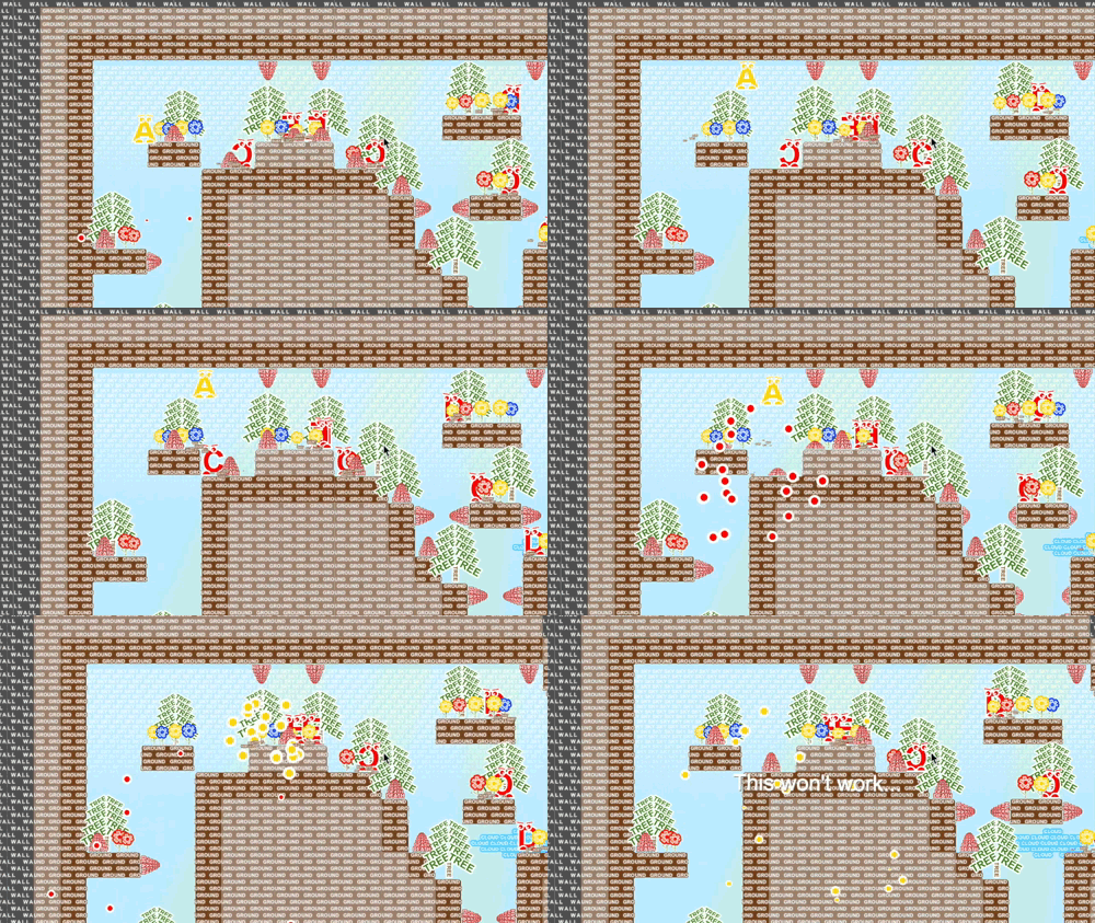
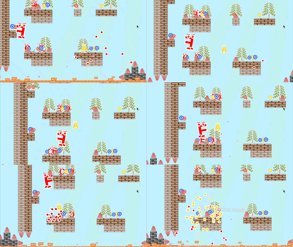
2D platformer about letters world and fight between Alpha and Zet
Submitted by pixelook (@pavelkoci) — 27 days, 6 hours before the deadline
Add to collection

Play game

Alpha vs. Zet's itch.io page

Results

CriteriaRankScore*Raw Score
IDEA | Was this game innovative, or did it use interesting mechanics?#503.6113.611
Overall#583.4443.444
VISUALS | Did this game have nice graphics, art or design?#593.6673.667
FUN | Was this game satisfying to play or did it bring you joy?#603.5563.556
MOOD | Did this game have atmosphere, or did it make you feel something?#693.2783.278
AUDIO | Did this game have great music or sound design?#723.1113.111

Ranked from 18 ratings. Score is adjusted from raw score by the median number of ratings per game in the jam.

Let people know how long this project has been going, or share a bit of its history.
The game was in development a few months only and I would say it's still not completely finished.
Only the first 5 levels are done and still feel there is a lot of work (e.g. balance the difficulty).

This game jam was high motivation to finish it at least into this state.
And it was the first game jam I was joining.

Thanks for the feedback :)

Leave a comment

Log in with itch.io to leave a comment.

Comments

Submitted

As fun as difficult!

Developer

:)

HostSubmitted

I like the idea, the trees are cool and the whole thing with the letters works well!  I wasn't able to get very far, and I believe it was due to one of the following factors:

  1. Your game was difficult
  2. I am terrible at games

I'm leaning towards number 2

Developer (1 edit)

Hey man,
Thanks for the feedback!
To be honest I'm really not sure with the difficulty...
I have feedback that "mission impossible" is easy :)

HostSubmitted

Haha, yeah difficulty is a tough one - you can never please everyone!

Submitted

This was fun. I liked the art style. The game was difficult as others have already pointed out, but still very fun. Also, a different color for UI text would be nice since the background is already light in color.

Good luck!

Developer

Hi,
thanks for the feedback!

Submitted

This game is original, but what is the point of the letters and the words? Visually it is very distracting and it makes it difficult to spot the enemies. Also the difficulty level is too high, even on the easiest level. Still, well done.

Developer

Hi, thanks for the feedback...

> what is the point of the letters and the words
not sure what you mean, the whole story is about letters...
it's the fight between A and Z.

> difficulty level is too high
hmm, I have also feedback that "mission impossible" is too easy :)

Submitted

Really liked the visual style, having words serve an aesthetic purpose was a really cool design choice!

Developer

Thanks :)

Submitted

Wow! Love the way objects are composed of their names. Music is great too. Execution feels really solid. It was a little hard for me, but I'm not much of a platform player. Nice work.

Developer

Thanks :)

Submitted

I enjoyed what I was able to get through, I am garbage at platforming but I liked your sound effects and the responsiveness of the character!

Developer

Thanks :)

Submitted

I love the art! Levels are challenging in a good way. Generally a good experience. Well done!

Developer

Thanks :)

Submitted

Fun game blasting around and stomping on letters!

Developer

Thanks :)

Submitted

The art is so cool! All the animations and the general feel were also very good!

Developer(+1)

Thanks :)

Submitted

Very clever art design with the assets! ^ ^ The mission impossible level is truly a test of nerves lol! Great app!

Developer(+1)

Thanks :)
One guy told me it's too easy so maybe I should create one more difficulty "you shall not pass" :D

Submitted

That guy is truly "CORE" LOL!!! I had a tough time, but to be fair I was using a keyboard. I might do better with a gamepad.

Submitted

I like the graphics. It looks fresh. Also nice levels!

I feel that the "death" colliders should be a little smaller and disappear when "death" go out but it is only my thoughts.

Great job!

Developer

Hi,

Thanks for playing...
The colliders of the death should resize with it... maybe I should make it a bit smaller so player feels it more fair...

Submitted

It is quite fun  and the idea of this game is highly interesting - If you are going to continue working on it and make a story through some short images , I believe it can become extremely enjoyable

Some things you could consider:
-One thing to add that I believe would help the player a bit is if they would see a red indicator or something similar to the areas where the "Death" columns are going to appear before they sprung up

-Coins or something similar to collect

-Upgrades / Skins -> in any case, something that would require you to have the "coins" like I mentioned before

-Differently colored Letters ? (just an idea xD)

Developer

Thanks for the feedback!

Coins: yep, the powerups / coins can be interesting... will think about it.
Different colors: my current setup is to have red color for all enemies so it's easy to understand what will kill you...

Submitted

Really like how the computer is teasing me every time I die.  And I died a lot so far ;) Quirky platform game. I love it! Please finish that one. 

Developer

Hey man,
thanks :)
Hope i will find a time for do so!