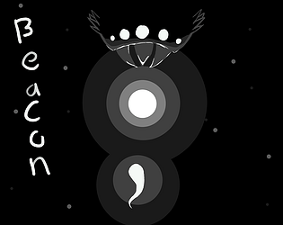
Play game
Beacon's itch.io pageResults
| Criteria | Rank | Score* | Raw Score |
| Visuals | #44 | 4.278 | 4.278 |
| Creativity | #45 | 4.056 | 4.056 |
| Overall | #102 | 3.700 | 3.700 |
| Fun | #113 | 3.444 | 3.444 |
| Audio | #156 | 3.167 | 3.167 |
| Fishiness(?) | #236 | 3.556 | 3.556 |
Ranked from 18 ratings. Score is adjusted from raw score by the median number of ratings per game in the jam.
Pre-existing assets (optional*)
I used a horror ambience track by N91 music. link:https://assetstore.unity.com/packages/audio/music/free-horror-ambience-2-215651
Leave a comment
Log in with itch.io to leave a comment.


Comments
liken the visuals and the sound it created a great atmosphere. It did feel a bit unfair at times
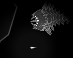
Oh this is definitely a difficult one, a good dark souls for fish lovers vcgdhsvgcd but I love it!! the visuals are really good and so is the audio design, and the concept and the idea itself is incredible, i do however agree with an earlier review that the dash could've been longer and to me, the floaty movement makes it hard to evade sometimes, but overall this is a neat idea! The monster designs are incredible, too, genuinely. i love how their eyes glow in the dark!
omg that shark.. thing looks so terrifying and the vfx helps to scare, well executed!!
The art style suits the theme of the game very well, it seems simple but it is very expressive, I like it a lot :) The controls also felt smooth. Overall really good!
Really love the aesthetics of your game! The monster design was beautiful :)
Amazing art, effects, and sounds. I was scared when there was only one monster chasing me, and then another one came.. that’s not fair! haha Good job! :)
Very good! The art is wonderful, but I think the tutorial could have been better included.
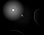
The aesthetic and atmosphere of your game is very good. I felt very small against those big monsters. I would maybe make the dash a bit longer (and with a longer cool down) to make it easier to dodge the enemies. But anyway, very nice work. I hope you had a lot of fun at the Jam.
So good! I saw this in the discord chat! the art is so well done, and it felt great to play! bonus points for accessibility. (I don't mean to brag, but I beat this first try)
Did you come across any enemies?
Yes, came across them a few times, one of them was a pretty close encounter
Wow, so beautiful !
Nice and smooth, the control are very easy to understand and the overall game feels very polish !
I would have love to have more of this game
It is a good game, and the first horror game I have seen on here. Very polished with what there is, but it feels like the game is lacking something. I played a few runs, and believe there are two things that would help some people.
Wandering around without knowing where you are going is a little frustrating. A small mini-map would have been a huge help, even if it was just a rough outline of the shapes. The monsters are great, and the sound they make is a great way to notify people when they are coming, however, there was one time when I was playing where the monster was off-screen, and charged at me. I'm not sure if this was intentional or a bug, but I would say that it felt a little unfair. I think that the way you have the monster's AI set up is almost perfect, and have no criticism on the "chase." The game lacked sound (which is understandable for a week game jam,) and it was annoying wandering around looking for the beacons. At the very least, I would've liked to know how many beacons I needed to collect to win. Good game, would play again.
Thanks for the critique! I for sure need to make game a little counter for the number of beacons, and some way to navigate better would be nice as well. Maybe like an arrow that points to the nearest goal