Play game
Destination: Nowwanus's itch.io pageResults
| Criteria | Rank | Score* | Raw Score |
| Overall | #2 | 3.727 | 3.727 |
| Innovation | #3 | 4.000 | 4.000 |
| Gameplay | #7 | 3.545 | 3.545 |
| Theme | #10 | 3.864 | 3.864 |
| Graphics | #10 | 3.773 | 3.773 |
| Audio | #12 | 3.455 | 3.455 |
Ranked from 22 ratings. Score is adjusted from raw score by the median number of ratings per game in the jam.
Leave a comment
Log in with itch.io to leave a comment.


Comments
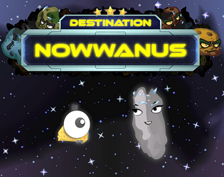
Very cool game! As a space enthusiast and hobby astronomer I love the theme you have chosen. Graphics and audio are also very good, so there is not much negative I can say about it. Maybe the difficulty is a bit high, but this was maybe intended.
Thank you! Yes, it's hard to nail the difficulty in games like this, but after the jam I'll keep optimizing it. I'm planning to make it mobile-compatible, so you can expect some changes in gameplay and in UI too.
This was interesting. Once I figured out I had a limited amount of pictures I got into it. I was initially thinking it would be nice to have random levels but I like the loop of memorizing the difficult levels and getting better. Graphics were simplistic but nicely done and audio effects/music were a nice touch for the atmosphere. Idea of space photography is definitely cool. Nice submission!
Thank you. The idea of persistent levels was totally random. I liked it so much that I sticked with it. Around mission 12 it started to feel like the laser dance from Ocean's Twelve mixed with the Edge of tomorrow.
Kuiper belt objects aren't actually so close together... just sayin.
Destination: Nowwanus Trivia
lol. Great response. I did notice the number of pictures available to be taken was somewhat limited.
Yeah, I needed them to be to allow the 5 tiers of RTG upgrade. Even like this, with only 3 upgrades, you should be able to finish the game easily.
I don't know if that was on purpose, but the noise of clicking in the space bar mach too well the sound of a camera shutter. Anyways, awesome game! Nice levels, creative idea, fun upgrades, I liked it a lot (currently trying to pass mission 10). I just don't think the graphics are as good as the game mechanics - they look a little childish, like from an educational game. That doesn't affect the gameplay by any means, it just make it less atracttive at first glance. Still, loved it!
Thank you! Yep, I'm not big in the art department. I wanted a more casual game, hence the childish graphics, but when I finished the asteroid field generator, it turned out to be a decent bullet hell.
I completed mission 2.
Good job! Only a few more left.
This is an interesting concept. Nice graphics and music.
I may have been missing something, but it seems a bit too difficult right now - could do with the early levels being a bit easier.
Thanks! Maybe you are missing the upgrades? Other than those the only way to finish the levels is to memorize the safe route and follow it flawlessly.
Now i know what a game with matching Artwork should look like.
Great game, innovative and smooth to play!
Thank you very much! Yes, the best way to add matching artwork to a game is to make one, or to find a complete set and adjust it to your needs. For this jam I went with the latter. As I mentioned in my community post, there are some nice sites to get those. CraftPix and Game Art 2D has some cool, free ones, if you are lucky and they are matching your needs.
It's one of the most innovative and solid game in this jam for me. The idea of taking photos of asteroids is unusual and interesting . A lot of levels, you really invested in this game and that's cool! I liked the graphics , all the game objects fit the game main graphic theme. The UI is solid and it's especially cool, because the most of the games in this jam didn't have elaborate UI.
It'd be cool to add some feedback sounds (camera snap e.g.) for a deeper game dive. Also it'd be great to have difficulty options, because i'm more a casual player and it's hard for me to beat a level : ) Yeah, and you already have written it bellow in the comments, some intro levels would be nice for newcomers to know the mechanics
Thank you very much! Yes, I was thinking about what sounds could I add. A camera snap felt to cheap for me, but some warning sounds, or an announcer who notifies you about some aspects of the game would have been nice. Too bad I don't really know where could I get those. I will take another look after the jam.
The difficulty options sound good, but I will try to make the whole game easier and add achievements instead to provide extra challenges. We'll see how that will turn out.
Sounds nice!
https://www.zapsplat.com/ is actually pretty good for finding a sound
I agree, I used their sounds in my previous game. I just didn't have time to run through their huge sound collection to find the ones that are fitting my game.
Yeah, I see, their lib is huge indeed :)
Who would have thought space photography to be so dangerous/difficult? Pretty sure the difficulty ramp up would have been made smoother if I had realized there were powerups (just read your comment "Did you use the upgrades?") but alas no upgrades for me. Still not sure what the "redirects" countdown timer was for. The unexpected find your path nature of the levels from quick repeatability was a nice feature. Overall, I felt is was missing an overarching objective or story-line to keep me invested. Felt more COPS than MCU.
Yeah, I have implemented the upgrade feature on the last day and only got told that I forgot to advertise it for the player in the last hour. I'll definitely add some hints for them, similar to the ones ingame.
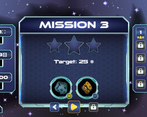
The countdown shows how long can you try to solve the same asteroid 'layout', by finding, memorizing and practicing the safe route. After the timer runs out, the asteroid field resets, and you have to start it over. Upgrading the timer becomes crucial in the late game, from around the 10th level.
I was thinking about adding an introduction to each level, maybe from a NASA agent, who warns you about the asteroids coming from new directions, their increasing number, and your distance from Nowwanus, but then decided to focus on the gameplay and menu instead. And as we can see it, even more development for the menu would have been pretty useful.
Also as a personal challenge I decided to use as little text and replace it with icons intuitive UI, as possible. This is why only the level start scene and info scene has some text more than a few words. The problem is that my core game mechanics are somewhat unusual and might need more explanation, than simple icons. Maybe next time.
Really solid game!
Thank you! That was my main focus! To have a completed game, instead of a prototype or a demo of an idea. Achievements, high scores, mobile-friendly controls, etc. are not in the game because of this, but at least I have a solid, hopefully bugfree, finished game.
The camera mechanic is really interesting. The art is nice and I like the particles showing movement. The music gives it a good tempo. The only thing that I was confused about was the multiple failure states of hitting something, going through the whole field without enough photo points and the timer running out but I got the hang of it after a few goes.
Thank you! I'm glad you liked it. How many levels have you finished? Did you use the upgrades?