Play Centipede
Umbra's itch.io pageResults
| Criteria | Rank | Score* | Raw Score |
| How well implemented were the mechanics? | #1 | 4.375 | 4.375 |
| Did the game feel fair and well balanced? | #4 | 4.000 | 4.000 |
| How good was the aesthetics and polish? | #7 | 4.188 | 4.188 |
| Overall | #8 | 3.913 | 3.913 |
| How fun was the game? | #12 | 3.625 | 3.625 |
| Did you feel rewarded for playing? | #12 | 3.375 | 3.375 |
Ranked from 16 ratings. Score is adjusted from raw score by the median number of ratings per game in the jam.
Which game engine did you use?
Unity
Will you continue if you get picked as the wild card?
Yes!
Who do you think will win GDKO 2023?
I look forward to defeating jebouin in the finals ;)
Leave a comment
Log in with itch.io to leave a comment.


Comments
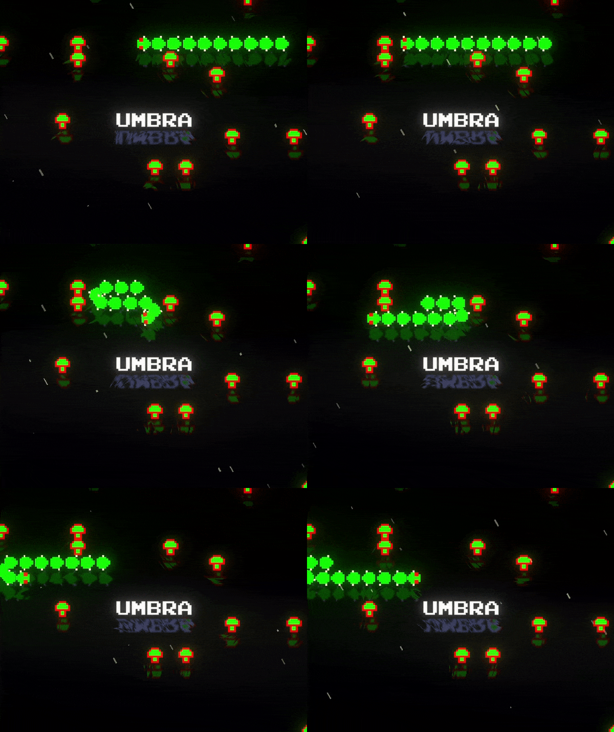
Really fun, felt a bit easy but none the less so so polished and full of juice, I love the mirror effect on everything, mixed with the rain.
This brought me back to the arcade of my youth minus the cigarette smoke.
Well done !
So juicy ! Also did you make the music ? The music and sounds are so good, they create such a weird retro vibe, I loved it ! I like the old arcade drawing at the side, and the fading of the barrier, it's some nice details !
Thank you for your kind words! I'm glad you enjoyed the retro vibe. I must admit I used part of the soundtrack from the 1998 Centipede game, it just fit the vibe so perfectly I couldn't resist :p
Really great recreation of the original! Love all the added juice that made it your own! Great work!
Your polish is always top notch. I'm really going to have to go back to all your entries after GDKO and study your particle effects. Those were fantastic.
Endmark introduced me to the term "juiceonomics: bigger number = more better!" The scoring felt true to the original. But adding 00 to everything really makes the player feel more epic. Passing on that suggestion.
Overall, fantastic update to the original. You really nailed it. Great work!
(And if you don't mind my asking, how did you handle the color changing for each wave?)
Totally agree with Juiceonomics! And the color change is easier than it looks, I used a Global Volume with Color Adjustments > Hue Shift
such polish! As expected from you! Wow. Even down to the fading in of the barrier as you get closer. It's the small attention to detail. This could very easily be plopped into an arcade and fit in and do much better next to the original! UHD 4K 320fps centipede! That could make a good YouTube vid aha
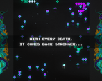
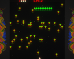
Dang what a polished game. The effects are just incredible from the blood splatters of killing the centipedes to that water effect in the background it all adds so much. I also love the arcade vibe with the sides of the screen being arcade like and the inserting of a coin to start your game. overall incredible!
Congratulations for once again making a game with one of the greatest atmopheres I've ever seen.
reminds me of this one arcade game I played once
i managed only 9403 :L but its really fun! feels juicy and responsive, and looks amazing!
Great recreation of the game. A lot of small but great improvements to the original.
35703 was my hi-score. The game is really good and you managed to recreate all of the mechanics perfectly and made it much better than the original in my opinion
The polish and aesthetics, the reflections, the graphics to the side, the way you introduced new enemies slowly, all of it was so good! This has top 3 potential.