Play game
The Other Side's itch.io pageResults
| Criteria | Rank | Score* | Raw Score |
| Theme | #33 | 3.167 | 3.167 |
| Music | #34 | 3.000 | 3.000 |
| Creativity | #36 | 3.250 | 3.250 |
| Graphics | #37 | 3.083 | 3.083 |
| Overall | #40 | 3.000 | 3.000 |
| Geometricness | #48 | 3.167 | 3.167 |
| Gameplay | #54 | 2.333 | 2.333 |
Ranked from 12 ratings. Score is adjusted from raw score by the median number of ratings per game in the jam.
YouTube Channel
https://www.youtube.com/channel/UC5rsCeW0rPocxLh1pWH0tiA
Epicness
Yes
Leave a comment
Log in with itch.io to leave a comment.


Comments
Nice game wit a good story telling and a strong atmosphere.
There is some work to do on level design to avoid exploit, like dying when you are to high/deep (or add spike on top/bottom if you prefer).
If you ran out of time, this was a good choice to polish, instead of making new levels.
Door particles evoke me "Stranger things".
Well done.
yeah, i ran out of time ):, & those are more like portals, not doors, anyway, thanks for playing :D
Summery : Good experience, short game beacause i want to play more, but yeh good for the Jam. Keep it up
8.5/10
And i also request you buddy to check my first jam game and give me your honest opinion on that
Thanks
Thanks :D
Congrats on getting the webgl version working! I like the post processing effect you added to the game! It is very fun and addicting! Too bad it is too short.
Thanks :D, i managed to make the webgl work by disabling the compression in the game settings, sadly i didn’t really have a lot of time for the game, so that is really all what i managed to make
This was really fun to play! I thought it was pretty creative how each square has a different ability, and how there is a little story to go along with it. Also, its kinda weird how the "black square" doesnt really look black, and tbh, I think you went a little over board with the post processing but that might just be me. Overall, nice work making a cool and fun game :D
Thanks :D, the “Black Sqaurs” Text is supposed to say gray/red, but it was just a typo since originally the squares were black, but i by mistake undo the color & i couldn’t edit it until it was a bit too late, but i am happy you enjoyed it :D, thanks
love the visuals! (pls rate my game!)
Good game, although a bis short (it's not a fault, mine is short too :3)
Thanks for feedback :D i understand the game was short, i just had a little bit of a hard time both having school, & thinking of idea’s for the game exc …
but Thanks :D
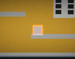
Very nice, visually appealing game! The Buttons are quite small for me and of course there could be more levels. But it's a good idea based on the theme and executed well!
Thanks :D, sadly i couldn’t really playtest the game, but i understand that the buttons may be small for other resolutions, & the poor selection of levels were due to me not really having enough time, i tried polishing what i got, But thanks for the review :D