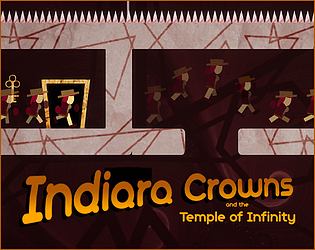
Play Indiara Crowns
Indiara Crowns and the temple of infinity's itch.io pageResults
| Criteria | Rank | Score* | Raw Score |
| Gameplay | #3 | 3.950 | 3.950 |
| Creativity | #4 | 4.100 | 4.100 |
| Graphics | #4 | 4.150 | 4.150 |
| Theme | #8 | 4.150 | 4.150 |
| Overall | #9 | 3.750 | 3.750 |
| Music | #14 | 3.600 | 3.600 |
| Geometricness | #61 | 2.550 | 2.550 |
Ranked from 20 ratings. Score is adjusted from raw score by the median number of ratings per game in the jam.
Epicness
Yes
Leave a comment
Log in with itch.io to leave a comment.




Comments
This is a great game! Very creative and enjoyable. Good Job. You might have missed the mark of geometricness a little bit but this is great.
I played another game with the same idea as this and I have to say, the approach on the theme of this was a stronger take. The gameplay was indeed splendid and the art and music just made me want to keep playing more and make use of the screen wrapping. Amazing job on this game!
Thanks for playing and your kind words.
I love how you approached screen wrapping in a more skill based way than my puzzle based way, and the moving screens made things really fun, I think a level select screen would be useful if you want to replay specific levels.
Thanks you for playing and feedback. :). Yes it could be interessing, thanks you.
Awesome game, impressive output for just a week.
Art is very cool, though not super geometric.
Loved the intro cutscene.
Really nice level design.
Amazing job overall!
This is very cool! I especially enjoyed the moving levels (before that I spent too much time bonking my head on the ceiling to my liking).
there is no ceiling ;)
Wow! This is incredible. You guys did an awesome job. I have very little negative to say, maybe the hint function is too easy that's about it.
Thanks for playing ;)
Brilliant game! This game is really polished!
kudos on the level design
Thanks you :)
99/100 This game is amazing, I know most of the the people will not like that Auto hint, but for the super stupid people like me it motivates me to play the game more , according to me there would be a option that if you want auto hint help or not, the game is super polished , the animations are amazing concept is brilliant and we could connect with the character, i know most people didnt notice but the start transition animation is extra legendry you could make a story with those types of animations.
I also request you buddy to check my first game jam game and give you honest opinion on the game.
Bye
The art was really nice. The other side theme was very creative! I like the hint feature but personally think it should be a player choice. Fun Game. Everyone did a great job!
Thanks you for playing and feedback. Yes, you are right. The bad good idea like he said. :)
This is a very cool game! I like the music and the art style a lot (although I am not sure if it is geometrical enough).
Thanks you for playing and feedback. The texture makes forget that all was made with geometrical shapes. ;)
Wrote a pretty long comment that unfortunately got eaten by server issues, so let me summarize:
- Moving screens + screen wrapping is a super neat and creative concept.
- Super-polished presentation.
- I didn't like the auto-hint system and wish there was a way to turn it off.
- I would totally by a game like this, especially if it leaned more deeply into the puzzley stuff.
Thanks for playing and your feedback. Auto-hint was a bad good idea. I will definitively remove it in a post-jam version.
The name alone had my interest. I really like the falling loops, found them funny for some reason :D Loved the game, despite dying like... a lot xD Great design.
Thanks you for playing and feedback. I'm happy you enjoyed it :) !!
Wow ok... first what I like and then what i dislike:
I like:
- the absolutely brilliant idea of wraping around the screen while the the camera is moving
- the graphics and especially the cutscenes. Who has time to put cutscenes in a game jam game!
- the music
- the smooth animation of the player
- the dying sound effect, it's just brutal
I dislike:
- nothing. absolutely nothing.
Thanks you for playing and feedback ! What a nice comment ! I'm glad you appreciate our work.
That's a really good mechanic (and a good take on the theme) for a puzzle game!! It hooked me for 20 mins!! The art is also really good!! The only thing i didn't liked very much was the forced hints, i wanted to figure it out on my own but after 5/6 deaths i got the solution showed anyway :/ also i felt that the character was a bit hard to stop, especially in the air. Well other than that the game was really great. Good Job!!
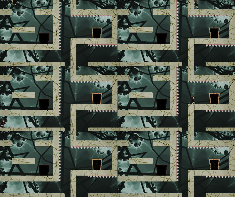
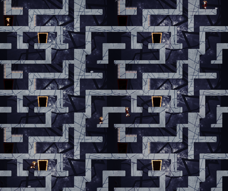
EDIT: Found that you can do this :P (Player gets kinda duplicated, if you look closely xD)
Thanks for the feedback. Sorry for the forced hint, I was afraid people get stuck too early in the game, and wanted them to see the end scene. And you are right the Character is in fact duplicated at each side cross to not have the impression he is teleported.
You guys did a great job on this! I thought the screen wrap fit the theme perfectly. I also thought the levels are really well designed especially the autoscroller levels. On top of that, the aesthetic is cool and interesting. The only problem I had was that the controls felt slippery. In conclusion, I really enjoyed playing it, so great job!
Thanks for your feedback. Glad you like it. And as other feels the controls are too slippery, next time I will do better :)
Nice that you added the arrows after u die too much bcz i need them! :) Nice game, difficult controls. It feels like the controls slide a bit too much
Thanks for playing and your feedback. Did you get to the end ?
nice platform puzzle game but it looks not perfectly in the theme geometric.
Thanks for your feedback. Yes we knew we have to face this objection, and I can understand why.
Just to clarify the "theme" is the other side, and I think we fit it.
Other than that, Geometric shapes are everywhere (but may be not perfectly). The intro is made with simple shape (roughly textured). The main character is only made with plain coloured shapes. The platforms are just square/rounded square, with a moving texture full of circle/square/circle. Spikes are triangles. The backgrounds are fractal. The middle backgrounds are lines.
But I think that what is tickling is textured shape. We choose to textured them because geometric shape does not imply plain colour.
(Sorry it was a little bit long...)
This is true , you have geometric shapes everywhere.