Play game
THE LAST E3's itch.io pageResults
| Criteria | Rank | Score* | Raw Score |
| Sights & Sounds | #1 | 5.000 | 5.000 |
| Themeness | #1 | 4.667 | 4.667 |
| Enjoyment | #3 | 3.917 | 3.917 |
| Overall | #3 | 4.083 | 4.083 |
| Giant Bombitude | #9 | 3.667 | 3.667 |
| Gameplay | #11 | 3.167 | 3.167 |
Ranked from 12 ratings. Score is adjusted from raw score by the median number of ratings per game in the jam.
Team Members
Nathan Labun (Hedgemouse)
Leave a comment
Log in with itch.io to leave a comment.


Comments
Nice game! I included it in my compilation video series of all of the Giant ROM 3 games, if you’d like to take a look. :)
@Quicklyer Thank you!
The visuals and music in this game are outstanding. Great work!
@Frump Thank you! Yeah I kinda figured most people would just end up running past everything when they realized there was no damage. But I've actually got a new build of the game ready to upload once the voting ends. It includes a player health bar, damage, death, and respawn checkpoints. Just so there's a little more incentive to actually remember the attack button. ;)
Great job! Well realized in all regards. Once I figured out I could just walk past the enemies that's all I did for the rest of the game. I even forgot what the attack button was so when I got to the room with tons of them I couldn't remember how.
@Warmonger Thanks very much!
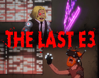
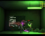
Looks really effing nice! Got a laugh out of the VR zombies, the last scene, and even 'More stuff would go here if I had time.' Well done!
@LCom Haha, thank you!
Fantastic job! Effective intro, amazing lighting, and you had me at "weirder anime".
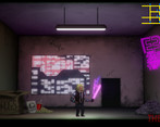
@MiniChimera Thanks very much! The nice glow of the neon was largely done with the bloom effect that comes with Unity. It takes some fine tuning to get it look right, but just make sure the neon sprite has a material unaffected by lights so it's always bright and toss a point light next to it, and it'll get there.
Man, this looks amazing, loved the neon! Some really good jokes, and all very polished. Congratz, this is incredible for the amount of time you had!
Btw, how did you make the neon effects?
@Aska and @jwang19 you're super right about the controls! I guess I just got used to using the F key since I use the same WASD + F combo in the other game I've been making, but I made a quick change to the inputs in Unity just now, and using the mouse definitely feels good! Two hands is the way to go for sure.
I feel like since it's so far past the deadline, that updating the game now with changes based on your guys suggestions wouldn't be a good idea. Maybe after the voting ends? Thanks again!
Whoa! Thank you so much everybody for playing and giving feedback! I really appreciate it!
@joystickhero Yeah having multiple phrases was definitely on my list of to-dos, but it kinda fell to the wayside as I was trying to finish everything else.
@PolarisInParis and @jwang19 you guys are totally right about it being weird that you don't take damage. It pains me that I couldn't figure out a good save/load or checkpoint system in time. As I was working on it, I decided to simply focus on making more art and building out a bigger level rather than spending time on player death. I could have implemented a pretty quick solution to just reload the game if the player took too many hits, but I thought the level was just a little too long for that, and it would end up being annoying or frustrating if the player had to restart the whole thing. And I would rather people actually see everything I put in there, instead of quitting before it was over.
Holy shit dude nice job! I can't believe you were able to do this all by yourself.
The design, the lighting, the set pieces all mesh really well and are incredibly polished. Your game definitely stands out.
From a gameplay perspective, it's kind of weird that your player is immortal so there really isn't any need to swing the sword. Also would have preferred the attack button on mouse click. I'm not accustomed to pressing F with WASD controls. But these complaints are completely minor especially knowing that you only had one week to do all this.
I really liked this one! you put some solid work into this and it shows
Holy polish, Batman!
Duder really nice work on the visual treatment, for only being a week it was really well made. I love the fact that your zombies are just dudes in VR.
Minor complaint about the combat though is that it was uncomfortable to move and attack with it being on the F key, would like to play it with two hands.
Awesome job!
You got some chops dude. Keep at it!
It's a bit odd that the player seemingly takes no damage from enemies, but this game certainly has it's looks and style going for it. Nice work!
Fantastic looking game! Loved the intro, and the art was rad as hell. Mostly minor complaints, like the VR zombies only having one phrase and a lack of a health bar. But hell, for something that came out in, like, a week? Good job!