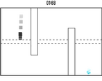
Play game
Box in a Box's itch.io pageResults
| Criteria | Rank | Score* | Raw Score |
| Design | #132 | 3.857 | 3.857 |
Ranked from 21 ratings. Score is adjusted from raw score by the median number of ratings per game in the jam.
Leave a comment
Log in with itch.io to leave a comment.


Comments
This was the last game I tried in this jam, and I must say thank you sir for ending my tests with such beauty.
I really liked your concept and enjoyed alot the minimalistic graphics and the cool background sound+sfx , its rare to see such complete game in a jam + you had so many levels to offer ( some were really hard man btw xD ) . the only thing that bothered me was that I couldn't jump to the next level when I finished one and had to go back to the menu everytime ( did I miss something or it was meant to be that way ? )
I also have a suggestion that will help you improve the juice in your game, that shadow effect that the player leaves behind him, it gets too far away sometimes making it unpleasing to see, I think you can add more shadows with less opacity by calculating an interpolation between last position and new position ( x+previous_x/2 , y+previous_y/2) for example
Great idea, and well executed, totally deserved the 5 stars!
Goodluck!
Thanks, glad you enjoyed it!
Yeah, I totally forgot the next level button lol, slightly annoyed about it.
And interesting suggestion about the trail... Because of previous feedback about the trail, I'd already changed the trail to a more standard trail for the post-jam version. I didn't think that the length of it might've been the problem. I'll definitely have a look at it for comparison, although I might just end up sticking with the standard trail now, at this point it seems like the safer option.
Thanks for playing!
Very cool concept and nice execution (so many levels!). The trail felt like it interfered with the gameplay at times, so I'd perhaps look into toning it down or replacing it with a lighter effect. Overall, nice job!
Thanks! I got into a good groove making levels lol.
Great concept. Control could use some tweaking so that the mouse pointer isn't all over the place (don't know if it's because I have a dual screen set up). I really had fun playing.
Thanks! There's actually an option to contain the mouse inside the window for exactly this reason! (I think it should work for dual screens)
Great game! I loved it! maybe i would change the color of the trail of the box because sometimes I got lost tracking it. Well done and I hope I get to see more games from you !
Thanks very much!
very good game with unique mechanic i loved it very much i won't talk about changing the trial because others talked about this other than that good job.
you can go checkout my entry it will be nice if you rated and left a feedback.
Thanks for playing! I'll look at your game sometime today.
That is a lot of content and potential.
It's a frustrating game which I wasn't in the mood for when I tried it out but I think i would have really got into it most other times. I also tried it on a track pad which was probably not the fairest test for you but I can see it is a good game all the same.
It was a little disappointing to see that the liquids didn't spill out when the level moved. I thought that other objects moving at the same time would be a big mechanic.
I would recommend and check out any future updates.
Please play rate and review mine at https://itch.io/jam/gmtk-2018/rate/300505
Thanks!
I also would've wanted to have some kind liquid physics but I've got no idea where to start with it, I've never done it before. I do think I'll try and learn it for this game if/when I update in the future.
And sure, I'd be happy to play your game today.
Ow, a great example of teaching player how to play without a redundant tutorial! I was wondering if replace the ghost trail to the line trail will offer more concise graphic? It did confused me in the gameplay.
Btw, you did come up with a cool idea!
Thanks very much! I'm looking into different trails now after a previous comment. The current trail was an aestetic choice but evidently not the best one. Thanks for playing!
Cool idea, nice minimalistic graphics, what else to say)
Thanks for playing!
Wiggling the levels round like an idiot is pretty fun! I thought the box silhouettes looked a bit confusing at first but I kinda got used to it at some point (may I suggest using a trail renderer instead since you're using Unity?). Anyway, love how the mechanics are slowly introduced and layered as the game went on and definitely add a button to go to the next level since moving through the menus felt a bit sluggish. Great game!
Thanks! Yeah the trail renderer might have been a better idea for sure. I usually would just use it but wanted to try something different aesthetically... That didn't go so well though, so yeah, you're probably right. Glad you enjoyed the game.
Thought I'd mention, I've been making a build that has a grid in the background and I'm very glad with how it's turned out, I wish I'd put it in before submissions ended. You can turn off the trail and still see how the box is moving and you can more easily see how the level is moving.
If you liked the concept but hated the trail or was confused by the camera/view, I hope you can check the update I'll post after the rating period ends.
Very well made. If this had been a browser game seven years ago, it would have been all the rage.
haha thanks! :P
I knew I was born in the wrong era dammit!
I like the concept here a lot, and would love to try it out. Any chance for a Mac version?
Sure, I'll see if I can build one. I haven't tried before since I don't own a mac but it looks like it's possible. I'll let you know once I do.
It was a lot easier than I expected :)
Here it is: https://drive.google.com/open?id=1C95aRw9n8uAX2CO2pqQvDe0XnbcbrDRA
Please let me know if it works as I'm not able to test it myself.
Hey, thanks making the build! I just played through all the levels and here are some thoughts:
Really neat little game, very polished for the time limits of the jam. For most of the levels I thought the controls worked pretty well and I could mostly get the box to do what I wanted, however there were a couple levels like 1-4, and 2-3, where I really couldn't get the jumps to happen consistently and found myself flailing about with the mouse until the box just randomly got to the end. Also, as for the structuing of levels. I really like how each new set of levels you introduced new mechanic, and then the mechanics started to layer on each other. Really good on boarding there. But was there a reason water was the last set of levels? I found the lava that came right before it much much harder than the water levels.
Anywho, really great job!
Thanks.
I can't yet see what the problem with 2-3 might be, but I can somewhat understand with 1-4. Looking back I think the level design in 1-4 kind of encourages the mind to forget that the levels moving (I might not be explaining clearly but yeah). Anyhow I'm very sure that there's no discrepancies like bugs or physics differences between levels.
Honestly there's no good reason why water was the last mechanic. It was basically because I created a few new levels after I created a new mechanic and it just happened that I made glass > lava > water. It was the type of jam game where I made the base game and then just added mechanics and new levels until I ran out of time. But these are EXCUSES, EXCUSES (lol)... I didn't think about it but I probably should've.
Very polished, but needs buttons to go back to the menu and to the next level. Kind of annoying gameplay, but still fun :)
Thanks for the feedback!
I really like the simple yet stylistic aesthetic, as well as the sound design. All the varying stages with new mechanics also makes for a lot of fun. This is an extremely polished and doesn't feel like something made in a couple of days.
Only issue I had is it looks like there's no "Next Stage" option? I would just go to the menu and then pick the stage that way, but it would be nice to be able to just binge through them one after the other without those extra UI clicks in between.
Thanks very much! I definitely agree with the Next Stage option, it's slightly annoying that I didn't think to add it during the jam.
Hard to control, but fun and interesting. And nice UI :)
Thanks!
I'm glad you like the UI, I often spend too much time on it during jams lol.
I am glad someone did something where you move the level instead of the character. I thought of an idea with that kind of mechanic but it would have been executed quite differently than yours. You did the idea better than I would have though, I really liked your execution. Also, I would appreciate a next button so I don't have to keep going back to the main menu and then to the level select, just to go to the next level.
The lack of a next level button was definitely an oversight especially in a game with short levels like this.
The comments so far have given me a good vision on how to improve the game. Thanks :)
Hope to see you take it further with the advice you got!
It's a bit tough to control at times, but fun nonetheless.
Thanks for the feedback! Glad you thought it was fun.
Tough controls seem to be a running theme for me. My Ludum Dare submission got similar feedback. It's something to work on for sure.
I thought about it a bit more, and it's probably not that the controls themselves are hard, but because there is no background and the boxes shadow is so opaque that it's kind of hard to see how you're moving the outer box. I feel a textures background might make this game a lot easier to control (maybe it would be nausea inducing though).
Yeah I actually agree with you here and it's something I considered during development. I too was worried about the nausea aspect which stopped me from adding it. But I'm thinking now that maybe something like a really faint grid would be ok. Something that you can consciously ignore but would sub-consciously give context to the level's movements.
fun, but it's a bit confusing. it would help if the camera didn't always center on the level so I could see what was going on.
Thanks for the feedback!
That's definitely similar to feedback I've got IRL. I should see if there's maybe a way to remedy this, hopefully without zooming out too much or restricting how much the player can move the level.
I kinda liked the camera moving like that to be honest. I feel like without it the game may be a bit easier but it would also take away from that satisfying feeling of throwing the level around and it pairs well with the effect you have on the cube with the trail.