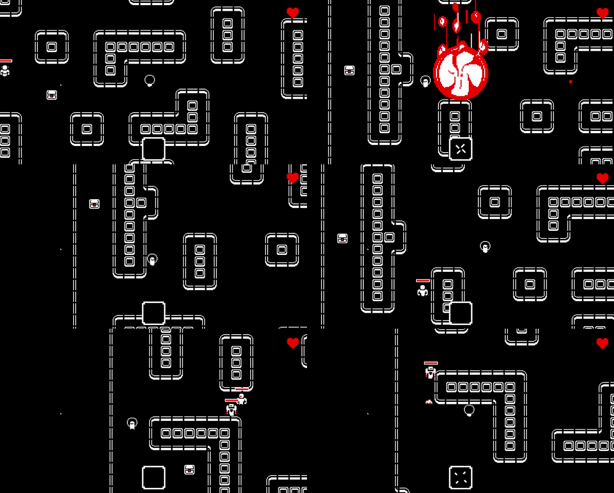
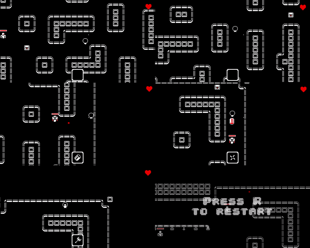
Play game
BOB DOES NOT CARE's itch.io pageResults
| Criteria | Rank | Score* | Raw Score |
| Adherence to the Theme | #407 | 4.202 | 4.202 |
| Design | #480 | 3.654 | 3.654 |
| Overall | #567 | 3.754 | 3.754 |
| Originality | #1003 | 3.404 | 3.404 |
Ranked from 188 ratings. Score is adjusted from raw score by the median number of ratings per game in the jam.
Leave a comment
Log in with itch.io to leave a comment.


Comments
Love the aesthetics and the feel! My one note in terms of arsenal, melee weapons feel severely underpowered compared to their ranged counterparts.
Smooth controls and camera. Great use of VFX
One of our goals for the post-jam release is to balance current weapons and add new ones. Melee weapons will be definitely be upgraded
Really like the art style and concept!
It seems like it has been said in other comments but I was basically getting shot from off screen by enemies that fire before I can see them, which grew tiring. I tried with keyboard and controller (props for adding controller support!) and couldn't get very far into Level 2 before getting frustrated
I'd also sometimes get unlucky with powerups (run into 2 enemies and the powerup you pick up is a single target one). It would be nice if you could bias toward placing AoE weapons near groups of enemies maybe?
I'd be excited to come back to play this more in the future if you make some tweaks!
Really loved the art style and the sound, one of the best i played in this Jam so far.
This has great game feel. I'd really like to play it without the 1 life limit. It's a good way to express the theme, but man it makes for a steep difficulty curve. Great action moments and lots of tension though!
It's quite addictive and very juicy, but the fact that the roll doesn't make you invisible is quite counterintuitive and i died a lot before realising that it wasn't a dodge. I also think that the enemies should telegraph their attacks, even if it's just for a split second. I experienced some frustating moments where I was being chased, rolled past an enemy in front of me an immediately died because the same enemy shot me without warning or time to react. Other than that, it's quite fun and really sticks to the theme in my opinion
I love it when you hold down spacebar it just turns into face-paced racing killing game lol
It's definitely not a bug that slipped through the play tasting phase ;)
BOB DOES GO FAST
BOBFAST'95 BABYY
Cool concept, really great presentation! It's very difficult!
Haha, this is a gem of the jam! Enjoyed it a lot. Very mature game. Incredible work for 48hours! Congrats! Rated! :)
Great game, but Bob definitely has to dance to the music.
Uh, that's an interesting idea.
~The designer
I'm guessing you guys want to make this a full game ? Cus it already seems like one.......
Wow, that game is hard! Or maybe it's just I who suck? Anyway, that's a really good work you got here, I loved the music and the effects. Running, rolling and shooting around feels great, but I'd say the enemy projectiles are a bit too fast. Sometimes they would shoot the moment they came on screen, killing you instantly. Maybe if it was more telegraphed, we could react more to what we see?
Good job, though!
Thanks for the feedback.
We published a new version with some problems fixed (like enemies shooting too soon). If you are curious you cane play it here.
~The designer
Really great graphics and game-feel. Lost it when the psy came on.
4/5
3/5
3/5
This is another scrapped idea of mine that I've seen done near-perfectly by someone else. Really good work, the colors remind me of Downwell, the game play is masterful, and I hope you make this a full title!
Thanks! You are right, we actually got inspired by downwell, the binding of isaac and hotline miami.
~The designer
That's some serious indie game over there.
It feels like the product of a well functioning team working together toward a unique goal.
Impressive quality at all levels.
Great game, awesome effect, nice music and good flow. I feel like more clear distinction between the weapon when you pick them would help with reacting faster to the enemies close by. The game is a bit too hard, i feel like the projectile the enemy fire are too fast and often kill you without giving you enough time to move out of the way. It would be great if the bazooka shot began from your sprite and not from the bazooka end, I had times when the enemy was between where I fired my shot and my sprite and this was very frustrating.
Amazing work!
Thanks! We will keep in mind your suggestions for future updates.
~The designer
I loved this, only issue is that I died so quickly like a bunch of times. I understand that was part of the theme but if you are taking this further you might consider adding slightly more health perhaps two or three hits before going down to increase the player's chance.
Still though very great concept loved playing it and it looked awesome.
Great game but the single pv and stiff corners were the real enemies for me ^^
DANG IT BOBBY!
------
Hey, we made a GMTK game too. Check it out!
a very satisfying core game loop! i loved it !
Very well done. The game was simple, fun, and rewarding to play with a neat concept to boot. Everyone on the team did a great job with this.
I agree with most of the suggestions seen in the comments, I'll also add a few suggestions I have for balancing the difficulty to be a bit fairer on the player:
It'd be useful if the player was given a bit of leniency when moving around corners, slightly shifting the player towards the nearest opening, so that when the player is running around the level, dodging and weaving between corners, they don't find themselves frequently stopping whenever they are just barely grazing a wall.
Bob's hitbox could probably be tweaked a bit, especially for a game that requires this much fast paced precision. Perhaps if his his hitbox didn't cover his Afro and was just based around his body, it'd make the area on the character you're trying to protect immediately clearer.
An addition that might be nice is to have an indication on the edge of the screen to show that an enemy is close but just outside the player's vision, and what direction they're in; giving the player the opportunity to plan ahead slightly. (Whether or not this could fit into the visual style of the game, I'm unsure).
I hope you do some more work with this because it's a great foundation with a lot of potential that is already very well made.
Thanks for your suggestions,
we are collecting as much feedback as possible to release a more polished and expanded post-mortem version and comments like this help us focus on what is important in the core game experience.