Play game
Teocalli's itch.io pageResults
| Criteria | Rank | Score* | Raw Score |
| Presentation | #321 | 4.079 | 4.079 |
| Overall | #1065 | 3.412 | 3.412 |
| Fun | #1271 | 3.184 | 3.184 |
| Originality | #2442 | 2.974 | 2.974 |
Ranked from 38 ratings. Score is adjusted from raw score by the median number of ratings per game in the jam.
How does your game fit the theme?
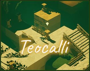
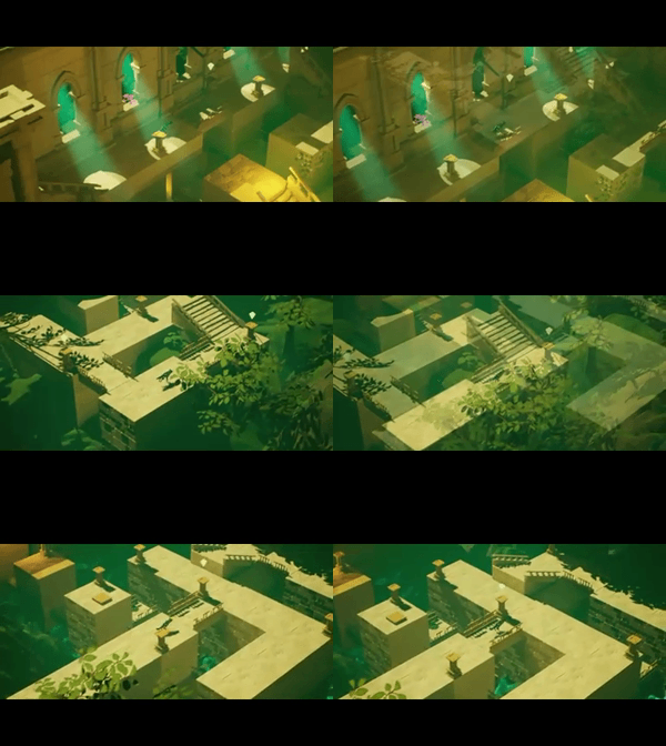
Main mechanic of puzzles in the game is to join various parts of levels together by raising bridges. Also some elements of the puzzles work together.
Did your team create the vast majority of the art during the 48 hours?
No
We used pre-existing art
Did your team create the vast majority of the music during the 48 hours?
No
We used pre-existing audio
Leave a comment
Log in with itch.io to leave a comment.


Comments
Fantastic presentation. I don't agree that using other people's asset is a detriment - you still have to arrange their design and that you did very well. The puzzle aspect is solid and competent, I actually see this working quite well as a mobile game for some reason? While I do see the link to the theme, I think it's not the most original implementation. But crazy original and solid design are not necessarily the same thing and while this game might not be the former, it's certainly the latter.
Thank you very much for kind words. Glad to hear that you enjoyed it.
And well... I guess the majority has spoken on the theme, I'm sorry! :D
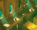
the game looks really good and immersive, lighning is really good, it's a shame that u didn't create the assets and it's a really normal because they are really detailed, the level design on the other hand it was really clever, good job
Thank you for your comment.
I'm really glad that you enjoyed the level design, because it is most important part for me personally as it is the thing that I like to do the most.
As for the assets I don't see it as any kind of shame, when jam rules allow that. I'm not an artist, but a game designer, so I'm very glad you enjoyed the part of my work that is most essential for me.
I don't see how it sticks to the theme, but as a standalone puzzle game it does have quite a bit going for it. It also needs to be heavily optimised, I was getting framerate drops on a 1050ti
Hey, thanks for your comment.
Let me adress the issues.
It sticks to the theme very literally as you are joining together parts of the levels to progress. Bridges are basically used to join together two parts of the city or sometimes even connect two cities or two countries together in the real world, so I thought tak bridge is a great representation of something being joined together. I hope this clarifies my line of thinking and maybe helps you see how the theme was implemented into the game.
About optimization, I'm aware of the game being quite heavy, but 1050ti shouldn't have any problems. Do you have latest drivers installed? Game was created on PC with Radeon R9 270 2GB which is much worse than 1050, and was tested among other graphics cards on 1060ti (which didn't have any framerate drops). I'll try to optimize my games better next time, it was actually first time I did something so visuals heavy in a jam, so please excuse me. Can you tell me if you experienced drops everywhere or on specific levels (for example level 2? it is the heaviest because of dynamic volumetric lights I think)
That being said, I'm glad you enjoyed the puzzles and the game overall. Thank you for playing and commenting.
As others have said a very loose connection to the theme, but the art and music creates a nice atmosphere. Puzzles are quite samey though, once you've figured out the trick it's very similar in all levels
Thank you for your comment.
I'm very glad you enjoyed the presentation aspect of the game.
I'll try to adress the issues raised. First theme adherence, I think that it is quite literally connected. I understand that people expect much more mechanic interpretations, and I know that I took the risk of having it a bit loose, but I still think it fits the theme while complementing the gameplay idea that I created. Second, the sameness of levels, this one I have to defend somehow, because there is only certain amount of what you can implement in 48h. I would rather flesh out one single mechanic/type of puzzle than do few that aren't well thougt out.
It is following rule of 4 levels per mechanic, and while it could have been executed better, I'm quite satisfied with how it works. We have level 1 with overall introduction to the game, than levels 2-4 that you could basically call a tutorial and then comes level 5 which checks your skills, level 6 on the other hand while it is quite short offers a very different puzzle than anything seen before.
I appriciate your feedback, because I noticed it myself too, that it could have been done better and I will do it better in the future, lesson learnt.
Point taken on the theme adherence I guess it is pretty join together. As for the levels I think 1 or two per mechanic would have been fine, no huge issue with 4, but maybe next jam try to get more diverse levels? That's just my opinion though
I will work on the levels structure for sure and we will see next year what I've learnt :)
Thanks
I had a bit of trouble moving around and getting the interaction with the jewels right, but the atmosphere was really nice. The transitions were very well done too!
Thank you very much. Movement is sadly my weak point every jam, but I'm working on it, and it's better this year anyway :D
I'm glad you enjoyed the game.
Very nice visuals, the atmosphere and the mood feels so immersive!
Thank you very much, I'm glad you enjoyed it :)
I think the connection to the theme is iffy, but as far as puzzle games go it is def a good starting place. The E to interact is sometimes a little finicky, for a iso-view game the detection boxes for that interaction should be a little less strict.
Thank you for your comment. I am aware of the issues that you pointed out. Interaction was made as smooth as possible without causing any additional trouble to how the game works, but I agree that it could've been done better. As for the theme, I understand that it can be viewed as little connected, but I think it still fits the theme and complements the gameplay in a fun way.