Play game
JoinedBodies's itch.io pageResults
| Criteria | Rank | Score* | Raw Score |
| Originality | #4717 | 1.917 | 2.875 |
| Fun | #4942 | 1.583 | 2.375 |
| Overall | #5150 | 1.611 | 2.417 |
| Presentation | #5443 | 1.333 | 2.000 |
Ranked from 8 ratings. Score is adjusted from raw score by the median number of ratings per game in the jam.
How does your game fit the theme?
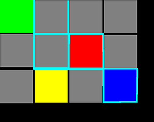
The two playable squares are joined together in a manner that allows them to weaponize the space between them
Did your team create the vast majority of the art during the 48 hours?
Yes
We created the vast majority of the art during the game jam
Did your team create the vast majority of the music during the 48 hours?
Yes
We created the vast majority of the music during the game jam
Leave a comment
Log in with itch.io to leave a comment.


Comments
Nice work for your first ever jam!
Pretty fun mechanic trying to decide between blasting or repositioning.
I don't know why, but it took me way too long to figure out you only really control the blue one. I think having a stronger indication like an icon on the controlled character may help. I agree with the lower comment that showing the higher healthed squares would go a long way. I thought there was something tricky about the order of movement and attacking until I read that comment.
A thumbnail and a couple screenshots/gifs helps with getting more visibility, especially for a jam this size. Even though the game files get locked during the jam, the itch page does not, so feel free to edit it while ratings are still coming in :)
Once again, good job!
- Josh
Pretty interesting concept! More visuals clue of what is happening would be very much appreciated. I am stuck in the level with 2 squares yellow and one of them is invincible, I think it's because it has a bigger outline but I am not certain :/
The swap mechanic is good but needs refinement, I am not able to see exactly what squares will be destroyed on each swap and sometimes you ended up brute forcing the way by swapping mindlessly.
Definitely agree, out of all the things I did poorly I communicated health the worst. I *believe* that one has 3 "health" but I probably picked the worst possible way to convey that, should've done some higher contrast colors or something.
Thanks for the comment!
I think instead of a outline maybe draw a square or a geometric form that loses one side each time or a color for each health type.
You're welcome!
hard at the beginning!