Play game
Almost Playable Character's itch.io pageResults
| Criteria | Rank | Score* | Raw Score |
| Presentation | #129 | 4.486 | 4.486 |
| Creativity | #169 | 4.243 | 4.243 |
| Overall | #343 | 3.973 | 3.973 |
| Enjoyment | #1671 | 3.189 | 3.189 |
Ranked from 37 ratings. Score is adjusted from raw score by the median number of ratings per game in the jam.
How does your game fit the theme?
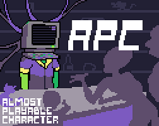
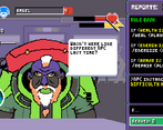
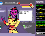
You play as the NPC in a MMORPG. The twist is, you are doing everything what's expected of NPC manually! Ooooh what joy!
Did your team create the vast majority of the art during the 48 hours?
Yes
We created the vast majority of the art during the game jam
Did your team create the vast majority of the music during the 48 hours?
Yes
We created the vast majority of the music during the game jam
Leave a comment
Log in with itch.io to leave a comment.


Comments
Great idea, art is beautiful! interface need some refines, as the difficulty, but you made a really good job!
incredible idea, incredible art, cool music, and very fun! EXCEPT for the fact that it's really too hard. like i type at 80-90 wpm and after the first difficulty increase I was struggling even though I had set 60wpm typing speed. Also, the font could be a bit easier to read, because capital letters are hard to distinguish, and even some small letters. Finally, **** 3L1T3_BL0K3. impossible to pass
As a developer, I hate the 3L1T3_BL0K3 too. I want to punch his smug face
Game looks beautiful. Concept very well executed i love it;)
One thing i struggled with was to determine if player names were with capital letters, the font was sometimes hard to interpret. But overall some of better titles here, well done!
Very nice game, I adore the art. Very obvious how much work was put into the art, love it. though the font was hard to read, which made trying to understand where capitals in the commands went, as well as difficulty reading the players names. Overall, decently fun game!
Great game! I just think the font is a bad choice for your gane.
One of the most unique projects I've seen so far!
this game is WONDERFUL. I love management games of this style and typing games. The perfect mix. This is the kind of game I would like to make. Graphically it looks great too. It's a great game even outside of a jam. Congratulations!
(To add a bit of feedback, the font is a bit hard to read at the beginning, but that's just a small thing)
It was : amazing, congrats to the team I can't believe how cool it is !
I don't know how to play this game, but the love and art is really cool!
cool concept and very cool art! humor was also really nice haha. although i think the font really hurts the gameplay on this one as it is very hard to read imo, especially since i didn't know its case sensitive up until like 5 minutes into the game. also having to scroll up and down to see all the action options was a bit of a weird design choice, feels a little clunky
VIBE CHECK IS PASSED. While the concept might be not something groundbreaking, the execution is solid and artstyle is amazing! I wished I wasn't so busy with trying to typing commands last second so I could look at the art more thoroughly. But I have small issue with text readability (maybe not the best pixel font imo) and it was a bit frustrating to learn a bunch of new commands when level difficulty was increased and timer kept ticking.
Overall love it a lot.
Thank you for sharing the feedback! I agree, some letters from the font could have been better... but I'm glad you liked it!
Apart from the font, it's a really cool game!
Visually, (almost) nothing to say: the sprites look good, the interface is well done, and the stats are clear. Only downside: the font is very difficult to read. I don't know if it is intended to ramp up the difficulty, but I'm not a fan if that's the case.
Gameplay-wise, I first though that it would become pretty boring once you knew what command to type in: look at the player, type some commands, next... Yeah no wonder playing an NPC isn't a great game idea since it become repetitive really fa-oh the commands have changed and are now much more difficult well. That got me!
One way to make it fit into the game would have been to pass it as an update: a pop-up stating that since more player were joining, more precise actions were required, with a list of all functions changes. That way, you don't lose time searching for what is different when you already have a very limited timer.
The music fits a game hub very well!
Great job! =D
Thank you for such an in-depth feedback! We definitely could have made an "update changes" screen, wish I had a couple more hours haha. Still, thank you for kind words 🙏
the geame looks (and plays) great.
the only downside is the font
The presentation is excellent. The font would not be so bad if the game didn't require you to enter names with capital letters or names that are very specific (words that are out of the ordinary + stylized font doesn't seem like a good combo). Overall, very cool.
It looks amazing. And while the gameplay is a basic papers please but as speedtyping, it works really well and with proper text controls you can get quite the speed in. I've gotta guess that the font was chosen deliberately to make it harder to read, otherwise i'd ask for something easier.
My only complaint is that the game changes the commands on the fly and you need to spend precious time checking what changed and applying those changes. Don't know if that is intended, but it felt unfair to me, so maybe pausing the game when a new set of instructions arrives would be a nice little QOL change.
This Looks Amazing!
Cool presentation and idea! i like dialogues with hero and type mechanic
This was crazy fun to work on!! This project has been my first time ever tinkering with game programming, and it has been a very informative and positive experience overall. Huge kudos to ttphb, Spiraleye and vemigvan for putting so much effort into this beauty!
Love this! The presentation is super polished and stylistic, an excellent typing game that is on theme, great work!
Beautiful game indeed.
took me a few tries to get the syntax right because of the font, but once I got it I was schmoovin.