Play late on schedule
Christmas Crunch Time!'s itch.io pageResults
| Criteria | Rank | Score* | Raw Score |
| Style | #518 | 4.150 | 4.150 |
| Overall | #2456 | 3.183 | 3.183 |
| Creativity | #2607 | 3.250 | 3.250 |
| Enjoyment | #5235 | 2.150 | 2.150 |
Ranked from 20 ratings. Score is adjusted from raw score by the median number of ratings per game in the jam.
How does your game fit the theme?
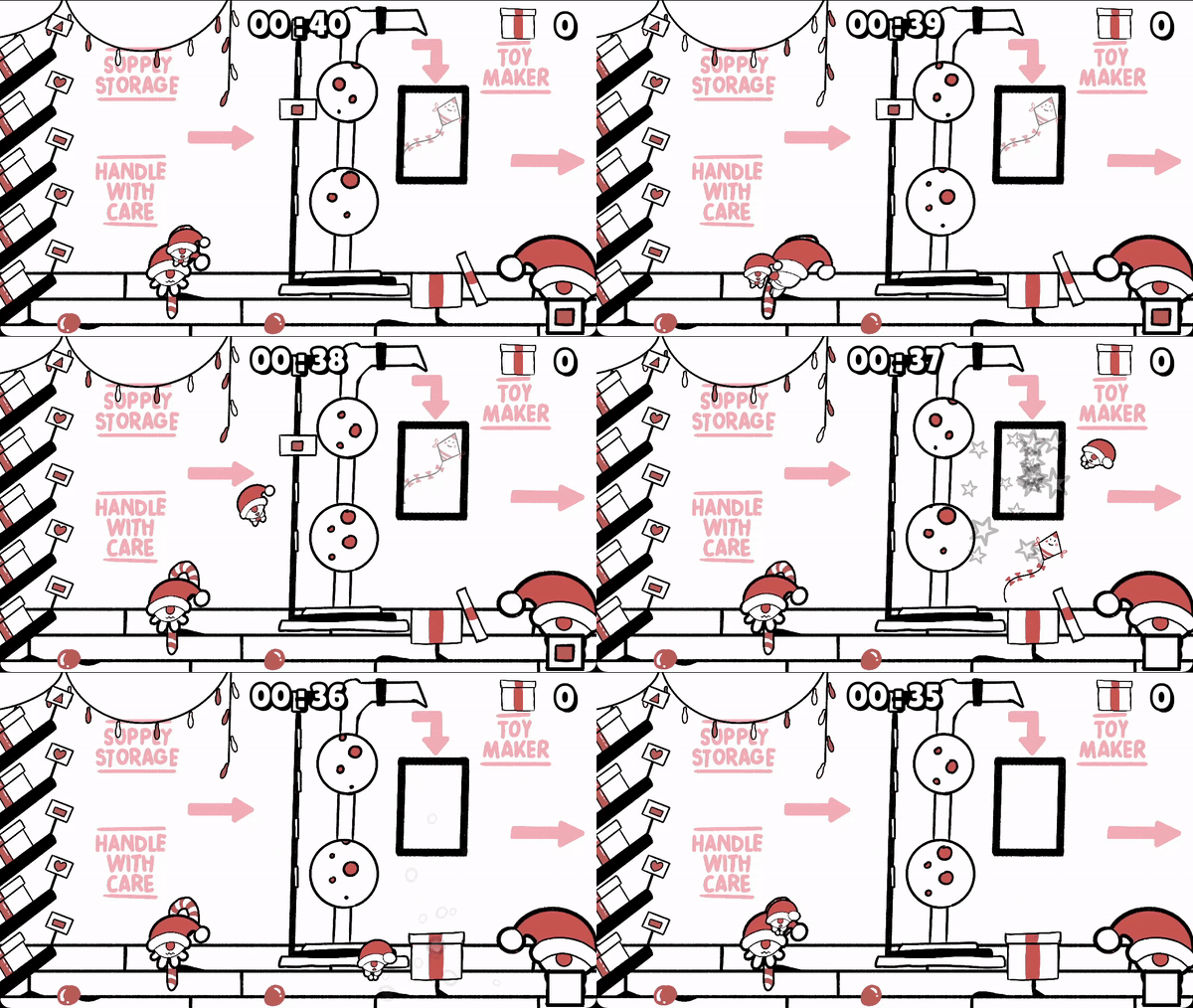
You build toys in santa's factory and scale up the pile of presents to deliver the kids
Development Time
96 hours
Leave a comment
Log in with itch.io to leave a comment.


Comments
I feel like this game lacks either an end point, or a system where it gets harder and more hectic as time progresses. The art is good, although I don't see the theme of 'Built to Scale' anywhere in the game. The controls feel somewhat clucky at times (especially the throwing, it sometimes threw the gnome really close without releasing the button and would waste the player's time) and I don't see a point in having the ability to jump. The shape below the one you throw an elf into also changes sometimes (I'm guessing the gnome falls a little behind the screen before it goes back to the player) (this is more of a nitpick)
Overall pretty descent game, but needs more of a purpose or difficulty curve because it gets stale after 4 or 5 toys
i love the christmas theme! i love the art! I enjoyed the game, thank you!
i love the christmas theme! i love the art! I enjoyed the game, thank you!
amazing game overall! found myseslf getting addicted to it. i wish u could also throw the presents to the santas cart to optimize more time. also the sound design, music, art. everything is so clean and polished. one thing i would suggest is to add increasing difficulty as time goes on. like on the first run my third toy had 3 shapes at once which killed the run but in the second run i learnt the game more and it was my 10th toy or smth and i was still getting single and double shapes. so removing the single shapes from the shape pool once u reach a certain score might be good and introducing 2 and 3 shaped toys AFTER the player reaches a certain score can also be a good change. the collisions can also be a bit worked on and there could be a translucent curve showing the tragectory as i was just guessing my throws most of the time. these are just tiny nitpicks though, overall the game was amazing and i love every aspect of it.
good art, collision a bit strange sometimes.
Very cute illustrations and a restrained but tasteful color pallete. The flicking was kind of hard for me to adjust to, but this game oozes charm.
Thank you, FHG for your kind words! Will be glad to hear from you in the future! And thanks for testing our game on the stream!
great job!
great color pallete, theme and maybe the best "how to play page" ive ever seen.
i suggest that you allow the player to throw himself from anywhere (not just the sling spot) and maybe add some hazzards in the stage
(we also made a christmas game hehe)
Hard! Ouch. Loved everything else. Couldn’t make one candy T.T
nice! I was a bit confused about controls, maybe put some in the description!
you won my heart with using the itch nouns already
improvement points: