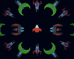
Play game
Space Conqueror's itch.io pageResults
Criteria | Rank | Score* | Raw Score |
Enjoyment | #2065 | 3.143 | 3.143 |
Overall | #3019 | 3.024 | 3.024 |
Creativity | #3187 | 3.071 | 3.071 |
Style | #3599 | 2.857 | 2.857 |
Ranked from 14 ratings. Score is adjusted from raw score by the median number of ratings per game in the jam.
How does your game fit the theme?
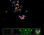
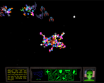
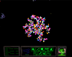
The spaceship that you control starts small, but keeps scaling to a larger and more complex form the more scrap parts you collect
Development Time
96 hours
(Optional) Please credit all assets you've used
Splice
Leave a comment
Log in with itch.io to leave a comment.
Comments
Interesting game! I like that old DOS look with the 3D renders, definitely captures that 90s vibe. It's an interesting idea to have the upgrades physically stick onto your ship, as far as I can tell though their positioning doesn't matter, quite like the idea of having the player decide to turn their ship so they can catch an upgrade on the right spot! I also found the number of types of upgrades quite overwhelming and they kinda blended into one multi-coloured mass, might be better for visual clarity and decision-making to whittle them down to 3 or 4 and dole them out with less frequency.
As far as the bullet hell gameplay goes, I think this game suffers from the shots being way too small and fast and not having separate colours for player and enemy shots. A bit of damage flash on the player/enemy models would also do a lot for visual feedback. Think you can afford to make the shot sound effects beefier too, though given the auto-shooting that might be tiring for the ears. This might be a personal preference of mine but I also wonder whether this would work better as a shoot'em up, as in the player is confined to a screen they can zip around in and the enemies fly in from the top or right?
With a bit more work post-jam this will be a neat arcade experience!
thank you so much for the extensive feedback! I too agree that the enemy bullets were hard to see and recognize but by the time we noticed, it was already too late to change it. Will absolutely consider the flash for visual feedback as well as tweaks to the sfx so it's noticeable but not annoying. Again, thank you so much!
220mb is a little big for this game, what files are even in there that is taking up that much space.
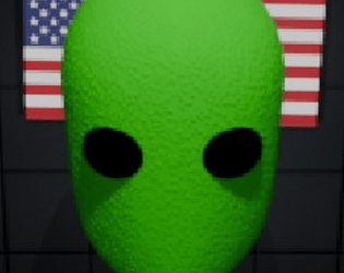
Other than that, alien dude is cool!
Fun game! Loved the idea of just covering myself in as much junk as possible to survive longer.
Nice and simple game to understand! Though it was a bit hard to tell when I was taking damage, since there was no audio feedback for that. I think this is a solid core idea though, with a longer development time this could become a really fun little arcade game!
Nice game! Fun to play and easy to understand I like it ^^
Interesting idea, reminds me a bit of Katamari
Omg so many bullet (but fun), and I liked the concept and the style ^^
NIce game.
My only complaint is I think the enemies start shooting faster too early and don't give you enough time to collect attack speed modules.
The alien shaking his head at you when you take damage is a nice touch. Good work!
classic looking game! easy to play too. Nice work!