Haha yeah, that's the kind of thing I had in mind!
mjoldham
Creator of
Recent community posts
Fun way of engaging with ant biomechanics! Like the overall presentation and music! A way of adding a bit more challenge might be to have some other kinds of obstacles or things that disrupt your scent trails, and maybe a drain on your leaf resources that scales with the number of ants you have? Really well done in the timeframe!
Cool atmosphere! The set dressing of the city was simple but effective. I also like how grimy and depressing the tower was. It was an interesting choice to make the movement feel so heavy, I think you could speed up the grounded movement slightly while retaining the feel and maybe having an input that makes you drop faster (or even just releasing jump) could help pick up the pace of platforming. I'm impressed you implemented an item shop in 48 hours! Must admit I thought the hook must've been bugged before I found the chain-linked surfaces. I don't know if I'm missing something or this goes against the vision, but allowing the player to jump from a grab would be nice.
I quite like these kind of first person platforming games, definitely develop this further!
This game oozes charm! I love the work you put into the animations and sound, the machine is terrifying and the performance intro puts you in the mood for panpiping! Really like the decision to offset the schematic from your ruler, I was always frantically glancing between the two trying to work out the measurements quickly. Really well realised in 96 hours!
Fantastic game and great theme interpretation! Kicking myself I didn't play it sooner! When I read the description it seemed quite daunting, but I think you started simple and ramped up the challenge well. The visuals and sound/music are very well done. Communicating the rules in the map mode might be helped with little visual illustrations, other than that I loved this!
Great visuals and great sound work! Quite impressive for 48 hours! The core mechanic was a nice interpretation of the theme. I found it particularly fun when squeezing through small spaces, less so when platforming in larger spaces. Maybe the focus could be more on having a larger default size and navigating through small pipes, possible puzzle potential there. Maybe a more immediate/intuitive way of scaling the different axes could be to use another set of directional inputs (e.g. IJKL) or to hold some modifier button and use WASD. I wonder given the nature of the controls whether the punishing setbacks incurred from falling suits this game.
Definitely develop this further!
Neat little game! Love the shader and modelling work! Sound FX and music are nice and dinky too! I wonder if deciding where to connect to should be automated or not? Could be that there are a certain number of types of sockets that can only connect to each other (e.g. red, blue, green), and maybe some kind of constraint on the length of these connections. Setting that aside, I think a time attack mode could work brilliantly with this, successful connections could gain time based on their length, nice frantic energy ensues!
Interesting game! I like that old DOS look with the 3D renders, definitely captures that 90s vibe. It's an interesting idea to have the upgrades physically stick onto your ship, as far as I can tell though their positioning doesn't matter, quite like the idea of having the player decide to turn their ship so they can catch an upgrade on the right spot! I also found the number of types of upgrades quite overwhelming and they kinda blended into one multi-coloured mass, might be better for visual clarity and decision-making to whittle them down to 3 or 4 and dole them out with less frequency.
As far as the bullet hell gameplay goes, I think this game suffers from the shots being way too small and fast and not having separate colours for player and enemy shots. A bit of damage flash on the player/enemy models would also do a lot for visual feedback. Think you can afford to make the shot sound effects beefier too, though given the auto-shooting that might be tiring for the ears. This might be a personal preference of mine but I also wonder whether this would work better as a shoot'em up, as in the player is confined to a screen they can zip around in and the enemies fly in from the top or right?
With a bit more work post-jam this will be a neat arcade experience!
The presentation is great! The 2D artwork integrated really well into the 3D world, and I like the characterisation in the environment design, particularly the room you start in. Would have been even better if you could interact with some of the set dressing with your tongue e.g. switching tracks on the boombox, opening the wardrobe etc. The music sets the tone really well and the sound FX are well done too, just missing a licking/slurping sound for the tongue! I think the use of the 2D animatic cutaways for death was a great and novel way of injecting style into gameplay, the closest thing to it I could think of were the die-o-ramas in Crash Tag Team Racing.
Really the biggest shame is that your core mechanic seems to be bugged, as I think others have pointed out your jump scales with each jump you make, and in fact eating flies resets your jump! Having said that I think this has great potential post-jam, it scratches that kind of Sludge Life itch so I'll be keeping an eye out!
Wow this was cool! Setting aside the lack of audio, I quite like the presentation! The monkey model is charmingly idiosyncratic and the colours and shadows were well judged. I'm of the opinion that a virtual camera shouldn't be constrained like a physical camera, so I think your implementation was just right: felt like I could always see what I wanted to see. I really like the way you use the grab action for all interactions, makes the world feel consistent and tactile. The hand-tiring mechanic was a cool way to make the player swing more like a monkey and introduced a nice little awareness challenge. I also think the way you could stretch and slingshot while grabbing on the ground is neat, reminds me of the rubber band in Sheep, Dog 'n' Wolf (US: Sheep Raider).
In terms of improvements, a nice bit of QoL would be to hold the hand out while holding grab and to initiate a grab as soon as you get in range. I assume you're using a spherecast for finding the grab point, might be better to use a thicker radius or to move the aiming to a separate mode and go purely off of distance to the monkey by default. Might also be nice to be able to apply a bit more force to your swings starting out (so that you're able to start swinging from a still start, for example), though that might de-emphasise the sense of momentum too much.
I also wonder whether it could be fun to let the player decide whether to spend their banana on upgrading both arms or one in particular? Could have a dedicated grappling hook arm and a swinging arm. Anyway I look forward to seeing how you develop this further!
Overall I liked this! Really the only bug that spoils this is the reset loop, but when you're in the thick of it it's good simple fun! I really like the idea of forcing the player to keep the pedal to the metal, nice chaotic energy that could be enhanced by including some drift physics. The physical coins are also a novel way of punishing the player for not driving well, definitely something to keep in the back pocket! It has that nice, simple, quick loop you find in classic Miniclip games, if you were to complete a post-jam version I think it would be right at home there.
So simple but so addicting! The sprite work and animation has a lot of charm and it was a fun idea to characterise those gubus in the description. Makes me think of Pacman ghosts, would quite like to see those kind of quick animations between levels showing their antics to squeeze out that bit more entertainment! This was a really cool interpretation of the theme, didn't expect testing my ability to size up groups to get me to keep coming back for more.
I think the only thing that gets in the way of initially onboarding someone to this game is how the goal and your abilities are communicated. I didn't have trouble with the sizing goal but it might help to contextualise why we're only rounding up a specific number (e.g. only x number of parents have called to drag their kids in), and it took me a while before I figured out that you can click on the bugus to get rid of them. Think that last one was because I confused the words gubus and bugus in the description, just need to add the sprite to fix that I reckon.
Also a quick word about performance: the game only struggles once the gubus are ascending away, if you were to divide them into groups and update them in separate frames that should hopefully keep it running smoothly.
Overall I must have liked it cos I kept at it until I got that A rank!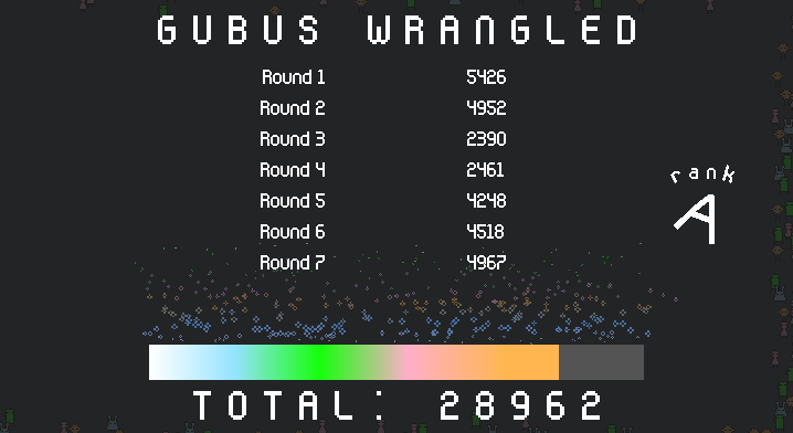
Wow so that's how it feels to get an essay in the comments! Thanks very much for your time!
To be honest I had the idea for this kind of control scheme for a few weeks, and after I failed to submit my last project I was determined to do what I was in the mood for straight away to save time. As I was making it the limb system kind of appeared and suddenly it fell into place theme-wise. Good suggestions!
- I find level design is what allows a game's mechanics to sing and I definitely need to work on that haha. I was kicking myself after the deadline that I didn't limit the player to the circle of light, easy fix for the pot shots problem. After my last project I also thought I could shove in some kind of style point system for this one to encourage the player to play sub-optimally, but even with double the time things get cut. I found the strategy that works for me for these kind of fast projects is to keep it as dead simple as possible, hence no changes in elevation, obstacles etc. Funnily enough I was surprised how straightforward it was to get that kind of drifting kart motion, wondered whether that would work against it being an FPS but clearly not! The kart track design is a great idea, puts me in mind of something like the on-foot chase in The Good, the Bad, the Weird. Definitely want to work more on that feeling of momentum, flinging yourself etc.
- After playing Devil May Cry 3 I've kinda warmed to the idea of rewarding the player's ability to mash, but a reload should hopefully bring the best of both worlds. And the animations were a total rush job and I should've emphasised more the use of limb shots to create openings.
- (&4.) Those cowpokes really should use their guns, it seems silly that they run around and don't fight back. If they did then the player would have a use for their dodge, and in fact if they angled their heads differently then the player would have to crouch under them to get a shot at their head!
5. This is the first time I really engaged with the selling of the game, not just the making of it. I really should look into putting up gifs, especially when YouTube seems to decide to take down your video and not tell you why haha.
Everyone's destined to eventually lose in this game I'm afraid haha. There used to be a kind of win-state by crashing your game with the amount of cowpokes, but I had to go and be clever and make sure that didn't happen didn't I. I did not expect someone to react to the gameplay this strongly, so this was very encouraging to read!
Nice relaxed presentation! Think it pairs nicely with the idea you're a horrendous growing infestation for some poor soul! The game definitely has that inherent appeal of exploring every nook and cranny of a mundane space and growing your legion of ants.
The most upfront issue with the game is the camera. I think it would've been better to let it freely turn (with a limit on pitch of course) and to enable backface culling so that you can still see your ant even when the camera is inside geometry. Letting the player move the camera closer to the ant would also have helped with awkward positioning. Personally I think it's better to give the player the ability to adjust for these kinds of things than to try and automate it, because then the player is fighting the camera, not controlling it. This would require playtesting but I wonder if keeping the camera vertical would also reduce issues and make the presentation more consistent?
The crawling tech is impressive, and I don't envy you implementing it in just 96 hours! Really like that you don't impose any arbitrary limitations and just let the player crawl everywhere! With that in mind, it does have trouble with corners, and I suspect part of the issue is that you seem to be using rigidbody collisions. Given that if the player moves into anything you want them to climb it and stick to the surface, I don't think these rigidbody physics are actually necessary for the game. It's an interesting technical problem, and it's impressive the game manages as well as it does! Definitely something I'll be mulling over.
Excellent visuals and sound/music! And with the simple controls and nice quick levels this would feel right at home on the GBA! I also really liked the simple way you made the slime feel goopy by wobbling its face as you moved, nice detail and good feedback for input! With these kind of escort games the danger is that the player will be sat waiting for the NPC to catch up, so not only were the short levels a good idea but being able to shove the wizard about was a great call, quite funny as well! It was also a nice lightbulb moment when I figured out that resetting the slime's scale moved it to where it's face is, and how you can use that vertically and horizontally.
In terms of mechanics the only real issue I have is that sometimes the scaling can feel inconsistent: tapping the scale button doesn't always reset (might be an issue of the timer distinguishing a tap and a hold, or maybe best to tie this function to jump?), and when you move to fill a gap the slight travel at the start can be a bit annoying if you drop the wizard, if that makes sense. I think for the sticky wall mechanic you just need a couple frames of animation and that would make visual sense too.
Terrific effort for 96 hours! I'll be waiting for the full release!
I love that 3DO/Saturn FMV jank vibe! You guys clearly had tons of fun making this and it's infectious when playing it! I particularly like the voice/physical acting and sound effects! And great music too, really puts you in the mood for fighting giant squids! Only thing that I find a bit of a shame is that the squid doesn't roam around the map more, I quite liked the layout and detailing of the city.
I think you rode the line between jank and playability really well with this one, the game really knows what it wants to be and embodies it!
Wow! This really goes to show how much can be done with so little! And the action twist you introduced to the JRPG formula was simple and fun! It's the kind of game that inspires you to go and make your own take on the genre! The only thing that dampened the experience for me was the legibility of the text, though obviously you were constrained by the use of it for the sprite work as well. Specifically 'A', 'E', 'G', and 'M' gave me trouble, the rest were fine.
This kind of game is totally up my street! I love that feeling of being a scrappy lil guy jumping and scrambling all over their ungainly mech home to explore and find a way out! I really like the choice of using wheels for all interactions, and I especially like sending the mech turning before engaging the throttle and vice-versa. Those kind of simultaneous interactions should definitely be explored post-jam! You really captured the look of a brighter version of Mech Warrior 2, in terms of presentation literally all it needs are interaction highlights and sound/music.
In terms of issues, I think the player needs a bit more air control or the platform around the mech should be a bit wider, even when being careful it's too easy to fall off. I also think it would be worth having wheels interactable in the bottom half of the screen or even just by distance so that steering and throttle could be engaged a bit more smoothly. A neat addition would be to have side and rear windows/mirrors to further sell the feeling of operating heavy machinery.
Given that everything works through wheels, it surprised me initially that you couldn't place them where you liked. Obviously this complicates the design, and you might want to add constraints (e.g. once placed a wheel can't be moved), but I think this element would suit a metroidvania and the fantasy of operating this machine. If you wanted to look for inspiration for more mech components I'd suggest looking at heavy machinery used in construction.
So to reiterate, I loved this! I'll be patiently awaiting the full thing!
This is amazingly well realised given 96 hours! The grimy visuals and the way you interact with your environment makes it feel very physical and tactile. I also really liked the sound FX and mixing, it may be my mind playing tricks on me but I like the detail of the furnace playing a sound effect when full! Overall the gameplay and presentation marry well to achieve that feeling of long stretches of mundanity broken up by emergencies in a cold world.
I only have minor issues: the collision seems a bit finicky and there was one time I got stuck on the pipes and had to restart (could extend collision above them or just remove their collision), and there wasn't good feedback on the brake lever. I wasn't even entirely sure which position was 'on' or 'off' haha, just needs a sound effect and some screen shake.
Overall I think you did well bringing together these premade assets to make something that looks visually consistent! I think that if you were to just tone down the bloom and chromatic aberration a smidge, as well as reduce the FOV to say ~80 degrees, then the game's style would be able to shine more and be less overwhelmed. I like the choice to place the UI in the 3D space, but typically in other games to maintain readability it's scaled to always take up the same space onscreen. I quite like the visual FX of the shots and their impact, think it's just missing some damage flash on the enemies and maybe a death sound effect. The sound of the shots has good impact, just needs a little variation in volume/pitch to make it sound right in action. I wonder if maybe a better way to present the gameplay, given the 3D cursor and turret defence, would be to use an overhead view that didn't turn with the player character? I do like how the player character feels like a hefty hunk of metal!
I think what's missing in the level design for me are specific entry points / chokepoints for the enemies, so the player would have more decision-making when it came to how to place the turrets to be most effective. In fact if you were to introduce turret repositioning you could use the turret defence antlion level in Half Life 2 as a point of reference for this kind of more action-oriented take on the genre!
The overall presentation is very well done! The direction of the music was unusual for this kind of game but it really sold the feeling of drifting through space. The sound effects worked well too, I particularly like the detail of harmonising the ship's shots with the music. The sprite work and animation of the shots/explosions were really nice, almost wish the camera were closer to appreciate it more! Nice sense of impact when landing shots too, but I feel taking damage was a bit lacking, maybe it just needs the damage flash that enemies have.
The trade-off between firepower and size/handling was a great interpretation of the theme for an arcade shooter! It clicked once I realised the point was to shrink to avoid any danger, not just the laser gates. I think the controls work fine (apart from a bug where you can't turn left while moving forward), but the issue for me is that the ship doesn't feel like it has enough momentum in its movement and turning. I think this would help make aiming feel less finicky and just add some heft.
Yeah the gun shots were made last minute by literally just adding together an impact sound and some melee strikes that I made in my last project haha. No time for any ducking or EQ, but very pleased to hear you enjoyed the sound work apart from that!
I originally wanted to include some kind of style system that would nudge players to act cool, but as it stands I'm just relying on them doing it because it feels good. And yeah I had thought to either expand the hitbox while you're spinning or introduce a slowmo mechanic, but apparently even given double the time things get cut haha. I've been meaning to check out Titanfall 2! What I had on my mind was actually Vanquish, though that obviously plays quite differently.
Ah 510, so that must mean you lost on the 12th wave! The theme of Built to Scale made me think of exponentially increasing numbers so the cowpokes spawn in the Fibonacci sequence.
This really does capture the spirit of Katamari Damacy! The pleasant visuals, the dinky sound effects, the underlying dark humour are all well done. Thought the dialogue was a nice touch too, especially how when you get past a certain size it becomes too tiny to read and you're filled with pleasant thoughts about the smallness and futility of humanity!
The scale of the ball is conveyed well through the heavier and heavier inertia, but it would've been nice if you got the wonky rolling from Katamari working, though I can imagine that would be awkward to code. In terms of the overall structure you got the spectacle of building up from a grain of sand to rolling entire islands right, but moment to moment it could've used the Katamari trick of gating progress by confining the player to an area sealed by some roadblock. Felt like there should have been those kind of subgoals that daisy-chain all the way up to consuming the whole town.
Considering Katamari Damacy was made by a whole team of people in a few years and you managed this in a few days, I'm quite impressed!
The game opens with such a strong hook that I felt a little let down that the ending wasn't a punchline to match, but I think that's more a testament to how well done that opening is with the limited resources. I hope it doesn't come across as backhanded but the quit out is pretty cool too! I'm always a sucker for injecting a bit of style into basic game functions.
The handling of the car is odd, and I think the game is less about you conquering a mountain and more about you conquering this machine. Going in with a Sisyphus mindset, there's some nice comedy built into the gameplay at the player's expense which I'm all for. It felt strangely satisfying to build up some speed and then send the car flipping wildly, wonder if that could be part of some future vehicular-platforming game?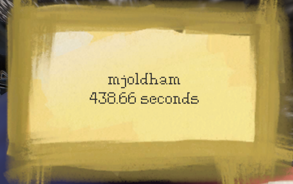
Nice snappy handheld gameplay! Obviously this game draws inspiration from WarioWare, but once I figured out that the motions in the clean up phase depended on what you caught in the fishing phase it actually reminded me of the tagging minigame in Jet Set Radio. The cool thing about that minigame that could be applied here is that you could actually input before the icons showed up to complete it even faster, good way to reward players who are paying attention.
Really nice, slow, and meditative. I liked how simple and tactile the boat felt to navigate. Felt good to fiddle with the sail and jib to go as fast as possible. Also quite entertaining when you get to an island and have to frantically adjust to avoid / recover from a collision.
I only have a few quibbles: tying interaction to jump leads to some mishaps, swimming feels too bouncy, and maybe it'd be nice to have some kind of speed indicator (diegetic or not) to let you know if you're eking out as much power from the wind as you can.
This is a neat, simple concept! The presentation is very clean, and it was fun figuring out tricks like syncing up lines into a mixer so that it can then output more than one colour along a single line.
Unfortunately just as I was getting into it a timer would expire and I'd be booted out. I'd really like a mode without time limits where you can craft clever logistical solutions, perhaps with constraints on the total line length, number of mixers etc. To me that would be the kind of challenge that would suit this kind of game.
I think if you were to develop this further then the controls could be made way more intuitive and simple: instead of having to select NODE or MIXER, just click and drag to create a line that follows the cursor's path, then automatically place a mixer if the line ends on an empty square. Also might be worth using some kind of pathfinding algorithm to make sure that generated floors are actually physically possible to solve, had a few no-win scenarios.
Obviously you're not happy with how it turned out, but there is a pleasant feeling of cruising around on the open ocean with this game. The presentation is quite dinky, kinda reminded me of playing with toy boats as a kid.
The steering is odd, but it makes me think that there's some potential in having a wheel that you can start spinning in one direction, but that you have to physically slow down before you can turn in the opposite direction, evoking a captain desperately trying to right their ship. I think with a bit of wobbling, drifting, and a pair of manic hands steering a wheel at the bottom of the screen, this could be a neat little minigame!
Even though you pitch this as a multiplayer game, playing this solo had that tingling feeling of both sides of your brain firing at once! I never knew how much I wanted to play Tetris and a 2D platformer at the same time until now! It felt great to have the tension of the water rising close to you and having to solve block/platforming puzzles on the fly, and then being rewarded for a well-placed grab jump with a bit of breathing room (much like clearing lines in some upside-down version of Tetris).
Really the only things I would want to change is for the platforming character to have a little slower side to side acceleration (the movement is so snappy with kbm that I felt like I was constantly on the edge of running off blocks, possibly not an issue for controller), and maybe for the bespoke levels to have a set order of blocks (feels like sometimes you can have a good or a bad run of blocks).
Once I figured out how to enjoy the game I quite liked it! Obviously the audio is sparse, but the UI and overall presentation is nice and clean. The feeling of inertia and speed is good, but more feedback would make more sense of the gameplay e.g. a line between the meteor and the cursor would convey the idea you're pulling it around, and maybe make it clear that pulling left/right doesn't have an effect (as far as I can tell). The trail that triggers as you build speed feels like good encouragement to go faster!
For me the game really clicks when you're ducking and weaving between planets and avoiding the walls, and the slingshot mechanic was a nice simple way of making the player dance on the edge of danger. It felt good just to sway the meteor up and down while avoiding the walls, reminded me of slithering like a snake! If you're going to work on this more (which I think would be worthwhile) you could add some kind of speed boost when you're swinging the meteor around.
Overall, with a bit more polish this would feel like one of those classic Miniclip games from back in the day!
Great effort! The pull back mechanic has some great tension and nuance. Felt cool to realise the ways it interacted with the brake, like the trick of braking before release to reduce initial speed. The level design really brought out the best of the mechanics: the few chokepoints in the game gave a nice opportunity for the player to optimise their route on the way there and take on shortcuts dotted along the path for a bit of optional difficulty! The sound design and mixing was also spot on.
In terms of critique it's only two small things: the jump triggers on button up instead of button down which messes with my timing (skill issue), and I would prefer if as you're pulling back the car turned in the same direction as when you're going forward, if that makes sense (e.g. pressing right always makes the car turn clockwise, forward or backward). (I know in terms of real steering that's accurate, but that's the one bit of tension in the pull back mechanic that I could do without. I know, skill issue!)
Nice interpretation of the theme! Definitely felt like I was grappling with scale and dimensions. Also quite liked the sense of humour in the dialogue and the scoring, but bit of a shame it didn't end with a punchline.
Issue with the audio seems to come from using 3D sources with a sharp drop off, next time you could try using a non-3D source and pan the audio so that it's not too quiet/loud but you can still tell where everything is.
Slick presentation and clever idea! Design-wise it would've been nice to have a few more easier levels to help ramp up to the more challenging ones, and/or some kind of open practice room where you can mess with all the parameters and get a feel for them.
The one bit of polish I would really like would be to let the player twist the knobs using the mousewheel, like in a DAW. Other than that this was a cool take on the theme!


