Play game
Glowscale's itch.io pageResults
| Criteria | Rank | Score* | Raw Score |
| Enjoyment | #4108 | 2.522 | 2.522 |
| Creativity | #4449 | 2.696 | 2.696 |
| Overall | #4478 | 2.580 | 2.580 |
| Style | #4613 | 2.522 | 2.522 |
Ranked from 23 ratings. Score is adjusted from raw score by the median number of ratings per game in the jam.
How does your game fit the theme?
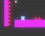
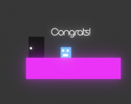
Glowscale's core mechanic is changing the scale of objects around each level to create paths and avoid obstacles.
Development Time
96 hours
(Optional) Please credit all assets you've used
See description for full credits
Leave a comment
Log in with itch.io to leave a comment.


Comments
Great game and great concept! felt little zoomed in throughout the game
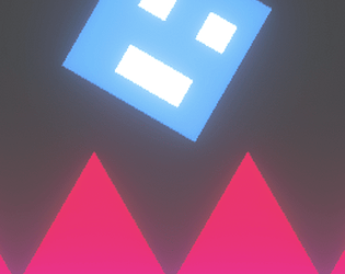
Great game ! However the art is too shiny and doesn't look too good to the eye. But u did a good job, keep up the good work :)
I liked the glowing objects. However, the game lacks polish. I would appreciate the camera being more zoomed out. Another thing would be to undo the expansion of an object by clicking on it again.
Amazing job, especially considering this is your first Jam. You should be proud of yourself for having an idea and seeing it out to completion! The aesthetic is very chill and I like the colors. I agree with others that it would be helpful to see more of the map in the screen so you can plan where to go next.
Enjoyable game and great execution on the theme!
What I would love:
- death animation (preferably with lots of blood that sticks on the obstacles)
- moving the camera slightly in the direction im facing so that i can see a bit further
- a button that "clicks" on the next box (though that changes the puzzle mechanics quite a bit)
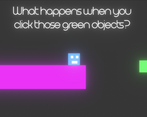
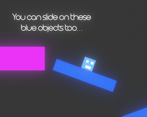
Ah and great job with the onscreen instructions and arrows, really liked those!
Great game!
Instead of transforming the position, use Lerp to avoid those quick position changes.
Overal fits the theme just right.
Fun game. The mechanics feel good and stayed interesting throughout the game.
Would love to be able to see more of the screen, and have the music continue between deaths. That said, the arrows did help a lot to avoid most of the offscreen issues.
This concept has potentia! I like the idea of using the mouse to interact with the environment alongside platforming with your keyboard. However, the level design needs a little work. Levels often had essential information hidden offscreen, so I wouldn't know where to jump next. Quite often, I had to die to unforeseen circumstances and restart a level to progress.
Definitely fun, Neon aesthetic fits the game well, I think the main thing needed is a few ease of life improvements, like jump holding and coyote time (where inputs are saved and where there is a brief frame after you leave platforms where you can jump most commonly used in Celeste). Other than 1 critique this game is AWESOME!!! Looks like I have a pretty tricky rival to beat.
Beat It! Cool main mechanic. The sliding was a blast, I wish there was more of it! I think the game could use some more player feedback in the form of particle effects or something.
Great level design! The art looks pretty good as well.
Nice concept!
Cool idea, the neon aesthetic fits well