Play game
Union's itch.io pageResults
| Criteria | Rank | Score* | Raw Score |
| Graphics | #72 | 3.354 | 3.750 |
| Audio | #88 | 2.683 | 3.000 |
| Fun | #129 | 2.385 | 2.667 |
| Accessibility | #131 | 2.012 | 2.250 |
| Overall | #132 | 2.428 | 2.714 |
| Theme | #143 | 2.311 | 2.583 |
| Originality | #149 | 2.460 | 2.750 |
| Controls | #163 | 1.789 | 2.000 |
Ranked from 12 ratings. Score is adjusted from raw score by the median number of ratings per game in the jam.
Godot Version
Godot 4.0 beta 13
Wildcards Used
Four colors and "Wait, what?"
Game Description
Is a plataform game about collecting, it has 2 difficulty modes
How does your game tie into the theme?
The game is about collecting to assemble the door, while the player is assembled themselves by uprading their skills
Source(s)
N/A
Discord Username(s)
C'k ☯#1066
Participation Level (GWJ Only)
0
My game has an export for Linux, Windows, & Mac and/or is playable through HTML5
Leave a comment
Log in with itch.io to leave a comment.


Comments
I liked the game and the music but i think you should make the game easier
Nice music and colour palette! I’m always amazed by 3D games and commend you for trying that for your first GWJ submission! I found the game a little difficult but that is probably because I do not play FPS games too often.
That was probably the most merciless game I played in a jam!
I didn't realize the original was the hard mode while playing, and then forgot a difficulty select existed at all!
I did beat it though! :)
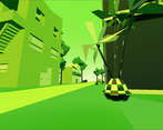
Loved the colors, the models, the music was simple but it really set the mood.
Once I got the hang of it it was pretty fun! and overcoming the challenges felt satisfying.
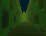
Also I really liked the corridor at the end! Felt mysterious and atmospheric.
I love the style and colors.
Models are cool.
But game itself is too hard, can't imagine the hard mode :)
Maybe because the main character tries to slide and moving like a flash.
Also the music should be probably not 2d, but centered.
Well done!
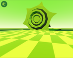
Liked a lot the world with the green palette! I just feel like it's too hard on the original difficulty for the wrong reasons. Platforming in first person is already kinda hard as it is but since the spinning platforms have no friction to them, it makes it so you can only land on the exact center of them.
If you gave the platforms friction and made it a little easier to tell where you're going to land, this can be a fantastic little game!
Fantastic aesthetics! Your use of sound is great and the environment is well laid out! I'd agree with bored_paramecium in that a shadow or something to aid in knowing where you'll land would be a great help. I felt like the jumping was awesome with the power up item however it's very floaty and therefore makes the parkour feel a bit slow, it'd be awesome if the jump felt a bit more responsive is all! Great job! :D
The aesthetics are really nice and even remember a little of Ico.
The game is really hard… Spent a lot of time in the challenge to get the double jump. I think that some QOL changes can be made to make the first person platformer a little bit easier, like a shadow below the character to better show where the character is going to land without looking down all the time. I also think that some different type of world floor or skybox could be used to make it easier to orient yourself in mid air.
It was a nice world to walk around, the lego piece is a nice touch :).