Play game
Submarine Game's itch.io pageResults
| Criteria | Rank | Score* | Raw Score |
| Graphics | #115 | 2.694 | 3.300 |
| Controls | #122 | 2.531 | 3.100 |
| Accessibility | #125 | 2.041 | 2.500 |
| Audio | #126 | 2.123 | 2.600 |
| Overall | #157 | 2.100 | 2.571 |
| Fun | #161 | 1.796 | 2.200 |
| Originality | #162 | 2.123 | 2.600 |
| Theme | #172 | 1.388 | 1.700 |
Ranked from 10 ratings. Score is adjusted from raw score by the median number of ratings per game in the jam.
Godot Version
3.5.1
Wildcards Used
Four Colors
Game Description
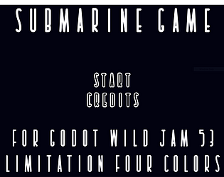
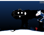
An underwater side scroller where you try to avoid obstacles and enemies
How does your game tie into the theme?
The player's submarine is a small and delicate vessel that falls apart on any contact with an obstacle. The light that's attached to the submarine is precariously attached to the ship.
Source(s)
N/A
Discord Username(s)
Even#4469, farmdogs#8178, kraken#7240, thunderbird 007#2959
Participation Level (GWJ Only)
0
My game has an export for Linux, Windows, & Mac and/or is playable through HTML5
Leave a comment
Log in with itch.io to leave a comment.


Comments
REALLY short game, but it's nice for a jam game!
Simple little prototype! The concepts are clever and I'd love to see longer levels with moving creatures! Decent entry, good job team!
Nice entry! I really enjoyed the concept of vision and trying to maintain it to keep going through the level. Was a nice touch. Keep up the good work!
Impressive work with the color limit, that's some beautiful art. Gameplay's short but fun and easy to control.
What font did you people use? Seems familiar and odd.
Yes, totally agree!
The atmosphere is cool! The music is really fit there.
As it being said before you can use parallax layer for infinity run and randomly place all those creatures. This way you can play the game continuously. The further you go the narrow is path for the submarine.
Well done!
Nice game! The art and music is really well done and the game is very easy to understand. Like another user has mentioned, would be great to have longer levels and random placement of the hazards. I too would have liked the light mechanic to matter more but nice job with the light implementation in general though! If the light did not illuminate the whole screen it would provide a much spookier feel.
I really like the atmosphere created by the art, but I wish there was more to it than a 20 second long level. Also, I feel like the light bulb mechanic could have been better - after you get the first bulb, you don't really have to worry about light anymore.