Play game
21st Century Farming Simulator's itch.io pageResults
| Criteria | Rank | Score* | Raw Score |
| Fun | #2 | 4.267 | 4.267 |
| Overall | #3 | 3.810 | 3.810 |
| Graphics | #7 | 4.333 | 4.333 |
| Controls | #8 | 3.667 | 3.667 |
| Accessibility | #12 | 3.333 | 3.333 |
| Originality | #18 | 3.733 | 3.733 |
| Audio | #19 | 3.400 | 3.400 |
| Theme | #29 | 3.933 | 3.933 |
Ranked from 15 ratings. Score is adjusted from raw score by the median number of ratings per game in the jam.
Godot Version
3.6
Wildcards Used
N/A
Game Description
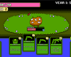
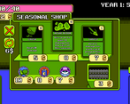
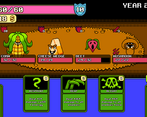
A fairly simple roguelike deckbuilder
How does your game tie into the theme?
The player harvests crops using their deck of cards
Source(s)
N/A
Discord Username(s)
N/A
Participation Level (GWJ Only)
8 or 9
Leave a comment
Log in with itch.io to leave a comment.


Comments
I love this game! The gameplay is very soft and polished. I've got some bugs but, in other part, is a very great game with a lot of potential! c:
Thanks for playing! I appreciate it
This has definitely been one of the most enjoyable games from the jam. It's so well polished and has a lot that can be built off of. The only gripe I have is the font. I'm not sure if it's because I'm playing on a smaller laptop screen but some of the more wordy cards are very heard to read.
Thanks for playing! I'm glad you liked it. Yeah I think going forward I'm going to use vector fonts rather than bitmap ones for games like this with a lot of text. To your point, they can get pretty chunky and distorted at different resolutions. Probably just worthwhile to use a font that scales more cleanly for readability, even if it doesn't entirely fit with the aesthetic I'm going for lol.
Good but has a couple of bugs in it.
Great game really needs a full version and bug fixes easy 4.5 out of 5
This is a really fun game! Good work. The only thing I would have liked to be different was how using cards worked. It would have been nice if I could have just double clicked cards that targeted all enemies or my self to use them. Additionally, double clicking cards with one target when there was only one target remaining.
Other than that small preference gripe, this is a great game!
Amazing you built this over the course of a 10-day Jam. Wild.
Thanks a lot! I appreciate the feedback, those are both good suggestions. Little quality of life changes like that definitely go a long way, but they're always things you don't see until other people point them out!
Thanks again for the kind words, I'm glad you enjoyed the game!
Yeah, that's how I felt when I was making my game. I luckily had someone playtest my nearly complete version about 6 hours before submission which got me to find a lot of little things, but I didn't have time to incorporate some of their feedback on QoL and balancing which was disappointing (for me).
There's always going to be more you could have done! I try to at least make sure I keep some of the specific feedback on that sort of stuff in mind for the next project I work on.
What a surprising game, especially for Jam, all the window sliding, backgrounds, and gameplay are all surprising.
Thank you for playing! I appreciate it.
I LOVE LOVE LOVE this game. The music is fun and playful, the animations and graphics are smooth and cozy. The gameplay feels fluid and the versatility of the enemies is nice. The one thing I REALLY love about this game is the way you've made everything scale with the viewport. When I was making my first game, I was struggling with bad quality at higher resolutions.
Thanks a lot, I really appreciate the kind words! Outside of changing the viewport scaling settings, I've found that letting all the control nodes place/size themselves (with anchors, nodes like VBoxContainers, MarginContainers, Separators, etc) rather than trying to place them manually has really helped me a lot. It can definitely be a little tedious to get everything set up how you want, but once you do: everything orients itself properly at whatever resolution you want.
I still think there's some issues I have with font scaling, I still don't know if I fully understand how Godot handles fonts/text. Certain card text will overrun the card bounds only at certain resolutions and can look kind of fucked lol. Regardless though, thank you for playing! I'm glad you enjoyed it.
Yeah I've been using the Control nodes (BoxContainers, MarginContainers, etc.) a lot in my games, makes the ui scale nicely with the viewport
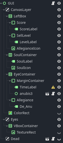
Nice! Yeah there's definitely a steep learning curve (at least for me lol), but Godot's control nodes are definitely powerful.
Really cool game! I’m a big fan of these kinds of Slay the Spire esc games. Though I think the difficulty needs to be raised a bit.
Thanks for playing! Yeah I always have trouble balancing games for jams, since I'm always focused on just getting as much stuff implemented as I can lol. I usually end up airing on making the game easier rather than harder (so that more people see more of the content), but sometimes go too far in that direction I think.
Out of curiosity, how far did you get before stopping? I'm interested where that realization of "this game isn't getting harder than this" is.