Play game
The Crown's Shadow (Game Jam)'s itch.io pageResults
| Criteria | Rank | Score* | Raw Score |
| Overall | #1 | 3.222 | 3.222 |
| Audio | #2 | 3.556 | 3.556 |
| Graphics | #2 | 4.111 | 4.111 |
| Thematic Relevance | #3 | 4.000 | 4.000 |
| Gameplay | #5 | 2.444 | 2.444 |
| Historical Accuracy | #5 | 3.556 | 3.556 |
Ranked from 9 ratings. Score is adjusted from raw score by the median number of ratings per game in the jam.
Leave a comment
Log in with itch.io to leave a comment.


Comments
Presents tons of potential as a point and click adventure as a spy.
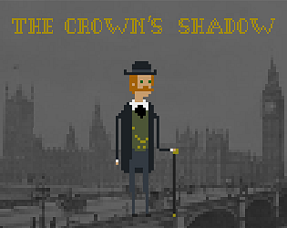
A great attempt for a first stab at pixel art. The character designs were consistent, and I especially liked the character setting for the “Crown’s Shadow’. I could see this easily be the setting and background for a Kingsman movie. I enjoyed thinking about how the narrative could branch based on the different choices available in each interaction.
A few points of feedback:
Thanks for participating in HAGJ9!
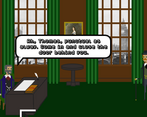
Thank you, Tuile, for playing and providing feedback. I really enjoyed the experience of creating pixel art and plan to develop this idea further. Many elements, such as the door, were placeholders, but I will definitely work on improving the vanishing point in the future.
Cool art and there was a lot of character in the writing. It's a shame that you couldn't finish the first mission, but the conversation at the end was funny none the less. As other people have mentioned a full screen would have been nice. Good entry.
Thank you for playing and leaving a comment.
The arrow is huge! But I loved what was there. I wish you had been able to do more. As such, I had to give gameplay a low star rating, but I'm sure if things had progressed more I would give it five stars
Thank you for playing and leaving a comment, yes it is huge, I didn't get around to shrinking it down to a more normal size. I totally understand, I wanted more game play as well, but due to time constraints I wasn't able to get everything in. I hope to continue working on this game in the future.
Very charming with quality writing as always. Would love if you decide to finish the game. I really love the vibe and left me wandering how to story goes further...
Thank you Petra, I hope to work on this idea some more after I have finished First Christmas. How is your entry going?
Very nice proof of concept! Although the abrupt ending was confusing, I really loved the way you handled the ending.
Thank you for playing and leaving a comment. The ending was a very last minute idea and I'm pleased with how it turned out.
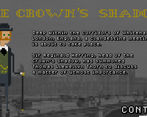
Super cute graphics! I liked the sound too. You should add a fullscreen button. For a point and click adventure there was little to click on. I clicked randomly on some answers, then I was able to advance. The text was a little bit hard to read. I would appreciate another type of font and more space.
Thank you for playing and the feedback. In the end I was rushing, so I had to decide between only full screen or 2 different resolutions, I went with the later, due to streamers preferring windowed games in my experience. Again due to time limits not as much to click on as I would have hoped, I wanted an inventory system and lots of items as well as lots of things to look at and interactive with. In the meeting in the office, you are completely free to choose any response you feel like, you will still get the information you need and advance to the next scene, it's just a play-through style choice. I totally agree pixel art fonts are not easy reading and I will definitely look to address this.
What a lovely surprise to see this submission! I loved it
Thank you Javier, It was hard having to do everything, especially trying to the right music :P The menu music I really like, I feel it's the vibe I wanted, but the in game wasn't really right, but I had to put something.
Nice idea, we really liked the different answer styles and the ending. :)
Thank you for playing and the lovely comment. :)