Play game
Cyborguard's itch.io pageResults
| Criteria | Rank | Score* | Raw Score |
| Overall | #12 | 3.333 | 3.333 |
| Visuals(Graphics) | #13 | 3.333 | 3.333 |
| Sound/Audio | #14 | 3.000 | 3.000 |
| Fun | #14 | 3.000 | 3.000 |
| User Interface (UI/UX) | #22 | 2.000 | 2.000 |
Ranked from 3 ratings. Score is adjusted from raw score by the median number of ratings per game in the jam.
DevLog Link
https://raptorspank.itch.io/cyborguard/devlog/744946/cyborguard-11
Developer Feedback Questions
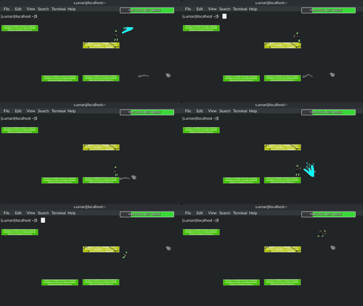
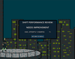
The art and music is still a bit rough, but the main thing we want feedback on is the core gameplay loop and how it feels. Also there is a new tutorial level so feedback on how well it explains mechanics and introduces them would be greatly appreciated as well.
Leave a comment
Log in with itch.io to leave a comment.


Comments
The text was so tiny in the tutorial it hurt my eyes xd. I like the floaty gameplay and the aesthetics, but the dynamic attack didn't work like I thought it would, I might have misread something, but I thought the dynamic attack would always go in the direction of my cursor which they would not always do so in certain angles. Also, the game is a bit too simple, and not fast pace enough for an arcade game.
Thanks for playing! Definitely going to take a look at the dynamic combat and changing it up a bit. It does off the direction you move the mouse/right stick in rather than cursor location, but cursor location would probably work better.
overall this is a cool game with a unique concept/theme!
here're some of my thoughts
TUTORIAL
- very helpful and good! a lot of this may seem basic, but it really opens your game to a wider audience.
- the tutorial should explain that there's no floor in the game itself and falling will result in a game over. possibly removing the floor at some point would be helpful.
- the tutorial should provide a basic enemy for you to fight.
PLATFORMING
the jump feels a bit odd and floaty. i can cover really huge distances in a way that makes some of the platforms feel meaningless. this also makes the character hard to control since their movement is hard to predict.
COMBAT
- too many buttons/options in my opinion. especially adding in the stuff with the mouse.
- if you want to keep the combat options as varied, i think left hand movement, right hand combat could work, with attacks mapping to arrow keys or something like that.
- a lot of enemies just float across the screen and there's seemingly no point in killing them? this feels a bit odd.
Thanks for playing and the detailed feedback! I definitely wanted to add an enemy part to the tutorial but ended up not having enough time. Great point on actually showing off the no-floor aspect, I'll make sure to implement something into the tutorial that goes over that. I really like the idea about using arrow keys for the attacks, that probably is a much better default control scheme for the game. The mouse combat was designed to add alternate ways to play based on some previous feedback but I hadn't really figured out exactly how I wanted to do it. I appreciate the feedback on the jumping too, there's a lot going on with how the jumps work so it might be throwing you too far to start or it might be a bit too floaty at the peak. I'll have to play around with those stats a bit more.
Killing enemies contributes to your overall score so letting them pass does effectively decrease your score by slowing down the rate at which you get kills, but I'll admit this is more of a temporary solution. For a full game, it likely will be more level-based and the amount of enemies you destroy will increase a currency you get for upgrades and letting them pass will probably decrease that amount. But since the whole upgrade system is just notes on paper right now, the current version of the game doesn't really punish you too hard for letting enemies pass.
these ideas/changes seem really great! i think adding them in would really improve the solid foundation you've built so far
excited to see future updates :)
I like the music and art style. The gameplay itself is a bit basic though. If there are more enemies that get stronger over time (for example, a boss spawns every once in a while), and also the player had some upgrades (extra lives, create platforms, etc.) it would be better. For example, the enemies can drop coins that you can collect to buy upgrades.
Thanks for playing! I'm glad the art style and music fit well together. Definitely the gameplay is a bit more barebones because we've been working on building out the foundation for the game. Ideally we want to have changeable attacks/abilities so you can customize your playstyle a bit more as well as adding more types of enemies to make it more challenging. One idea is to include an enemy that does make the game more like a traditional platform fighter, which would probably fit like a boss like you mentioned.
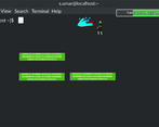
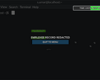
Hi, great game! I thought the terminal menu screen was very creative, and maybe leaning into that more (ex. turning the buttons into clickable terminal commands) would make the game even more immersive.
The tutorial level helped me learn the game, but it seems kind of unnecessary to have it as its own level. It might be best to have it at the beginning of whatever is the first level you play.
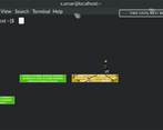
As for the core gameplay loop, I love the idea of protecting the platforms you stand on! Maybe to add depth there could be platforms with different functions so the player has to prioritize which ones to save first.
(Also, you probably are aware, but there is a bug where the actual button is above where the button graphic should be).
If you could rate my submission too, that would be great!
Thanks for playing and the detailed feedback! I love the idea of turning the buttons into clickable terminal commands. I'll have to take a look on how to implement that while still having it be obvious that they are buttons. I'm sure it can be done and you are 100% right that it would lean into the feel a lot more.
I wasn't aware of the button bug, it might have something to do with the mouse cursor too. I'll have to take a look at that and work on fixing the button's hit box. I definitely understand the tutorial being a separate level, I did it the way I did because my plans were to eventually have a sort of hub level where you could enter levels, and I figured the tutorial would be an option in that hub. It probably would make a lot of sense to have the option presented when the player goes to start a level for the first time though.
Different types of platforms is definitely something on our roadmap, such as temporary platforms or moving ones.