Play game
The Aftermath: Unnatural Selection's itch.io pageResults
| Criteria | Rank | Score* | Raw Score |
| Graphics | #79 | 2.517 | 3.167 |
| Audio | #88 | 1.589 | 2.000 |
| Jam Theme | #99 | 1.987 | 2.500 |
| Overall | #101 | 1.801 | 2.267 |
| Crafting Mechanics | #102 | 1.589 | 2.000 |
| Gameplay (Fun Factor) | #109 | 1.325 | 1.667 |
Ranked from 6 ratings. Score is adjusted from raw score by the median number of ratings per game in the jam.
Which theme was used for the game, and in what way?
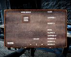
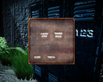
Aliens! The game is set on earth after an alien invasion and is inspired by games such as Fallout. I have been wanting to make this for a while and the themes seemed to be the perfect fit
Leave a comment
Log in with itch.io to leave a comment.


Comments
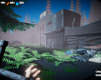
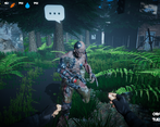
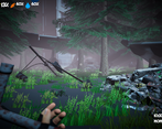
Once I saw the screenshots, I knew I had to play this game. Sadly, once I started it up it was running so slow at 3 fps. I managed to remember a trick about the game's camera and rendering and managed to get it up to 17-20fps. The bad part is the trick is to look down, as it means things are not rendering. I'd advise that if you continue work on this, fix the rendering system because I'd love to play this as long as it doesn't burn out my laptop (XP). Good job!
Cool concept, would love to see it finished!
Just booting up the game made me think the scope was too big, hahaha. I had some sort of bug happen with the interface after I added anti-aliasing and increased the shadow quality. Everything became much larger and was aligned oddly. Reverting the settings didn't help and restarting the game didn't help, but I was able to play through it. Scrolling with the mouse, either in options or the inventory, required the mouse to be directly over an element (say text, or a button) in order for the scroll to work, placing it in a blank spot (but still within the area that scrolls) wouldn't let me scroll, which was a little annoying.
The concept was ok, but seriously, the scope of this game was wild to behold and was much bigger than it should've been for the 10 day jam. I have no idea how unity works, but it felt a little asset-flippy. Also what was the point of Bob and John (was that their names?). They seemed to do nothing at all.
Overall, nice attempt, but needed lower scope and more work on building interesting elements for the player to play around, rather than just a large world.
Thanks for playing the game and reviewing. I think everything you've mentioned is fair and I agree the scope was way too big (I did get a little carried away during the level design phase). As for the "Asset flip" feel to it , I can see how it would feel like that. The game is made using free assets acquired from the Unity asset store, CGTrader and Sketchfab, this is because of the obvious time constraints and the fact that I worked on this alone and my skills lay more in the programming and level design aspect (basically my modelling & animating skills are non-existent/trash lol). The Interface/ui bug sounds like it could be an easy fix (hopefully) I will try replicate it, even though I will be discarding most of this project after the jam to start fresh it could be a good learning experience to know what to avoid in the future with the configuration of the game. the other npcs (bob and john I think?) they were originally going to be enemies but the AI was buggy af and I couldn't get the combat system smooth enough for release so instead turned them into friendly idle AI for the sake of having more than one npc in the game. Upon talking to either of them they should give you a blueprint for crafting but other than that they serve no purpose (in this build at-least) I think I found the scrolling issue you mentioned and I may have found a solution for that but that again will be more for a learning perspective for me rather than implementing a fix into this build.
Thanks for your review/rating, if you're interested in following the further development of this concept/project then please join the discord (linked on the store page for the game) down the track I'll be reaching out for people to contribute once I figure out the best way to go about that and have got a solid plan/road map in place
No problemo. I totally understand the inability to make models and thus using some free assets. I don't think this would've been a problem if the scope wasn't so big. I think it's the combination of free assets PLUS the unfinished empty nature that gave it that asset flip vibe. I didn't mean anything particularly negative about it, just an observation as a player.
But I'm glad to see you're continuing work on the project =)
That's all-good, I definitely see how it has that asset-flippy vibe to it. I know for next time to keep my level design/scope realistic to the time-frame haha. Overall was a good learning experience and I got to test out a few ideas I had for this project and test out ways to implement them
This was very interesting, but I had some issues with the performance! Maybe allowing an option to disable post-processing effects might help! I see there was a lot of ambition here, I think with more time it could have been something truly great! Otherwise, excellent work!
Feel free to come check out our project, Zixels 2!
Hi, Thanks for the feedback.
I have a few questions in regards to thew performance issues.
Did you try adjusting the graphics settings? I tried to make them as customizable as possible (without spending too much time on them) if you tried that are you able to tell me or screen shot those settings and what your machine specs are?
all of these will help me improve the games performance and overall experience in future iterations.
Thank you, I will check out your game tonight when I finish work :)
I enjoyed the concept surrounding this game. Much like with a few of the jam games, I'd love to see what could happen with this project with a bit more time :) Played and rated, nice work Anton!
I enjoyed the idea of the game. I liked the big map and being able to explore the area. But the game seemed to be lacking a sense of direction. For example, after I left the first area, I couldn't find a crafting table or additional things to craft besides the first aid kit. Nevertheless, I'm interested to see how the game might evolve after the jam is over.
Hi, Thanks for the feedback. In hindsight I feel i spent too much time on the Map/Environment as well as building some other systems that didn't make it into this build of the game, it definitely turned into a case of "biting off more than I could chew" there are other blue prints available in the game they should spawn in lockers and crates but they're a "rare" item so maybe I could up there spawn count in future to make them more accessible
INFO:
Controls: Movement - WSAD, Open/Close Inventory - Tab/i, Pause - Esc, Equip/Unequip Wepon - F, Action - E
I had so many big plans for this game for the Jam, but time-constraints meant that I had to sacrifice a few things. Nevertheless I am happy with it's current state. If you like the concept of this game, I will be developing the concept further. Stay up to date on the progress on Discord Here: https://discord.gg/7rxMbUT