Play game
Multivac. Inc.'s itch.io pageResults
| Criteria | Rank | Score* | Raw Score |
| Art Style | #13 | 3.950 | 3.950 |
| Gameplay | #14 | 3.350 | 3.350 |
| Audio | #14 | 3.250 | 3.250 |
| Creativity | #16 | 3.750 | 3.750 |
| Overall | #16 | 3.300 | 3.300 |
| Fits the Theme | #44 | 2.200 | 2.200 |
Ranked from 20 ratings. Score is adjusted from raw score by the median number of ratings per game in the jam.
Leave a comment
Log in with itch.io to leave a comment.


Comments
Very neat puzzle game! I think it would benefit a lot with a bit more simplification of mechanics, as figuring out how to modify simulations alone was a bit of a learning curve, and then having new types of cells appear with not much explanation made it kind of hard to grasp at times. It definitely made me think hard about how to pass certain levels, but ultimately I'm kind of a pea brain and had to tap out once things started getting more and more hectic.
thanks a lot for the feedback. I agree that introducing neww cells may need a tutorial each time. I was short on time it was quite hard to finish that in a week where i also work. But i agree with you it miss some accessibility in the puzzle follow.
Great puzzle game! Love the buttons. My only feedback is the other part of the UI: It was hard to find which pawn i was selecting(maybe you could also select from the board) and that I was constantly trying to put the pawn before the action, this one may only be me though. I think its because in spanish (and english too, I think) you usually say the subject before the action ("Mable turned right") so while I was thinking the puzzles the solutions came out of my head in that format.
That nitpick aside I had a fun time with your game!
Thanks a lot for your feedback. Yhea i was not good in the tutorial for the order of actions. I was not able to drag from the screen for various technical reason (1 is the drag and drop is only UI in unreal engine, 2 the 3D world is ofset a lot and film by a camera projected onto the screen with a material so there is too much math calculation involve for the timeframe of the gamejam). But i understand the issue you got i need to make it more explainatory. Thanks a lot for the valuable feedback.
Ho and for witch cell is selected when you put four mouse on tthe icon of a cell it's highlighted with a lignt into the 3D world but it's not explained so it's my fault.
Yeah I get you, it's hard to make a game in 7 days!
I saw the highlight, but if there were 2 or more of the same time I had to use trial and error to figure out which one the one I wanted
in the first place i wanted to add the name of the cell into it but i was not able to find an estethic way of doing it. And yhea you are right on this point it's a bit frustrating to find the good one. Thanks for the feedback it's realy constructive.
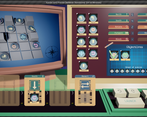
Interesting game ! The art was really nice, along with the cool music and sound effects. You can go far with such a game I think, in fact you can extend it to more squares, have new objects ! The button animations are really satisfying :D , and the info button (dictionnary) was well made, good job !
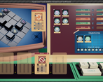
The tutorial was great, cool images, it sets up the context, but I didn't understand that you could attach the objects on the top right to the cards, and that you could launch the simulation again after one is finished. (I had to read the comments here lol)
Some stuff annoyed me a bit, such as the music restarting everytime you reset (I don't know which engine you are using, but on most of them It's quite easy to avoid this kind of stuff).
One last thing, be sure to have people playtest your game, in fact, you do not lock the UI while a simulation is running, thus leading to weird behaviors when clicking buttons and cards during that time. You should lock the UI and unlock it after each cycle.
Very good game good job !!
thanks a lot for your feedback. For music i used unreal and was not able to fix thhe issue with just a button push (and i try) but you are right for that. For the tutorial you are right two those are the two points i fail to explain correctly. And for the playtest it was done a bit and i found this issue but don't got time to change it and lock it correctly. I have to make a choice on the last day between making puzlles or keep improving the game as i don't get a puzlle 24 hours before delivering lol. By the way thanks a lot for your feedback. I completly agree with you.
really cool game i really like the concept, it might just be for me but the game worked kind of slowly. a thing i think you should improve is that th interface it is a bit chaotic its a bit to hard to understand because there is so much there but except that i like the audio and the art style goodjob.
Thanks a lot for the feedback.
It's a very pretty game. The art all looks great. Everything had a great amount of detail. The tutorial images were stylized in a cool way and were pretty good at showing visually what to do. The sound effects on everything fit very well and added a lot to the game. Pressing the buttons felt great because of the way they moved making them feel very real. The music resetting was a little annoying, but oh well.
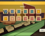
I was very confused on level 4 because I didn't realize you could just press launch again.
The level design was very good; each of the levels felt quite unique and interesting. The game is very complex so ideally, it would be nice to have more levels in between each of the levels you already have to teach players some of the mechanics a little bit better. But I know this is game jam game and making more levels takes a lot of time you don't have.
I think the only issues I really have with this game are only issues because of the limited time frame. Given more time, I think most of those issues would just naturally go away. I could nitpick every little thing, but at the end of the day, I think the good outweighs the bad. It's a great game and really impressive that it was made in a week.
Thanks a lot for your feedback. For the ability to press launch again you were not the only one that got confused and it's clearly my mistake. I would have need to add another tutorial on this with maybe a bit more story. And you are right i miss time to add more in between puzzles to help player get familiar with mechanics. I try to use all cells that i have created to at least let player see them at least one. But i start to make puzzles the day before the release and it's hard. For the music yhea i know but i don't know how to do things differently based on how i have made the game and the engine i don't got enough time to do more research.
And thanks a lot for enjoying buttons i realy like them too.
Nice Game! I love the music and UI. It gets me back to when we were learning on perphocards!
Nice Game! I love the music and UI. It gets me back to when we were learning on perphocards!
Glad that you like it and got the perphocard ref.
Thanks a lot for your feedback Yhea you are right in the first concept of the game there was meant to be human but i'm not skilled enough in blender to create 10 human characters with different styles and animations so i move to basic stupid pawn. I finally choose cells that look a bit more alive and a bit in the theme of the game but it's not perfect. I provide more cards than what i found usefull because i feel like if i give you only what is needed it tells too much about how to solve the problems. And i'm also open to solutions that i have not imagine myself. Maybe to help with that i could setup some goal stars by using a certain amount of cards only. But it need more playtest of each levels to be sure of that. By the way thanks a lot for the feedback i appreciate.
thanks i will think about it.
It's a really unique puzzle approach for a video game. Arguably, it doesn't benefit too much from the virtual medium and might be more enjoyable if it had tactile pieces. The instructions are also fairly unclear, though the game is simple. I had a good time playing through all but 2 levels and honestly wouldn't have minded doing some more puzzles.
Thanks a lot for the feedback. Yhea it could be a real gameboard. I think it's something that i like doing those kind of things in video game. For the numbers of puzzles yhea i miss of time. It's a bit hard to invente puzzles for those piece. But i planed to maybe add realy more puzzles for a comercial release.
Was super laggy on my toaster of a computer, so I didn't get very far. I think adding some sort of feedback when you mouse over would help dumb dumbs like me figure it out. Really cool concept and visuals though!
Thanks a lot for the feedback. Yhea i have forgotten this point you are completly right. Too bad for your toaster i'm sorry.
Overall great game. The music and the models were very nice and fit the theme very well. The only suggestion I would have is to help allow the player to reset some of the cards without having to reset the entire thing.
I have not well explain it in my tuto but you can swap cards, readd them with the trash bin to the overall library and you can add another icon on an existing card to swap the cell into it. or you can swap cards by another. It's coded but not explain my bad. By the way thanks a lot for the feedback i aprpeciate.
Really nice game! The puzzle design is generally interesting and fun (albeit a bit confusing at first). The artstyle really fits the game. It was a really cool idea, though I'm not too sure how it fits the theme. However, it was a still a great entry and fun game.
Thanks a lot for the feedback. I agree for the theme it's not obvious at all. It happen during my brainstorming. The purpose of Multivac. Inc. is to create a future new world and as "at the begining there is nothig" they must work on simulation to be ready to create a new world. I must admit it's kinda thinking in the oposite of the theme. That was my decision i would compeltly understand if i got a bad score on this part. By the way thanks a lot for your feedback realy appreciate.
I really liked the old school art, it is impressive you created all that in just one week and made it into a game as well! I really like these types of strategy games and I felt like this one had great depth! The only suggestion I would have for this game is to make the controls a bit easier, letting you drop the cells over the entire card and/or making the drop-area light up when you are able to drop the cell. Otherwise a really cool and impressive game. Great job!
Thanks a lot for the feedback. Yhea you are right for the droping part of the icon. Not sure if it will not cause drag and drop issue if i put the drop zone over all the card but put an highlight on the cell slot is a good idea. I have think of it during the dev and forgot (so much work in so litle time lol). To be honest i got only 1 puzzle on tuesday and i as i work the days it was a bit in rush.
I love games like this. I also love logic gates games and so this was a little treasure for me. The graphics turned out really well too and fit in with all the rest.
Thanks a lot for the feedback and the compliment. It was the first time i made the graphics of the game so i'm really happy on how it turn out.
So... kudos for the graphics! Well done
Cool game. At first I didnt understand what I have to do, but then I read the tutorial again and I finally understood how the game works :)
Good i got other comment about people got difficulty to understand what to do before reading tutorial. I was thinking that the tutorial can't be miss. Can you tell me why you miss it the first time ?
There were so many things on the screen like arrows and text and there were too many pages. At the first time it was very overwhelming and I thought how should I remember all this stuff but on the second time it wasn't actually that much and pretty easy to remember. I think its the first impression that makes it not so easy to understand. Maybe make smaller steps or make the tutorial interactive, without a instruction page.
In my games I try to avoid tutorials and make everything as intuitive as I can. Maybe try this approach too and see how it goes
honestly my games are always too complicated and not intuitive at all. That's why the tutorial. Maybe i must lower the number of step on one page. Interactive tuto is good solution but very much time consuming so for the game jam was not possible. Thanks for the feedback it's instructive.
Sorry I can't really say much because I stopped playing after a few levels because my frame rate was so bad. It took me ages to drag the cards and buttons and then trying different solutions with the very bad performance was just extremely unfun. But that isn't your fault. It's just that I don't have a good PC and Unreal games usually run very poorly on it. No worries I won't drag down the rating because I think the puzzle design from what I played was very good and it looks beautiful as a bonus. great game, just can't play a lot of it sorry
Thanks for the feedback. Maybe in the future i will try to add some settings to lower the ressources. Have you try to play it in windowed low res ?
no but I can try that later again
nope sorry its still way to slow for me
Maybe don't name your build Xander Jam if submit it to multiple jams xD. Interesting game tho.
Yhea you are right. I have prepare my git repo with the xanderjam in head and found that both theme mix well so i work on the brainstorm on both theme.
Tutorial, should mention that you have more than 5 moves/cards per puzzle. Because of this I got stuck on couple of levels. Definietly music shouldn't restart on puzzle restart. Very cool entry.
Yhea for the music i have not found how to do that but i agree with you. And yhea i have not think about the multiple rounds it was so obvious for me after a week lol. Thanks a lot for the feedback i will add this note in the future version.
The art style was old school puzzle game that I really liked! The music was great though having it exactly the same every level did start to get old. I really liked the idea and the game was very interesting and playable! Not entirely sure how it fits the theme I know there was some mention of evolution or something, but still not sure exactly. I enjoyed your entry!
Thanks for playing and enjoying. Yhea sounds is not my good point you are right i could have add one music per level. For fitting the theme it's in the first tutorial sentences. The multivac. Inc. prepare a new world. And we must not start from nothing as basically "at the begining ... there is nothing" we need to prepare the new world with some simulation. By the way i agree the theme could be seen as not fully respected. It was the output of my brainstroming.