Indie game storeFree gamesFun gamesHorror games
Game developmentAssetsComics
SalesBundles
Jobs
TagsGame Engines

Crusticus

38
Posts
1
Topics
4
Followers
2
Following
A member registered Jan 31, 2016 · View creator page →

Creator of

Recent community posts

(1 edit)

 Making the art style consistent was definitely a struggle and there were some things that feel off (like the dithering). it's funny that you mention having tufts of grass/flowers because that was what I originally was doing, but felt it didn't look quite as clean.

I definitely tried to keep gameplay as simple and easy to jump in as possible, so I'm glad that the game had that feeling for you. I DID try to emphasize the importance of micro management and multitasking, Even to the point where I kept  in the ability to  use the scythe while also watering plants instead of making them exclusive actions.

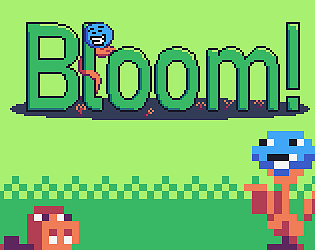
The blue bars under plants are their saturation meter, which increases their growth if it is filled, but will drop over time if they aren't being watered. Max saturation doesn't do anything significant other than to just let you know your plants have water. When their saturation bar is at 0, they slowly lose their orange bar over time(even if not being attacked), which is HP/growth. You can only harvest crops in the 3rd stage (the goofy blue headed plant dudes) and harvesting them gives you points and cash, which can be used to get a higher end score as well as buy upgrades, respectively. You can also get points and cash by killing worms alone, but doing both harvesting and killing is optimal, as you won't have enough money saved from just killing by the time the difficulty starts to ramp up. It kind of adds to the micromanagement as well as the risk-reward of "do I keep more plants alive for longevity or do I harvest them all in a risky move to earn more points?". At least, that's how I saw it.

There's a bit more to upgrades that I could be more transparent about, but couldn't find a good way to show what they did in-game and didn't want to clutter the itch page with all of what they do. Scythe is mainly damage increase and cooldown decrease, however plants and the watering can have multiple unique features. Some of them I couldn't get to work by the deadline though, unfortunately :( I actually wanted to make it so plants shoot projectiles at level 5 that increase in power and speed each level after that, but I couldn't implement it properly with my limited knowledge.

Thank you for all of the great feedback!

I think this concept could be turned into a really great learning tool for aspiring programmers if given more than a week. The fact that you got something working like this in such a short time is really awesome, too!

In the beginning, there were beans. I love the sense of humor and seeing your poor BeanDozer get retired was pretty silly. The gameplay was a bit slow and I felt the Dozer got stuck frequently. 

I think it'd be more entertaining if you have to keep up bean pushing production to avoid getting fired as opposed to the void just claiming everything right away after a certain point. As it stands though, this was a lighthearted, neat little project and I had fun messing with the physics and slamming into a big pile of beans.

(2 edits)

Love this goofy little alien. He has so much personality in his movement, idle, jumps, etc. and it's hard not to enjoy seeing him on his journey. Art style is simple and cute, and the random world generation is really neat to see in a 7 day jam.

The game would've benefitted from a game over screen or restarting from the last point as opposed to kicking us to the main screen. The first time it happened I was very confused. I didn't even know about the spikes hitting me until the second time around. Otherwise pretty solid!

Really gorgeous game aesthetically and tonally. Gameplay wasn't enthralling or exciting, but I found myself just wanting to hear more of what Ellie and Lori had to say than anything. Thank you for the experience.

I like the very simple design and gameplay! It never gets boring and is very easy to just start up a round. Nice job!

Turning feels stiff, and keeping track of yourself gets very hard with all of the asteroids. I think having the main character or the enemies being red, something that stands out over all of the green, would help a lot with tracking.

I like the concept of having to fight enemies for money to gain resources, and then use those resources to beat the level. However, it is very easy to cheese certain parts by jumping and then moving the platform under you. Perhaps making it so you can only place once, or you have to stay still/can't be jumping while building, would help with that.

Art is nice, I feel the victory sound is a bit too loud but overall a nicely done little game!

Nice.

This game has a lot of charm, I'll give it that! I liked the voice acting and top-down old school Zelda style that you ran with. Art style was cute, and I liked the little pig dudes with sunglasses. Finding out that spacebar was a run button was a life changer, as the map is a bit on the larger/too spaced out side.

I don't think I was ever in any danger at any point. Can the character take damage? Also, the voice clips need to be mixed a bit better, as the guide lady/witch(?)/whoever was a lot quieter than all of the other NPCs and I had to mess w/ my volume whenever certain NPCs would talk. Could also use an HP bar or indicator (again if the character can take damage) but otherwise really neat and goofy game for what it is!

I love the way the levels build themselves through completion, super creative and fun spin on the theme. Platforming could be a bit tighter imo; I think a bit higher gravity and less slippery movement would help a bit, and hit detection feels a bit unfair at times. Otherwise a solid game and I had a lot of fun with it!

Love seeing the way you handled the building concept as opposed to Blooey's Path, both games feel very unique with a similar idea. Some of those levels made me struggle (but mostly because I am stubborn and need to get the gem in each level lol).

I feel like the game loosely fits the theme and would've liked some sfx or music but I can understand getting that all together in a short time can be hard. I like how simple the mechanics are and how easy it is to get into each level, and I enjoy the ability to have certain spots effect how the block moves like the rotation spots. It felt rewarding learning that you can rotate blocks and then move them out of the rotation spot to keep them rotated afterwards, love that mechanic a lot. Nice job!

Super hectic and fun game. Things definitely snowball out of control at the end. I don't even know how but my radiation went from near 0 to maxed out right when Earth was on the verge of growing so I lost, but it was probably my fault lol. Big ups for making all of the planets be animals, I thought that was cute.

Getting elements into the creation bubbles was a bit annoying but it kinda added to the challenge so I'm on the fence about it. I think this game would benefit a bit from a difficulty slider/options and definitely a pause menu, since my hands were getting kinda tired doing it in one go and I could've used a break haha.

Great job!

Pretty cool game and it fits the theme very well! It's fun to see the monkeys progress and evolve, but the menu bug made it hard to progress much further than trees and houses, unfortunately. If it makes you feel better, my game has game-breaking bugs with it's menu too! I'm sorry I'm just glad I can relate to someone on this

(2 edits)

Going to parrot below comments here and say that it's very hard to tell what's going on and that's a bit detrimental to the overall experience. Other than the camera zoom-out, maybe make it clearer as to what house is coming next, as the indicator at the top of the screen is a tad hard to read visually, at least for one of the more detailed house pieces (the long rectangular one). Maybe having the houses be detailed 2d sprites (like in the thumbnail) could help with that. Something that could also help is having the floor lighten up on the platform to indicate where exactly the piece will fall.

This is a very interesting concept, almost like physics-based 3D Death Tetris, which is super neat. I'd love to see it fleshed out a bit more!

(1 edit)

It's insane to me just how polished and clean you guys managed to get this game in a week, to the point that it's inspiring to me as someone very new to the scene. That final level was terrifying and I definitely had to edit the level at least 10 times, but who's counting?

The animation is so smooth, stuff like the squash and stretch based on fall distance/gravity is super nice to see in action. Movement mostly feels crisp but maybe just a LITTLE too slippery for my personal taste. Level design is well-varied and not too much is introduced; it never feels overwhelming, which I think compliments the simplicity of the game's overall idea very well. Sound design is nice, but I feel like the visual quality outshines it a bit in comparison. That being said, I do like the music choice, and having it cut to that eerie track at the final level definitely got me a bit nervous for what was to come.

Altogether, Blooey's Path is a finely tuned game that clearly had a lot of love and hard work put into it. You guys really killed this one.

Pretty rad idea, a tad short but really like having abilities given to you each level (took me a second to realize you could shoot until I saw that window in the background saying I can lol). Would've loved to see more of this!

(1 edit)

The ending of the level with Walter's wife actually made me tear up a bit. This game hit really close to home with the feels. 

The art style was very nice although the level design itself felt rough and moving objects felt very unfair at times. Collisions were kind of janky, especially with trampolines. I can get over all of the jank (even if I wanted to pull my hair out at times) with the storytelling in this and putting a kind of "reversal" on the theme was absolutely genius. Definitely going to play the updated version when I can.

quick edit: not sure if this was fixed in the updated version but I think if the grapple mechanic wasn't done it shouldn't have been accessible at all - it is very easy to break the game and clip out of bounds since it is still there.

Very neat puzzle game! I think it would benefit a lot with a bit more simplification of mechanics, as figuring out how to modify simulations alone was a bit of a learning curve, and then having new types of cells appear with not much explanation made it kind of hard to grasp at times. It  definitely made me think hard about how to pass certain levels, but ultimately I'm kind of a pea brain and had to tap out once things started getting more and more hectic.

Cute game! Love the choice of music. It took me a bit to figure out what the goal was though. If I'd change anything, it'd be both a tutorial and maybe some form of goals/objectives to guide the player.

Played the original build but might have to go back to this one w/ the updated version since my big gripe (movement) was updated.

This game is pretty impressive for a 1 week jam. I enjoyed the little storyline and how open-ended things are with the father and how you should judge him in the shoes of Niko, as well as the gameplay itself being as open as it is with things to explore and different paths to tackle rooms.

I wish there was a way to view collectables on a home screen, not sure if there's anything more to them or not but I managed to snag a couple along the way.

Great job to everyone on the team!

Pretty interesting game, love the art style and it's super creative! Mouse detection is a bit funky and felt myself fighting with the controls a lot, and I feel the theme isn't there super well (which makes sense considering this was made for 3 separate jams), but otherwise a neat experience.

I wasn't sure how to make a standalone (new to GMS2) and the default is an installer. I will see if I can build a standalone and upload it (assuming that is allowed).

yeah it can get pretty hectic, glad you liked it!

Man I just read your edit and it literally has me in tears right now. To think that my 1 week project impacted you in such a positive way makes me so full of joy that I can't even put it into words. Thank you for making my night.

I definitely went hard on the old school aesthetic as much as possible -- maybe too much at points like for the upgrade system  -- but I wanted to just keep everything as simple as possible, yeah. I wasn't here to write a story for the jam or do anything too complex. I just wanted people to enjoy my game. And I'm so glad that you did and felt it necessary to expand on your comment. Seriously, thank you so much.

(1 edit)

Thank you! I'm glad you had fun with it!

Thanks for playing! The randomness/difficulty scale was kind of just an easy way for me to focus more on gameplay than level design as well as make it endless. I'm sure there's a better way to go about doing that, but I'm not quite at a level where I can make it more consistent but have that same feel yet. I'd definitely change that if I were to revisit the project.

Thank you! I'm glad you liked it! 

thanks for playing! Yeah might've went a bit much on difficulty haha.

ah that was my bad for not reading down haha. Hope everything is okay now! What you have is still pretty interesting and I'd love to see it fleshed out more if it's a game you plan on pursuing past the jam.

Thank you for the kind words! Balancing the game was honestly one of my weaker points (a lot of values were changed constantly throughout the week lol) and I might've went too hard on the beeg worm, but I did want it to be difficult to enforce that old school arcade-y feel.

Conceptually pretty cool, but in action it's definitely too short with no threat to success (in my experiences playing through twice). If you spam build houses and crosses the game can be over in about a minute or 2, and resources don't deplete upon creation of houses or crosses which I would assume was unintentional.

The art is nice, and the game fits well into the theme.

#protectmublins these little dudes are just doing their own thing and minding their business!

This is a neat little game with a simple concept, though I feel there should be a clear indicator on how to build. I think I pressed about every button, stood near the anvil and did the same thing, and couldn't really figure it out.

Really cute game! Unfortunately I also use a QWERTY keyboard which made it harder to enjoy/play though. I also think this game would benefit with a controls page (or maybe there was one and I missed it?)

Also as a heads up, the standalone does not launch due to missing files.

Love the art direction in the game! Also jumped on this game because of seeing your progress in the discord. My biggest (and really only) issue with the game are the controls, which feel awkward, but otherwise it's really neat!

I kinda tried to make it so you have to balance gardening with combat (you can also use the watering can while also swinging your sickle) but it can be kind of difficult to get used to.

I thought about making items level up with use or having some sort of notification of when you can upgrade something, but by the time I thought of that I didn't have enough time to implement it unfortunately.

I wasn't sure how to build a standalone .exe in GMS2 since the default is a build with the installer, so that'll be something I figure out soon. I probably should have looked into making a web build before the deadline too, but oh well.

Thank you for playing!

Decided to finally jump into indie game dev after obsessing over it forever. Luckily finding this concept very easy to work with and already got a good idea on what I want to do. Thank you to Kindred for running this and best of luck to everyone!