Play Adventure
Arms of the Undying's itch.io pageResults
| Criteria | Rank | Score* | Raw Score |
| Usability: Is the adventure easy to use on the fly? | #69 | 3.313 | 3.313 |
| Fun: Is the adventure fun to play in an OSR playstyle? | #70 | 3.500 | 3.500 |
| Overall | #76 | 3.354 | 3.354 |
| Writing: Is the adventure original and fun to read? | #90 | 3.250 | 3.250 |
Ranked from 16 ratings. Score is adjusted from raw score by the median number of ratings per game in the jam.
Leave a comment
Log in with itch.io to leave a comment.



Comments
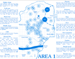
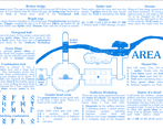
The layout of this is great. The blue really pops of the page. The areas are drawn very well and we love that it is a Hex Crawl!!!!
Is that repro blue I spy!? marvellously laid out and easy to read hex crawl, very spartan location details that make it easy to prep as a GM, Hemmingway would be in awe! Love the addition of Yigoomba too! takes a minute to adjust to the blue on white, but once that sweet sweet nostalgia kicks in it reminds me of adventures my 1e/2e friends run. Simply fabulous and striking!
Thank you very much! I was trying to get the vibes of early TSR or Judges Guild modules.
Yigoomba also Gladiolo, and dont miss the mecha-statue of Lorthumdir the Artificer!
Loved the layout, the choice of sticking to just blue and more than anything, packing so much in so little! Very evocative, your choice of type took me back to the early days of RPG design :) There’s something about how it’s all depicted that makes it feel it’d be incredibly easy to run.
Im really glad! Thank you for taking the time to go into the details.
Yes, there is a lot going on there. My goal was to avoid having to flip pages to run it.
Im currently running Moldvay BX so there is a lot of inspiration from there.
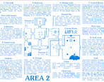
I love the layout, putting maps to every location on the same pages is a great idea. Was a little uneasy for me to read due to a color of the text
Thank you, Im really glad! You know Ben always talks about not having to flip through the pages. And sorry for the color, some like it but it really is harder to read, maybe a little darker would be better.
Nice! I like the idea of climbing ranks in a faction, remind me sandbox videogames like elder scrolls. I also like the blue!
Gracias! I feel leveling up by ranking in a faction is more immersive and sends PCs right into the Domain-level play that was implyed in OD&D and BX (i.e.: getting to build at stronghold at lv 9 and so forth).
This is a great piece that really does a great job at capturing that old-school esthetic and feel (love the blue ink).
Thank you very much!
(Those Xerox machines wont pirate my work! XD)
This has a very old-school vibe, right from the start through to the finish, which is great. I like the idea of investing in factions to gain experience.
I think monochrome was a great decision and I like the color and font you used.
I wasn't sure what the dots on the maps were meant to indicate.
Thank you! Im glad you like it.
About investing in a faction to level up, thats the way I run BX in my homebrew.
With dots I guess you mean the trees outside?
I think you're right about the trees, and also because most objects inside were represented by dots I just had a little trouble keeping track of what each was representing in each room. That's probably a failure on my part though.
my arms are certainly undying !