Play game
How Many Repairbots's itch.io pageResults
| Criteria | Rank | Score* | Raw Score |
| Graphics | #3 | 4.652 | 4.652 |
| Authenticity (Use of resolution restriction) | #13 | 4.826 | 4.826 |
| Gameplay | #23 | 3.826 | 3.826 |
| Overall | #37 | 3.804 | 3.804 |
| Audio | #127 | 1.913 | 1.913 |
Ranked from 23 ratings. Score is adjusted from raw score by the median number of ratings per game in the jam.
Leave a comment
Log in with itch.io to leave a comment.


Comments
Nice game. I included it in my LOWREZJAM compilation video series, if you’d like to take a look. :)
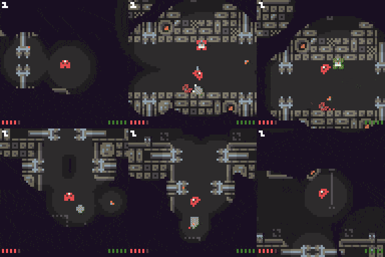
The environments and the lighting are really beautifully drawn! The floaty controls are fun - especially while drifting past projectiles and hazards - and cautiously sneaking around for lights to fix in amongst all that is a tense, but good, time.
Love the art style! Controls take a bit getting used to, but feel nice when you do. Too bad about the lack of audio, but other than that, really nice job!
Really enjoyed this - the art work and level design is fantastic, and controls feel very intuitive. Minor criticisms - it would have been nice to have a little more feedback after repairing something - show how it contributes to a larger purpose/goal. The closing door obstacles were a nice touch - i felt like I should also be penalized for running into walls at full speed, but didn't mind that it didn't hurt me :) Great work!
This is excellent. Graphics are just wonderful, and so glad you didn't turn it into a mindless shooter, that you're repairing stuff is really refreshing. I really recommend checking out https://www.bfxr.net/ and getting some low fi sfx in there - it'll really aid the atmosphere. This game is worth the effort!
Thanks! BFXR looks really neat, I'll give it a try.
This is a really cool idea! I like the emphasis on fixing things rather than breaking them, and the art is all very nice too!
Very cool game. Very polish, very good work. lot of good gameplay idea. good Job
Nice light effects and visuals.
I don't realy like the controls, the acceleration of the ship is a lot too hight.
I'm not that good with this control shem (forward + rotate), i prefer to use the 4 directions to directly move the ship where i want.
I absolutely love the visual style.. it's so good and I can't praise it enough.. The objective is cute too, I feel motivated to help repairbot succeed.
Since the robot only flies in 8 directions, I kind of wish I could tap left/right just once to adjust the direction.
This game is a great accomplishment, good work.
Thanks! I wanted to give NekoDanmaku 6 stars for graphics, so I very much appreciate the praise :)
I'll give the 8 angle tap-direction idea a try, though I worry that will make it harder to do fine controls. As an alternative, do you think adding more steps to the rotation animation would help?
Aw thanks Ross! (≧▽≦)/
I was hoping if one keypress turned you 45 degrees and you always moved in one of 8 precise directions, you could do stuff like double-tap to quickly apply a new velocity at 90 degrees, or triple-tap a direction to make a very hard turn. Possibly this would let you move around more responsively because you can always be certain of what velocities your inputs will result in. The main motivation for this was I had a lot of difficulty with navigating around the two electric gates where the first enemy appears the last time I played.
I put more time in and tried shooting with the repairbot this time, I see why you would want to preserve finer rotation. It might be sufficient to add a modifier key which allows you to rotate 2x as fast while it's held?
About the animation, I'd personally avoid adding more rotation sprites since pixel art suffers outside the 8 major rotations, even if it results in some ambiguity about the stored rotation ^^;
Great game, great graphics! It looks exactly as I would expect a 64 pixel game to look. It has that retro style. The mechanics are very original and the effects and detailing is spectacular! Some 8 bit audio would have round it up nicely. :S
This is a brilliant game! I like the controls and how intuitive everything works. The game won't need any more pixels. The sign language in the backgrounds is a really great idea.
absolutely loved the control and game style... reminded me a lot of a game called solar jetman on NES that i LOVED as a kid. I did leave it alone for a bit as i went and did something else and the java crashed so i lost my game :( but I don't think its anything you could do about it.. amazing job.
I assisted on a game for this jam. would love to hear your ideas on our game :)
WaterRush
fantastic, clean and charming pixel art! was a bit hard to control and understand at first. reminded a bit of insanely twisted shadow planet (a very good thing on my book)
I enjoy quite a lot wondering in the game world, although the controls felt a bit off...
Nice graphics!
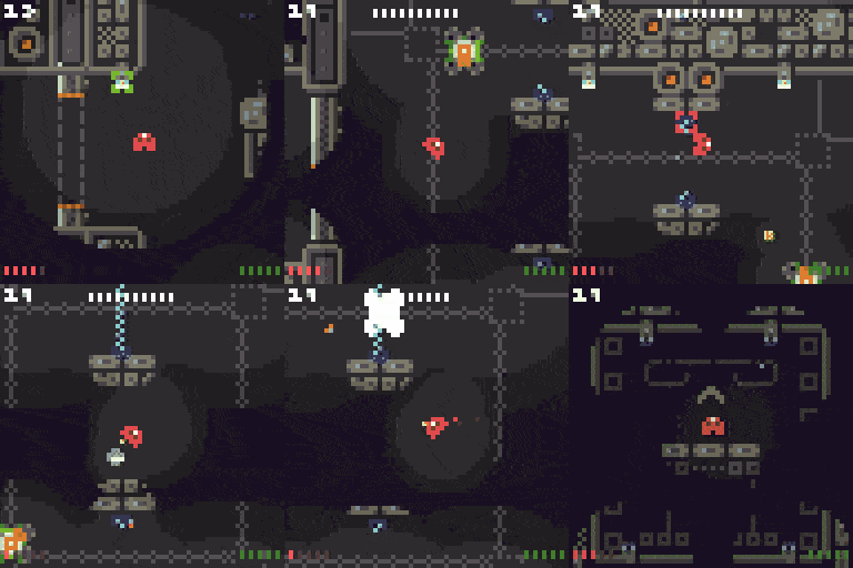
Favourite bits: The fact you've used graphical tutorials, I always love these. The way you've hinted at some 'older' parts of the facility. Like with the rocks(?) and the dead bots etc. The boss fight is a great addition!
Unfortunately it really needs some audio. Some basic BGM, some thruster sounds and a basic shooter sound really would have lifted this. Also, the working space being larger (1024x768?) and the game being at 64x64 is really offputting.
Otherwise I really enjoyed it and it's a fun little title.
Thanks for the feedback, Deexenigma! I glad the graphical tutorials made sense :D Totally agree on the sound - after playing some of the other (excellently audio'd) entries, I realise how much atmosphere even simple sounds add. Can you explain more about what you mean regarding the working space?
By 'working space' I'm vaguely defining the window size vs the actual used portion of it. On the itch.io page if you play in browser, this isn't an issue. However, if you download it with the ich.io app and run it, you get what looks like a 1024x768 window with the game itself being in the top left.
Ahhh interesting - I haven't used the Itch.io app. I've probably just messed something up in how I build the web version. Thanks for the heads up!