Indie game storeFree gamesFun gamesHorror games
Game developmentAssetsComics
SalesBundles
Jobs
TagsGame Engines

Deexenigma

40
Posts
1
Topics
4
Followers
3
Following
A member registered Jun 23, 2019 · View creator page →

Creator of

Recent community posts

Hi, thanks for giving it a play! There were a couple of issues with the inventory system that seemed to snag you. Unfortunately issues that showed my inexperience with the engine. That being said I have plans to fix it this year soonish.

Glad you enjoyed it!

By 'working space' I'm vaguely defining the window size vs the actual used portion of it. On the itch.io page if you play in browser, this isn't an issue. However, if you download it with the ich.io app and run it, you get what looks like a 1024x768 window with the game itself being in the top left.

Thanks for giving it a go and giving feedback all the same :)

This really shows promise to be much more than it currently is. It's unfortunate, as you say on the game page, that you didn't plan enough elements and implement them. Ironically the devlog is really well documented.

the art style itself is really well done. It's informative and clear and enemy status is really obvious when you get a hit. The controls are fluid, however, it really could do with an automatic switch from left to right if you want to fire on the opposite side instead of forcing the player to physically turn first.

Overall I'd be keen to see it developed much further on into a game with a storyline and more to do!

What I like about this specifically is that there's a reason off the bat to the lack of any graphics. My only concern, as others have, is there isn't any. I'm not sure it really fits the low rez jam theme but it's not in violation of it either.

The story itself is believeable, which is great. It gives me a very 'zombies run' vibe (for those that don't know its a running/jogging/cycling app with storyline based elements). You can definitely paint the picture of the events in your mind. The somewhat branching story paths are great too.

A critique would be that what exactly to press isn't exactly obvioius. For example early in the game run is forward, yet at the end of the game forward isn't enough? Also, there's not a lot of confidence in the timings. I understand you press the button at the sound, but is there a 'best' time to press it?

I loved the map layout in this. It definitely gives me the 'VVVVVV' vibe. I feel as though it  was inspired by it. The controls are tight, you don't feel cheated if you die, and it's well balanced. A definite must play for this category.

You're on a boat, and you fire at targets to speed up. It's simple and makes (no) sense. It's a basic mechanic but it works well and stands alone as a game in itself.

I'm unsure if without a bunch of targets you can actually win? I felt as though unless I was losing and therefore had a lot of targets given to me it wasn't a winnable race.

This is definitely an interesting take on the rock/paper/scissors game style which is enjoyable. The way the game works is fluid and I like the way the pentagram is used to make 'elements'. Albeit a little bit of a creative direction take on the use of the pentagram itself.

A little bit of criticism would be that it's a little predictable. I.e. it's rock/paper/scissors. Figure out the pattern, and whre there is none, try the one you think it right. Otherwise it's an enjoyable experience.

(1 edit)

The sounscape in this game is really important. It's a bit 'walking simulator'-ish but the treads in the snow and the envrionmental sounds really paint the picture.

Also, the suspense is great. Personally, I do find a certain aspect about the 'creatures' (for want of a better term) a little comedic in the grand scheme of things.

It's also a little short. I'd love more storyline and content. I'd definitely be interested to keep playing and see more!

EDIT: One interesting little bug(?) I found is if you go into the inventory and hammer the 'enter' button it'll slowly darken the screen. To get it back you need to press 'x' a few times.

Any chance you can elaborate on the bugs you found? I know the Inventory can be a little bit of an issue (as it's often picking up objects behind it). I'm trying to keep tabs to improve it in future.

Thanks for playing!

A very promising start to what could definitely be a larger game. Very Panzer-dragoon esque (at least to me). It definitely benefits from having different scenery to look at, i.e. buildings, a river etc. etc. 

As with others it seems to suffer from some performance issues. I'm not sure if that's a Unity rendering thing or possibly there's a memory leak there but it's obvious in a couple of points (at the river and before entering the main city area). 

I really liked the pace and play style of this. Being turn based with everything in front of you it really makes it approachable and something you might pull up every so often to have a bash at. Also, being that you can generate random room after room means there's a definite degree of replay-ability.

A little bit of feedback I'd like to give is in the UI. I found the palette to match the windows a little too similar between pink/purple. Also, with the info windows, a button at the bottom instead of just the X in the top right would be great!

It's really interesting to have two different styles of game in one. Like you can explore, crush buidlings (reminds me a LOT of Blast Corps on N64 btw) but then you can plant trees and go inside buildings. Definitely a cool little plaything.

It's short but exceptionally well done. I love the dash, given it's directional and fair when hitting enemies. The art stule really suits. I'd have loved to seen maybe another enemy or so, however, it made sense with what's there. Also the end goal is self explaintory, which is great.

Love to see somore more levels!

It's clean, handles well, the story is outlined distinctly. I really enjoyed it. I especially like the differences in tactics of the enemies. Also, the fact your health regenerates with each new level makes it easier to learn to play without dying. The art style works very well, you can tell what everything is immediately and houses etc. have the right amount of detailing.

I would have loved it if the tree hitboxes weren't so large though. It feels a little restrictive and I really was looking forward to walking into the forest to see what I could find.

Ah you're completely right. If I go into it, then out, then back in, it looks like some low-rez alien text... Yea thats... intentional ;)

I'm actually unsure. Something to fix in a further revision. It should render it the same each time.

Thanks for playing!

Your mention of the inventory is a real problem I fought for a long time. My suggestion is when selecting from the inventory make sure there's nothing behind it (I.e. a cupboard etc.) and select from the top half of the inventory 'box'.  I've had a lot of issues with object layering. So likely when you're selecting from the inventory it's getting confused which item you're actually clicking.

By reading the text I assume you mean the text on the items? I wans't really able to find a 'good' font for the size restriction. I completely agree that some items 'hovertext' isn't the best.

Favourite bits: The fact you've used graphical tutorials, I always love these. The way you've hinted at some 'older' parts of the facility. Like with the rocks(?) and the dead bots etc. The boss fight is a great addition!

Unfortunately it really needs some audio. Some basic BGM, some thruster sounds and a basic shooter sound really would have lifted this. Also, the working space being larger (1024x768?) and the game being at 64x64 is really offputting. 

Otherwise I really enjoyed it and it's a fun little title.

I really like the ability to scroll and buy new parts of the map. Also, the build menu etc. is very well layed out and well presented for the resolution. Text does make it a bit hard to understand things at times. Also resources are a little difficult to understand, including why certain buildings wont place. That's mostly a resolution thing though in terms of explanation.

Screw the orc empire, I'm going rouge!

Interesting thing is I can't seem to see any difference between setting the viewport or using the 'window_set_size()' function as you described. That being said I'm only doing 2D side scrolling with a sprite walk animation. I'm not doing any scaling etc.

I have however used the round() function on the pointer location. That was I get a pixel by pixel grid for the pointer which really adds a lot to the feel.

To be honest I haven't done any movement based work by using that method yet. I've been mocking up menus etc. with it.

I'll report back tomorrow when I start doing with the artwork and start building he project. I'll definitely keep your method in mind though if it seems to work better!

Unfortunately I don't. I jumped onto Gamemaker in GMS2 so I'm not familiar with the 1.4 build.

I know the camera works by 'viewing' a set area. The viewport itself in GMS2 is the window you actually see. So perhaps there's a way to program in a view of a set area and get that sent to the viewport? Sorry I can't be more help.

I'm on GMS2, however, the way I have it set up is as follows;

  • Room - 64 x 64 px
  • Camera 64 x 64 px
  • Viewport 512 x 512 px

This way your room is physically 64x64 px, the view of that room matches the size directly, then it's scaled up to 8 times the size.

Hopefully that helps.

Definitely give the physics for it a tweak. I've found, especially for implementing things that use large amounts of calculations, giving it a little-by-little approach usually works best. See how you go!

Thanks for giving it a play!

I agree about the gravity. I kind of toyed with making it a little more lenient. However, the code I'm using for the collision detection is all object based (hence the large file size relative to the game length). By allowing extra jump height or air time some of the levels became a bit buggy. It's all experience that I intend to eventually build on.

I'm glad you liked the branching routes and picked up on the pitfall idea. As I'd never done a platformer before I was focusing mostly on the gameplay elements and level design more so than the platforming mechanics.

(1 edit)

I'm here because of your post to the playtesting thread:

I really liked the happy / evil style of the game. One mechanic I really liked is the health mechanic in the first two stages. It's actually a bit of a welcome surprise.

I enjoy how there's a little story in there, the UI disintegrates when you're sucked of your happiness etc. It was a bit of an unexpected storyline. It reminds me of 'Little Red Riding Hood'. I suppose that's the flowers part talking.

As for your floatyness from what I could tell it seems as though there's a multiplier on the jump button or it's time based and increases exponentially. That and it feels like the gravity is far too low and the left / right directions aren't sensitive enough in a jump. I fell that's where your 'floatyness' comes from. Addtionally, the collision detection with walls for wall jumps feels very inaccurate. I felt as though I didn't have any confidence in timing when jumping from walls.

You can have a look at my game which is a platformer (my first also) to see how i've configured platform jumping (no wall jumping though, at least not off a flat wall). Admittadly it's not my code in the bare bones (credits are in the game) and I'm using GameMaker 2.0 so there may be some engine differences there. However, I'm familiar with code and have altered a lot of the barebones code I used for the platforming mechanics overall. Perhaps it might give you some kind of 'feel' to change up your code a bit?

Unfortunately not as I didn't have the time to keep playing about. I enjoyed it all the same.

I'd be interested to see what it becomes with some more features implemented etc. It would likely become a very interesting little mini-game!

Hi fleece!

Thank-you very much for your playthrough. It was great seeing someone play it who has no idea about the project.

You're 100% right about the hit boxes. Unfortunately due to my inexperience I had to make them more or less 'standard' in the engine which obviously makes them a little oversized. Something I definitely want to polish in a future attempt when I have a little more  time and experience.

I'm glad you challenged the viewpoints of the messages. Honestly they weren't all as well written as I'd like. However, time restrictions and everything... It was great you also played through a couple of different paths and chose things a bit. That was the intention of the design after all.

Game Title/URL: A matter of opinion: PRIDE / https://deexenigma.itch.io/a-matter-of-opinion-pride

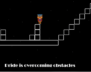
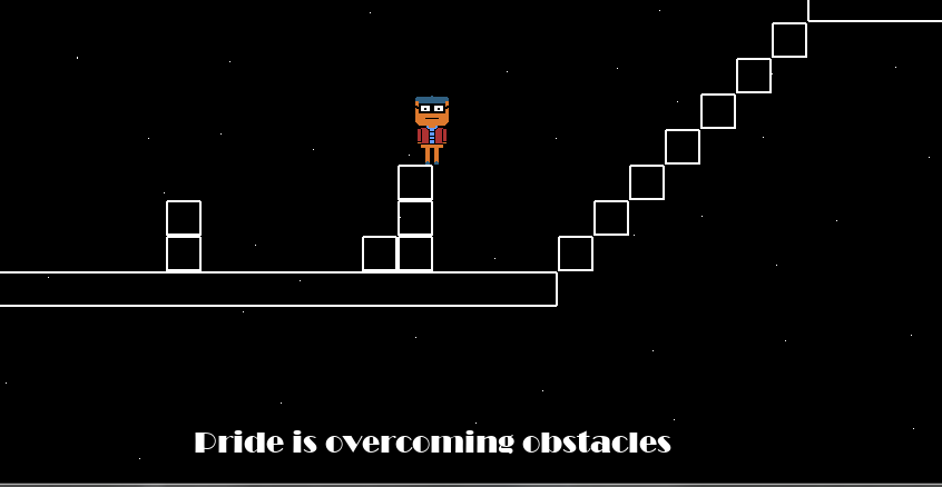
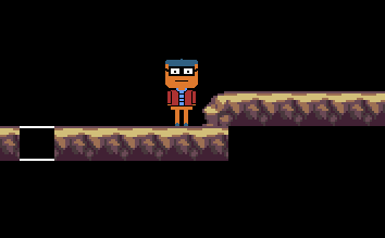
Pitch/Information: An experimental platformer where you, as the character, explore more / less positive worlds. While you're jumping and running your way over and around monsters you can take time to reflect what pride is to you and how you define it to yourself. The game is a prototype first effort in the platforming genre. It uses a few tricks and ideas I'd devised to more test out the platformer genre than make a solid platformer itself. Not to say the gameplay should be bad.

I'd like feedback on: Specifically I'd like feedback on world design and how you 'felt' about the overall title. Did the concept the game tries to convey work for you? Did you understand why certain things were happening within the game. Did the visual art style meet the needs of the game etc.

I need help on: If you think there's something fundamentally wrong about my game design or how it functions I'd love to hear how to do better.

One thing I must say is tricky is that going uphill and then hitting a flat area can be brutal. However, the ball physics in that respect are quite fair overall.

I would have loved to see some SFX or BG music in this however. It all seems so clinical and void of life because of that. Some simple bump sound effects etc. would have really contributed in a positive way here.

One little gripe I had was with the matt surface glare from the light source. At times on cerain maps the platform would go from completely clear to completely washed out. Which means you're often fighting the camera angle as well. Other than that I loved the level design and the way certain sections of the maps are 'hidden'.

I like the sandbox nature of this. I especially like that thought has given to the finer details (fridge has the temp on it etc.). It would have been cool to see the temp go up if you spent too long with the fridge open etc.

One bit of feedback would be to make the objectives a little more clearly attainable. I found there isn't much going on in terms of feedback to the player in how to achieve each objective etc.

I like the somewhat space-age solitude type world this is set in. 

I must admit though I personally didn't quite get all the puzzles. I got the telescope and floor puzzle and the code for the cabinet as a result. However, I didn't quite get the key box puzzle, although it let me grab the key without figuring it out. Unfortunatley the 'red pair' puzzle is a little beyond me and the time I have to invest in figuring it out. 

One thing I did notice though is the UI cursor is white, and the boxes on a lot of things are white or bright also. This causes issues with misclicks etc. Also, a sensitivity option for the mouse would be muchly appreciated. It takes a little of getting used to but there's no reason for the mouse to be so twitchy.

Overall though I like the concept. Given I want to branch into puzzle games there's some little pointers I've noted from this one.

The general structure of the levels being intertwined was an idea I had at the  beginning and was something I really wanted to push for. My biggest challenge was the first darker level where there was the top / bottom path. I had to make sure that the player couldn't die and go back on the other path and cause issues with the message trigger events.

I agree the hitboxes were harsh in this one. Being new to it all I played with different hitboxes but more often than not it was causing issues with the collision detection of the platform objects for 'containing' the monsters. Defintely an experience thing I want to polish in the future.

Thanks for your input!

My biggest problem with this game is it's far too short. 

The characters are memorable. The writing is ludicrous. The soundtrack fits it extremely well. I love how it goes from 0 to 100 with the innuendo. It's a very modern point-and-click with a vero retro art style. However, I definitely understand that almost 'breaking the fourth wall' humour may not go over well with some.

Suffice to say I felt cheated when it ended. I definitely want more from this world and these characters. I'd love to see a full game.

CURRENT STATUS:

All levels developed and most 'set dressing' is completed.

All menus, credits, endgames etc. are completed and functional.

There are now three distinct playable routes in the game. Each one of these will give the player a different experience.

Art assets are mostly complete, however still need;

  • Development of backgrounds for levels
  • Polish of menu backgrounds
  • Possibly polish some of the UI and give more information during play

Work on sound fx and BG music will start tomorrow and likely round out the game itself.

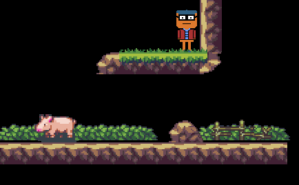
Come and meet a pig!
(1 edit)

I've been a little flat out with work / uni / this jam so I haven't created a devlog until now.

This is really my second game (ever) and I'm using GMS2. Luckily I have a bit of a programming background which helps a lot.

 - - - - THE GAME - - - - 

What is your opinion of pride and how do you define it?

I try and set out, with a slow paced platforming game and a single character, to better explain the positive and negative connotations of pride.

Currently it's still quite early stages in terms of level development. However, most of the minimum viable product code exists and assets etc. have all been organised. Tonight marks the first night of pure world building with the assets I already have and decide how far to push it in terms of level design and complexity.


As you move through the world you contemplate what pride is and what it means to you.


As you continue the world develops before you. Giving way to life, whether is be good or bad...

GOAL:

Currently this stands as having a working prototype model. Ideally with enough content and replayability to ensure the player doesn't see everything on the first run. How far this extends and how much the artwork is developed will purely be based on time constraints. Hopefully a bit of audio world building will also be used very soon. No sound as of yet though.

Encodya is a point and click where you can tell the developers have really tried to nail the quality of life and feel of older polished games. The art is great. The world building amazing. The sound-space and setting is phenomenal.

However, my main gripe is that breaking the fourth wall seems to be a troupe they've really shoe-horned in (at times). Admittedly, in this demo, sometimes it's purely intentional. Other times, it's part of the script writing. In my opinion it really isn't warranted in the density that it appears in this demo. If it were taken out, it'd make the experience so much more magical.

Either way, this is definitely a game I'll be looking out for a full release of.

The mirror definitely is one as it really doesn't give any clues that it is in fact selectable. Another is the slot for the terminal and the pipes. With the pipes the puzzle is given to you, but it's quite a specific location. All three fall prey to the point and click troupe of trying to not make the puzzle obvious, but at the same time not giving any clues. For example, with the mirror, perhaps it could have had a crack in it, or been at a slight angle, just to signify it's 'different'. By putting it where it is, on a selectable item, it makes it seem like there's nothing else there to select, if you understand my view.

An interesting addition to the 'Outer Zone' world. I must admit the protagnist 'swearing like a sailor' was definitely a disconnect from the first two games. Admittadly, a very different character also.

A great example of another two week point-and-click project. I really enjoyed the third angle this story has taken and look foward to more.

A great point and click adventure that has a strong premise and story from the start. I really enjoyed the time that's been given to developing the story from the get-go and telling itself very quickly in a short time-frame. My main gripe however is the near pixel precise selecting that's needed for some puzzles that effectively and without need 'hides' some of the activation points.