Play game
Return of Serenity's itch.io pageResults
| Criteria | Rank | Score* | Raw Score |
| Gameplay | #53 | 3.231 | 3.231 |
| Graphics | #75 | 3.231 | 3.231 |
| Authenticity (Use of resolution restriction) | #80 | 4.231 | 4.231 |
| Overall | #82 | 3.115 | 3.115 |
| Audio | #130 | 1.769 | 1.769 |
Ranked from 13 ratings. Score is adjusted from raw score by the median number of ratings per game in the jam.
Leave a comment
Log in with itch.io to leave a comment.


Comments
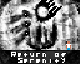
Nice game, The background is amazing, good job.
I hand drew everything on my iPad ^_^
Did you beat the game? If so what ending did you pick?
Interesting game! I like the concept and think a lot more could be made of this. I agree with things others have said - a little more hand holding at the start, keeping the player sprite on the screen and a more legible text would help this out as would audio. Would like to see what you do with it!
I did nothing, because I could not terminate any of them. But there is no closure? TT___TT Great game!
I left the ending open ended. You have all the pieces you need to create the “epilogue” in your head.
That and I totally ran out of time XD
Doing any kind of text-based story games in such a low resolution is always a challenge, but this one worked well, and the whole art style certainly helped provide the bleak atmosphere.
Good job!
( Browser went funny and submitted this twice.. I deleted the other one, should you have gotten multiple notifications! )
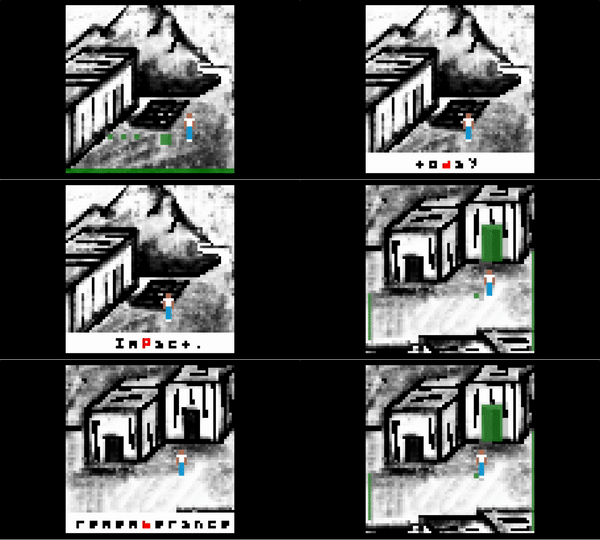
Really enjoyed this. As other's mentioned it would be nice if the player bounded to the screen, and it took me a moment to really understand what I was doing with the green areas (not a bad thing - I think it's good to make the player discover mechanics). But I became really invested in hearing the whole story. I spared the engineer and the dad (because emotionally I felt I had to let the dad see his kid :) )
Just curious why you chose Sasha and not Aanka (the nine year old genius)?
OK, so I kind of forgot she's still be 9yrs old - I would probably have picked her beacuse of paternal instincts on that point :) But I chose the engineer becausethey both had strong leadership, but engineering feels more important for rebuilding than astro-physics.
She had a 390 IQ and addressed the world to deliver the bad news (in multiple languages no less). So not only Astrophysics smart, but the pillar of hope.
I hope you feel horrible :-P
this gripped me a lot more than I expected, is it intended to skip to the title screen when you make the difficult decision at the end?
this reading technique seems familiar to me, was there a speed reading app that presented one word at a time in the past? I think this is a fine technique, if it's handled programmatically maybe players can even adjust the speed using +- keys.
maybe the glowing lights (from the mainframe etc) could be a different color from the green text prompts, I was a bit anxious that I was missing text content on some screens. or maybe it would be even better to change the "exit" prompts to orange, I definitely did miss a couple by wandering around in the wrong order.
nice work, and good writing ( ̄ω ̄)/
You can use + and - to change the speed actually. And making the “exit scene” squares a different color is a good idea!!
Who’d you end up picking? What did you think of the nightmare sequence (lol)?
And yes, the ending just takes you to the memorial with the title. I didn’t want to give any kind of “closure” (it’s up to the player to speculate and decide how the story unfolds in their mind’s eye).
That’s great, maybe add the +- keys in the description :D
I picked Matthew because I valued the physicist and engineer more for the task of rebuilding civilization, even though I wondered if they could accept that. You’re right that I imagined various endings to the story even before making the decision, so I think it was an effective design. I wonder if the end of gameplay could be signaled a little more clearly somehow, maybe even just “fin” on the bg image.
Yeah the dream totally got me, I didn’t want to spoil anything but I laughed.
I see a lot of potential for a 64x64 graphics adventure there...
The art was very original and the use of only grey tones is a plus :-)
Two things that could improved are keeping the player in the screen's bounding box and maybe change the way text is presented as horizontal scrolling instead of flashing words: it will make reading easier and faster.
If you end up beating the game, lemme know which ending you picked. I’m always curious about that.
I like the black and white gritty looking design. Gave the whole game kind of a disturbing vibe, which isn't easy to do with that small of a resolution. Also, "new phone who dis?" cracked me up haha. Nice job man!
I drew all the art by hand on my iPad ^_^