Play game
Match-Lite Castle's itch.io pageResults
| Criteria | Rank | Score* | Raw Score |
| Gameplay | #14 | 3.917 | 3.917 |
| Overall | #19 | 4.063 | 4.063 |
| Audio | #24 | 3.750 | 3.750 |
| Graphics | #24 | 4.125 | 4.125 |
| Authenticity (Use of resolution restriction) | #64 | 4.458 | 4.458 |
Ranked from 24 ratings. Score is adjusted from raw score by the median number of ratings per game in the jam.
Leave a comment
Log in with itch.io to leave a comment.


Comments
I found it hard to tell when things were the same color, but I liked the idea of this! I included it in my LOWREZJAM compilation video series, if you’d like to take a look. :)
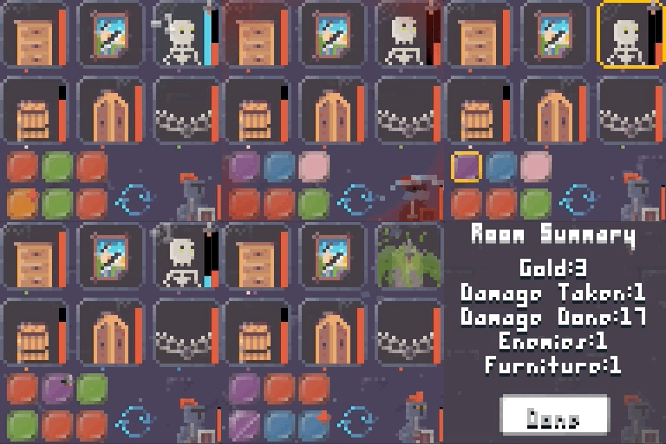
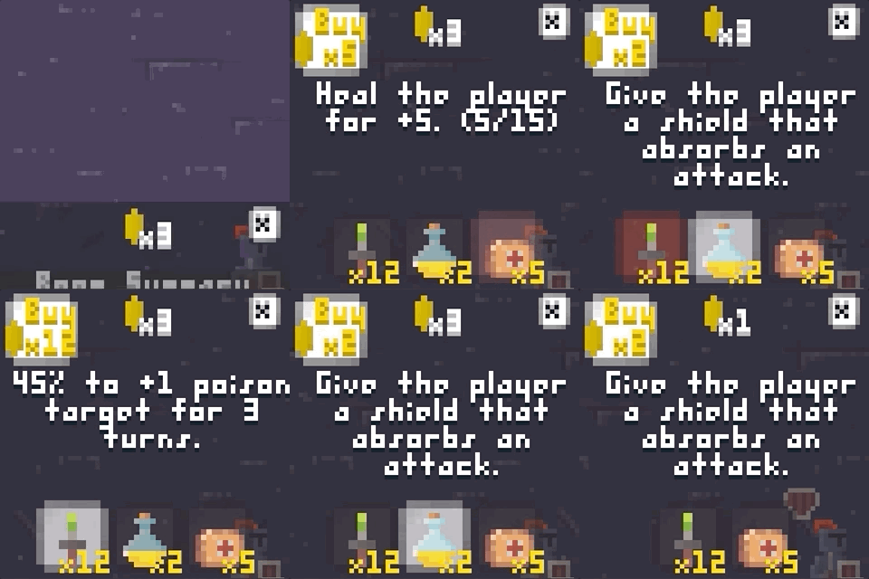
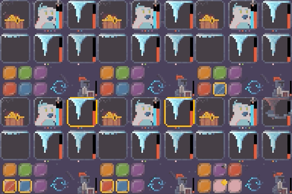
This is a really cool take on the match-3 genre! I really liked that you included traditional dungeon elements beyond just monsters and chests and stuff - but scenery and props as well. I also liked that it's not just a case of matching identical colours, but of seeing opportunities above and looking for matches with those.
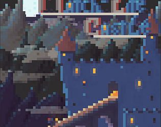
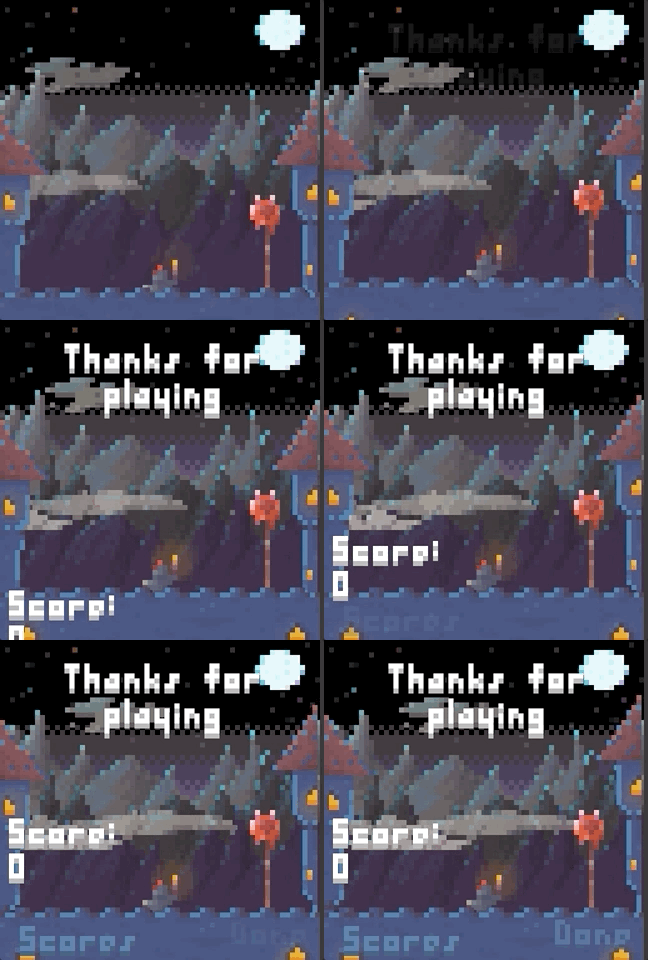
Beyond that the art and music is just really nice. Especially the backgrounds in the title and ending. The muted colours with quite detailed shading is not something you see a lot at low resolutions, but it works super well!
Appreciate the kind feedback, Mistodon! Thanks for spending time with the game and leaving a nice comment 😁
This was great, a lot more strategy involved than I initially realized. I ended up playing for quite a bit haha. Great feedback/polish and the game loop keeps me wanting to play just one more round. Nice job!
I'm so pleased you enjoyed your time with the game. Thanks for dumping so much time into it and giving such kind feedback. 👍
Very cool game, with a very nice game play, and just perfect art. The audio is very cool. The game mechanics work. This is game is very polish, lot of feedback, and lot of content. Very Good Job.
Thanks, IronPowerTGA! Appreciate you taking the time to check it out and leave feedback about your experience. Cheers!
I love the design of this game, I haven't seen this style of matching mechanic before and I think it pairs really well with rogue-like mechanics.
I kinda wish the target matching color below the 6 enemies was more prominent, I think you could comfortably increase the 1px squares to 2x2. Or maybe increase the contrast/saturation in the color palette, since it's largely midtones?
I didn't get to the end but I probably ran 8 or 9 times, it's fun. Nice music too!
Thanks for giving the game a try, ParkDraws. Not having the color requirements more prominent was one of the most criticized aspect of the game. That will be one of the first things I address if I do continue development. Like you said, perhaps using more saturated colors or increasing the size would be a solution. I really appreciate your time and valuable feedback 😊
Wow what a fun game. Great animations, great sound, great UI, great gameplay. I had lots of fun and I think this is one of the first games I would consider revisiting!
"I think this is one of the first games I would consider revisiting" - That might be one of the best compliments I've ever had in a Gam Jam. I'm really glad you enjoyed it and thank you very much for playing.
Cute graphics and nice concept - overall it fits very well together ;)
Thanks, CoffeMugGames! I'm glad you liked it 😀
Woah!
The graphs are really nice, that adds to the fact that the detailing on this game is incredible and the music and effects are very well integrated. It is a round game and definitively something that is 0x64% low rez! xD
Congratulations!
Thank you for such kind comments, edupo. Appreciate the positive feedback.
I didn't get very far but it's an interesting idea I haven't seen before and the everything is well done.
Appreciate your time and comment, cupcake. Cheers!
I got very confused at how the colors should be matched...
The only way I could play it was by clicking on a random color and check what highlights.
The graphics was quite nice :)
That's a fair critique. Thanks for checking the game out and leaving feedback.