Play game
Assault on Yato's itch.io pageResults
| Criteria | Rank | Score* | Raw Score |
| Audio | #111 | 3.200 | 3.200 |
| Authenticity (use of resolution) | #138 | 4.000 | 4.000 |
| Overall | #140 | 3.300 | 3.300 |
| Graphics | #152 | 3.200 | 3.200 |
| Gameplay | #165 | 2.800 | 2.800 |
Ranked from 15 ratings. Score is adjusted from raw score by the median number of ratings per game in the jam.
Leave a comment
Log in with itch.io to leave a comment.


Comments
Looks really cool but I have linux and the html5 did not load on my browser. Don’t know why. Other games are working.
Good ratings for you!
Crap I'm sorry to hear that. Idk if it's allowed for me to do during the voting period, but afterwards I can try making a Linux build if you still want to try it out then
Yes, of course. I let your game open in my tabs. Do you want to check mine?
Yep! I'll check it out later tonight
Just beaten the boss. Game feels great to play tho I'd prob slow down the accerelation of the player a bit
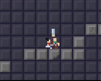
Very nice platformer, the only thing i could really say is that you don't know where you're going to fall because of the way the camera is implemented as well as the level dessign, but for a little game like this it is not a big deal. Liked a lot how the attack works and how it feels, the movement is good and the sound design is nice, so overall a very nice jam entry, congratulations :)
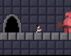
I loved the variety of enemies, their graphics and their attacks, each having their weak spots. It's a fun game, nice job!
Good job friend.
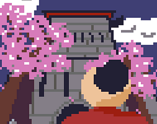
I kinda completed the first level without engaging in any fight and then killed the boss, it was pretty short but liked the graphics and music.
This was enjoyable. Love the variation in the enemies. The Oni at the end was a nice touch. The movement of the character was super snappy and the music was fitting. Great job!
I really like the concept and it was pretty fun
Nice minimalistic artwork!
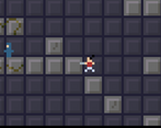
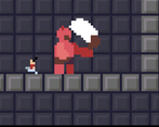
A bit barebones. Could use some variety in the tileset. I found myself going back and forth because every corridor looks the same. Boss fight was the most fun part for me. If you get a good left-right rhythm going you can slap the enemy every time he tries to get a hit. Personally I'd drop the entire initial level and just make the entire game this kind of boss fights. Congratulations on completing a game!
I'm glad you enjoyed the boss fight! I was actually worried that'd be the weakest part. I definitely do need to practice tilesets and level design more. I actually did have the idea of fleshing out the combat system more and/or including an arena mode but felt like I didn't have enough time. Thank you very much for trying it out though!
I have saved the kingdom! I had fun figuring out how best to deal with each enemy's attack. Although the boss almost got me before I learned to make him whiff his attack. And then to go for a strike or 2. The jumping felt a little clunky at times.
Congratulations on making progress in your game development journey. Keep up the good work.
I'm glad to hear you enjoyed it! I do plan on working on my platforming, that's something I've been neglecting. How were the animations, did the enemies telegraph their attacks enough? Or did you feel like there was too little time
The spearman felt a little weird or unfair at first. Because if you walk up to them from the front they poke you pretty quickly. And their spear animation is kind of hard to notice. But if you learn to get behind their patrolling, then they are a piece of cake to deal with. There are likely many paths to solving this. Some simple solution might be to have the spear shaft thrust in front of the enemy's torso. Looks like it is animated to be behind him almost. Or you could have a longer, more exaggerated wind up. And so on. As I am not the developer, I will leave the creative problem solving to you. That is a lot of the fun of creating a game.
The big brute enemies were good to fight. Felt fair and they telegraphed their attack well.
I have a problem with the ninjas. The first 2 encountered seem to come out of nowhere. As the character runs pretty quickly and the screen is small. So you are sprinting along and suddenly there is a ninja 24 pixels in front of you. And they immediately chuck a shuriken at your face. Perhaps there are people out there who can react that fast. Not me. But the like 3rd ninja you encounter. The 1 you get a first glimpse at from a lower level. Now that felt much better. I was able to realize it was there ahead of time. And plan accordingly. So to me the problem could be viewed from 2 angles: level design or enemy design. Depending on how you envision ninjas as a challenge to overcome. Keeping the current implementation and using them as a "see this ninja here, you better remember they are here when you get to that area". Or whatever other clever uses you can come up with. Or giving them a slight wind up animation or possibly a slower shuriken.
There is some room for argument against most of what I just said. The game does seem to be about one-man-army storming a castle. The character does have quite a big health pool. So even if some of the things I said would normally feel unfair. For this game it might add to the feeling of power the character is supposed to have. Running through these rooms, taking all these wounds, but still charging onward. Comes down to your vision of the player's experience.
Perhaps I went a lil' overboard here. But hopefully it can be of some use.
Oh no you didn't go overboard at all, thank you a ton for this feedback! In hindsight the spearmen were unfair in their design. I did try to put the stationary one at the beginning to help the player learn a bit about their attack and how to tell which way they're facing, but it's easy to blow through them so quickly you don't really notice anything about them. I could've also gone with better color choices to make the spear more noticeable in addition to fixing the animation. The ninjas too I'd agree were a mix of lackluster game and level design. I couldn't playtest much to get the placement right but I do agree the first two pop up too suddenly to be fair. I did consider putting a block in front of them so the player could learn about them in relative safety but I didn't think I had time to add in collision for the shuriken. But I'm glad to hear the big brutes worked well!
I did consider at one point adding in better telegraphs for all the enemies like the exclamation points from Dead Cells, and possibly even parry and dodging mechanics (all of which might've added even more to the power fantasy), but I just didn't have the experience or time to do those systems justice. Despite that I do feel much better prepared to do a much better job the next time around. And again, thank you so much for the feedback and for playing my game!