Play game
Monolith's itch.io pageResults
| Criteria | Rank | Score* | Raw Score |
| Audio | #35 | 3.692 | 3.692 |
| Authenticity (or, Creativity in use of resolution) | #37 | 4.154 | 4.154 |
| Gameplay | #53 | 3.462 | 3.462 |
| Overall | #55 | 3.654 | 3.654 |
| Graphics | #99 | 3.308 | 3.308 |
Ranked from 13 ratings. Score is adjusted from raw score by the median number of ratings per game in the jam.
Themes
I didn't use them
Tools
I used Libresprite and Godot, they were very helpful and had a lot of useful tools. The Godot animation player was especially helpful for this project, as I used a lot of them for basically everything
Lessons
I learned a lot about level design
Leave a comment
Log in with itch.io to leave a comment.



Comments
Pretty nice environments despite the very simplified art style with a nice atmosphere. Enemies are moving straight to the player which can be abused to just kill them through the floor when they're above or below, but that's not an issue. Definitely enjoyed them game.
Yeah the enemy AI is certainly stupid... Thanks for the feedback though! I'm glad you enjoyed the atmosphere
art style is very cool and i'm curious about this world but why use so many buttons, it's really not within my skills... plus it's not easy...i'm really sorry because it looks good
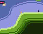
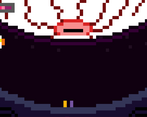
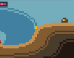
Amazing bit of atmosphere and you did so much with the minimalist pixel work! Your overall level design flowed nicely and your checkpoints were generously laid out. A lot more depth than it might look from the screenshots, great work!
Appreciate it!
For some reason this game reminded me of myself the last time I went camping and was trying to kill the mosquitos hovering over my head lol! I have to say that at first, I was skeptical of what I was about to play, but very quickly became impressed by the depth of the world, the enemies, the level design (thank you for the checkpoints...) and the bosses! The music was absolutely fantastic and really added a ton to the atmosphere. Overall a really fun game to play!
Thanks! The game really does feel like swatting mosquitos at times hahaha. I'm glad you felt like the world had a lot of depth and im glad you enjoyed it!
Fantastic experience, really loved how i kinda felt immersed even though my character was 2 pixels haha.
first boss was a good challenge, but I could not beat the second one, I might have gotten close though.
some hitboxes seem to be much larger than whats shown onscreen, or it at least feels that way.
Also i think have a health bar that has 2 distinct color, instead of red and pink would make it much easier to keep track of your hp.
Great work, really enjoyed it :D
Thanks for the feedback, didn't realize it was hard to notice when you're low on HP. I think the hitboxes are a little big, and I should've made them smaller. I also think it sometimes can appear really big due to the pixel perfect aspect ratio. Im glad you felt immersed! I spent a lot of game design choices on making it that way, and Daniel's music also really helped with that... so im glad it came across how i wanted it to.
Thanks for the feedback!
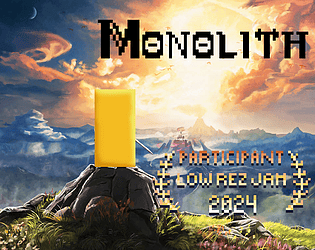
I'll admit I wasn't expecting a lot from the splash image, but this really surprised and delighted!
I liked the nice smooth controls and found the combat surprisingly engaging. The first time you see those big enemies! I liked revealing each individual cave and having to deal with whatever was in their up close. I do think the combat starts to dissolve into spamming, but... that's kind of Zelda too? Overall, solid work across the board.
Apologies if this is an insulting question, but did you compose the music? If so, excellent work! It really adds a lot. If not, please credit your sources.
Thank you so much for playing I'm glad you enjoyed it !
I was the composer for all the music here as well as the SFX so thank you so much for your positive feedback :D
Ah, rad. You did excellent work on this project. It really feels like something out of the source material you all are responding too.
You are too kind, thank you so much :)
Haha, thanks a lot!
I do think the cover art looks really low quality, but we both agreed it was super funny so we kept it. (its just botw art with a rect ontop)
Im not completely satisfied with the combat, as it does get very spammy, but I'm glad its not complete garbage.
Im glad you liked the big enemies and the cave section!