Play game
Tooth and Nail's itch.io pageResults
| Criteria | Rank | Score* | Raw Score |
| Graphics | #29 | 4.077 | 4.077 |
| Audio | #35 | 3.692 | 3.692 |
| Overall | #39 | 3.769 | 3.769 |
| Gameplay | #61 | 3.385 | 3.385 |
| Authenticity (or, Creativity in use of resolution) | #74 | 3.923 | 3.923 |
Ranked from 13 ratings. Score is adjusted from raw score by the median number of ratings per game in the jam.
Themes
Unconventional Weapon, Self-Destruction For Gain, Frick Around And Find Out
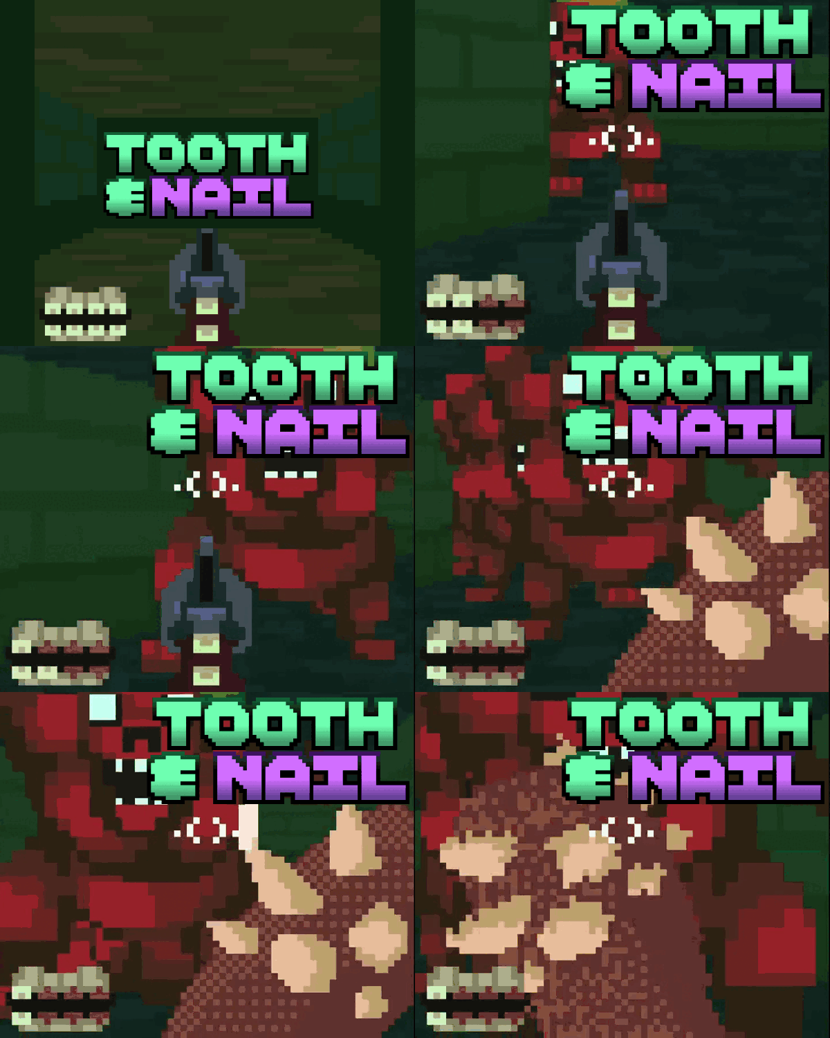
the self destruction for gain was an interesting theme, so we did some exploration and wanted to make an game where your health is your ammo, to make the game reward exploring the arenas, we decided to include keys and hp drops at various points off the beaten path (frick around and find out)
the guns using teeth rather than bullets are an interesting side effect, so we leaned into it and made the enemies use teeth as their ranged weaponry too, so Unconventional weapon
Tools
Godot, it was easy to make the level layouts using GridMaps, but making enemy AI was challengin
Lessons
This game was a lot of firsts for our team, our first FPS together, our first LowRezJam, our first game with big AI, our first game where we had unlockable features like doors, boss AI with states, etc, we learnt quite a lot, but the biggest lesson was to believe in ourselves when things got tricky
Leave a comment
Log in with itch.io to leave a comment.


Comments
Nice art style and gameplay. A lot of levels and enemy variety for a jam game. I wish the FOV was a bit higher, but I guess that would make the sprites look bad since they would have to be squished to an even lower resolution. Good entry overall!
Interesting concept, the teeth bullets are pretty metal. Very doom like atmosphere, the sound track was sick. Fun to play as well. Quite difficult, I ran out of bullets and had to juke enemies a lot.
Nice job, well executed and the vibe is on point for sure.
Wicked! Feels just like Doom back in the day. :)
Really dig the overall vibe and aesthetic, the teeth ammo icon is so perfectly nasty lol.
I’ve mentioned this on some other entries, but I love the games that have me forgetting it’s 64x64 pixels, and this is one of them.
The animations and branding all feel nice too. Really solid job.
Just played Tooth and Nail. The game remind me a lot of old DOOM which is seriously awesome! Like the comment below me, I fully agree on the Health/Ammo mechanic feeling underbaked as a lot of the time I didn't fight enemy's barbecue I knew I would just die. I think giving the ability to be able to use a weapon from the start that dosnt use your health could have made game play feel much more smoother. I also feel ike the level design at sometime can feel bit lack luster with enemy's poping out of nowhere and killing you. Overall though the game was super awesome and I would love to see an expansion of a concept like this! Awesome job!
Using your own teeth as ammunition is such a gnarly concept - I love it! The game has some attractive art and Wolfenstien esque vibes which was quite a throwback. I especially like the design of the red demon - they are big, colourful, have a beautifully crafted sprite and stand out from the environment well.
However, I did have some issues such as: enemies being placed too tighty around corners (which made for some unfair situaitons where I would get hit without any time to react), and I think the concept of using your health as ammo is a little underbaked as it feels like fighting enemies sometimes just puts you at more of a disadvantage than its worth. You're meant to pick your battles, I know, but the most fun thing to do is to shoot enemies, so when you can't do that the gameplay devolves into sprinting past everything and trying to get the levels over with as fast as possible. Pressing E didn't bring up the club for me so I couldn't fight that way either. Unless you get the club later?
Anyway, this is a very cool entry to this jam. It was fun to check out and I hope you're all proud of what you've made!
Thanks!
The club is unlocked after the first boss. It was overpowered in the first levels, but we could add a punch or something weaker from the start.
I'm happy to hear you found it cool and interesting nonetheless!
The art is really well done but I am not very good at this game.