Indie game storeFree gamesFun gamesHorror games
Game developmentAssetsComics
SalesBundles
Jobs
TagsGame Engines
A jam submission

Stickystack: A Paperjam ChronicleView game page

Submitted by Al Smith, superspen97 — 1 hour, 12 minutes before the deadline
Add to collection

Play game

Stickystack: A Paperjam Chronicle's itch.io page

Results

CriteriaRankScore*Raw Score
Authenticity (or, Creativity in use of resolution)#1073.7193.900
Gameplay#1422.5742.700
Overall#1422.8372.975
Audio#1472.4792.600
Graphics#1702.5742.700

Ranked from 10 ratings. Score is adjusted from raw score by the median number of ratings per game in the jam.

Themes
This game concept came directly from brainstorming around mixing and matching the optional themes. That's how we ended up with the stacking/doubling damage mechanic and the environment and art style, among other things.

Tools
We used Unity for this project. We both have a lot of experience with Unity, so that was useful.

Lessons
This was my first interaction with the new UXML system for custom inspectors in the Unity editor, so that was cool. Mostly we just dug deeper into some things we'd barely touched in the past like ScriptableObjects or Coroutines for simple animations, and found ways to add polish to the game at such a low resolution.

Leave a comment

Log in with itch.io to leave a comment.

Comments

Submitted

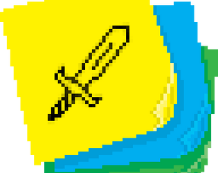
I have to admit, I don’t understand. The whole thing is beautiful, especially the paper handling effects, but I don’t know when I’m supposed to stack or when to attack, or really what’s happening from moment to moment. A tutorial would’ve really helped me out, but time’s always so short in jams isn’t it? Still, it’s bloody beautiful!

Submitted

This is absolutely delightful. The notebook paper background, the massive stacks of post-its you could make after a while. The stick figures. The *pair of eyes with nothing else*. Wonderful. I did have some difficulty with the font, but once I figured out what everything said, I played for... well, quite a while. Very nice.

Submitted

This was really a neat concept and  did a good job aesthetically making everything cohesive. I thought using the "grades" and the sticky notes while having everything on school paper was just a great call. As a few other comments said, I share the opinion about the hp/attack vagueness but I was still enjoying myself enough to keep playing for a while. I also hope you'll all keep tinkering around with this idea!

Submitted

sank at least an hour into this, it was such a fun game! the concept is so fun; grades as HP and sticky notes to attack are so clever.  i agree with the comment that enemy HP / how much my attack is doing is vague, and a block function would be nice to counter the harsh RNG of when all enemies attack at once. i was also mildly unsure what the enemy's "next action" would be when i started since i couldn't decipher some of the icons. sick idea though for the beginnings of a deckbuilding roguelike! i'd love to see more :3

Submitted

This is a neat, minimalist take on the roguelike deckbuilder genre (though we don't really deckbuild so much as deckplay). I wish I had a clearer sense of enemy remaining HP so I could make more informed decisions about who to attack with how much damage. I also would love a block or something similar so that I had some recourse when all the enemies decide to attack simultaneously.

The graphics and audio do a lot with a little here. I found the slight hang after playing a card to feel a little jarring, some kind of animation, effect, or something feels warranted or else it just yanks me out of the experience.

Submitted

I like the paper/doodle aesthetic, the dragging of the sticky notes in particular felt nice. The doodles work well at this resolution too. Nice work!