This is absolutely delightful. The notebook paper background, the massive stacks of post-its you could make after a while. The stick figures. The *pair of eyes with nothing else*. Wonderful. I did have some difficulty with the font, but once I figured out what everything said, I played for... well, quite a while. Very nice.
goddommitdom
Creator of
Recent community posts
I adore this! I love that your goal isn't to hit the enemy but to bring bananas to the people. It's a light bullet hell—a banana hell. One of my own making when I whiff and my own banana comes flying back at my face. My heart is in the right place but my aim is very bad, hahah.
Displaying the UI elements right there in the background / on the actual ground is a very clever touch, sound effects are solid, music is fantastic—that dirty jazz is somehow, hilariously, perfectly fitting.
All in all, a great game. Well done.
Thank you! I figured, if I'm gonna make a game about farting through space, I'd better at least try to make it look as good as I can, hahah. This is the first time I've managed to incorporate an animated tutorial sequence into a jam game, and I had a great time with it. Definitely going to continue trying to do so going forward.
Thanks for playing and for the kind comment!
Ahaha. Thank you so much! That, honestly, is the best mix of emotions that I could have hoped to evoke with my entry.
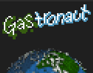
The planet is mostly shader magic! It's five layers: water, landmasses, cloud shadow, cloud (sized slightly bigger than the others), and a non-rotating shadow overlaid over the whole thing. The layers are each done in greyscale and colorized via values fed into the shader, and the shader also inflates the rectuangular textures into a "sphere". (It's still 2D so it isn't a proper sphere. Shaders are spooky but 3D is even more so.)
The shader handles the bulk of the "rotation" by shifting the textures, but also the planet object is rotated in order to get a rotation that looks like it's not fully along one axis or another.
Oh! You also used Godot, one thing that was integral to the look of the planet was setting the texture filter to Linear instead of the usual Nearest for pixel games. Gives it that sort of softness.
And all this for a fart game. What *have* I done.
Thanks for playing, and for the incredibly kind comment!
Okay the intro was stunning though? The way the lighthouse light was animated, and the minimal use of lines for the keeper only visible by the barest illumination? Chef's kiss, no notes, wonderful.
Ah, right, there's a game, too! And the game is also very good! I'm just a lighthouse keeper's spirit, doing my silly little tasks, keeping the coast safe, and when the light has been fixed, going into the light. Chef's kiss. No notes. Wonderful.
An excellent entry. Well done.
Thank you!
I usually run out of time before even thinking of adding a tutorial so I really wanted to make sure I got that done this time—it helped that the idea for it hit fairly early on.
The radio chatter was, in contrast, a very late addition. I thought that I would be shipping with only the fart sound effect, but then I found out that NASA has audio recordings archived and free to download and use, so the chatter is actually a recording from an Apollo mission in the 80s, chopped up and mangled to be incomprehensible and static-y.
Could I have just manufactured my own sound in less time? ...yeah probably, but it wouldn't have been as authentic! And that matters, I guess! Hahaha.
Anyway, thank you for playing and for the kind comment!
What a fantastic idea! What really makes it come together is the omni-directional ship, I think. Had it been a more traditional rocket it might've been too unwieldy, but the lil cube ship makes enemies blastable from any direction, which is great. The number of times I just barely managed to take down an enemy before the last pixel disappeared from the screen. Sure, if they dropped a powerup it was gone, but the point is they didn't get away!
I will admit, sheepishly, to "running" against a screen border a handful of times to shred a clump of incoming enemies, though. That they didn't get out of the way means it's their fault!
A really solid little game.
I finally got the second ending! For anyone struggling: You need to pay careful attention to Udyr's sprite (and sounds). Give him pets when his ears are down and his lil mouth closed and he's calm. Get his attention when he's looking riled up. Give him pets when he calms again. I know, buddy, I know the other animals at the park are distracting, but we'll get through it together.
There's a lot of love in this game and that comes through wonderfully. The sound effects were great and the art is so, so expressive—even, somehow, the screen transition, which is so beautiful that I actually linked the game to a couple friends, "Look how lovely the transition is!"
All in all, a great little game.
Fantastic art, just a cozy little game overall. Having to scroll the item list did catch me off-guard; I kept "finding" things I didn't realize I had to find, because of course I didn't read the page before playing, hahah. At the end all the items are placed in such a way that they're all visible, so that might be a better layout during the game?
Regardless, a lovely chill time.
Time: the curse of game jammers everywhere. Even with the understanding that this isn't finished and some things broke in the eleventh hour, I think there's a lot here to like. Really solid bones, y'know what I mean? Dungeon generation is a tough nut to crack and it seems like you've done really well on that front! The levels I saw were all sanely built and populated, and that's more difficult than maybe it sounds.
Heck, my first generated-dungeon game came apart so badly mid-jam that I had to add in a "dig through the void" mechanic because some rooms were spawning disconnected and to this day I still have no idea why, hahah. So, y'know, well done there.
I love this, from the idea to the execution, fantastic. Very tight little puzzles, some of which are real head-scratchers. I'd love for there to be either a save or a password system, as I got to around level 10 before having to get up—but also that isn't really something I*expect* for a jam game.
I'll definitely be coming back to finish this one. Well done.
At this point I'm convinced the last ice cream doesn't exist, but... 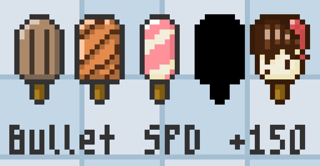 I mean, that I've played *this much* surely says a lot. But let's not let it go merely implied: This game is cute af, the idea is A+, and the game loop and progression is satisfying as heck. There is an issue that pops up *I think* as your bullet speed increases, that makes bullets sometimes pass by ants without doing damage, but that's a fixable thing.
Really, though. Your first code project? You did great.
Thank you for the kind comment! I *intended* for the game to be a little more frantic, a sort of cascading correction of direction as you toot wildly through space, but, uh, one thing after another and in the end I absolutely did not manage that.
I plan to revisit it post-jam and rework it into something more fluid and dynamic and, well, fun, hahah. Anyway, thank you for playing!
I'm so glad you enjoyed! There's a very fine line between "entertainingly jank" and "irritatingly jank" controls, and I've definitely landed on the wrong side of that line for most people—not that I *wanted*, necessarily, for the controls to be jank at all, but it was more a matter of damage control vs being able to actually fix things by the end, hah.
Anyway thank you for playing and for your kind comment.
Very cute throwback to the bleep-boop button games, and the sound effects nailed that feel. I was apprehensive when I went to climb up the plant, thinking I'd have to carry water all the way from the ground, so it was a relief and also very funny to see a faucet through a window!
All in all, very solid.
I came back to play again.
This time I was able to get the dig claws easily, as I think was intended. Below, there's a gold circle that I couldn't seem to do anything with, and an altar I couldn't get to. In the other direction, by the NPC who tells you about standing in shallow water, I could not manage to make the jumps across the platforms without running the candyfloss into spawning water particles. I can *see* that there seems to be a break to make the jumps during, I just couldn't manage it, the timing needed was too tight.
HOWEVER. Spam-jumping allowed me to double-jump to get to a button that let me kinda... bypass that one hallway that was giving me trouble, so I was able to see the rest of the game. I got the items, dropped off the Gift, and got outside.
Honestly, if not for that one hallway over the water, the rest was very doable, nice little puzzley elements with the valve.
The ending screen is lovely; I'm glad I came back.
The movement is, I readily admit, definitely Not Great. I struggled with it a lot. Everything else was far more in my wheelhouse, haha.
Some of the issue with timing the fart button push is, embarrassingly, an issue I created myself and didn't realize until too late. I intended the sprite to be readable as direction, but each frame of the sprite covers 1/16 TAU. And that's more than enough variance to at be annoying at best. And that's without taking into consideration any bugs in the movement, of which I know there's one that I could not get ironed out by jam's end.
My takeaway really is that even if an idea is simple to explain it doesn't follow that it will be simple to implement. However, it does give me a post-jam chase task: fixing this game!
Anyway, thank you so much for playing and for the thoughtful comment.
The movement didn't turn out nearly the way I wanted it to—feels a bit like, y'know those amateurs-failing-to-make-professional-cakes pictures, where obviously they had good intentions but the end result is a bit of a mess? That. That's this game for me, hahaha.
I struggled so much with the movement system and had intended to add *some* sort of rotational control, it just didn't happen. A post-jam update will come, and the astronaut will be able to kick his feet or something.
Anyway, thank you for playing and for the comment!
I am now the Spooky CEO. As my first act in office, we will be replacing all Starbucks locations with Spirit Halloween—
This was fun. There's something of a steep learning curve but the detailed game page really made things clear. The monster progression seemed totally reasonable—I wasn't managing to kill most of the witches(?) but they also weren't spawning in numbers great enough to cause a fail.
Placement in build mode is maybe a smidge hinky, something about your character not being gridlocked but the buildables are, perhaps, which is just exacerbated by the granularity of a 64x64 resolution. Especially with being able to ignore collision during build mode, it wasn't a huge problem.
I did notice something very odd, sometimes coins seemed to have collision? When they were piled up in the later levels, at least, I noticed some issues with running *into* them rather than *through* and picking them up, had to ram poor Edgar's face into them a few times.
(And this is maybe a weird detail to praise but I really liked the path-showing effect. I dunno. Something about it is just nice.)
The character design is wonderful. Oh! And the cutscene at the end was delightful!
Overall, spooky and good.
It took me *way* longer than I am proud of to figure out that you had to jump + down+x to drop the candyfloss onto the altars. I made it to the digging claws and then had to stop. Definitely agree with the sentiment that a quicker way to get new candyfloss would be super appreciated, as it quickly became a slog to go back and get more.
The candyfloss being on an offset pivot takes some getting used to—at first I was ruining it by trying to adjust my position, but then I realized how clever it is because it allows you to stand with your head/body in falling water and the candyfloss safely dry. It just takes some adjustment to work with.
I will be coming back to this game because I feel like my early frustration with getting the candyfloss onto the altar really sapped my energy, and now that I understand the mechanic I want to give it a fair shake.
And let's not let it go unsaid: The art is cute as heck and the music is quite enjoyable. The falling water effect is also very nice, the particle splash especially.
Love the idea of this so much. A rhythmic avoidance game? Fantastic.
I had some issues with the movement—either I kept falling out of rhythm, which may well be the case as I am not a very rhythmic person, or inputs would randomly start failing. When that happened I could usually press a different direction and get going again, but that really could just be "re-aligning" to the rhythm. Hard to say. It was definitely difficult to persuade the game to let me free if an enemy overlapped the player in the same square, though.
Honestly, already a fairly solid game, but with another polishing pass and a bit more *oomph* to the music, I think you'll have something great.
(Another commenter mention the bubbles—I read those as, like, dancefloor spotlights? Were they? Now I am curious.)
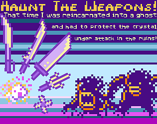
Whilst fumbling for the controls (I clicked play too soon) the first slime nearly killed me and pushed me out of the level, which was incredibly funny.
The hit detection of the sword is a little odd, and thus it's far more difficult to kill the slimes than maybe was intended. (Of course, I understand the limits of time, however—the lack of feedback on whether a sword slash actually hit didn't help. I'm not actually sure if slimes were a one-hit-kill and the hit detection was *that* precise, or if the slimes needed multiple hits and the hit detection *wasn't* all that precise.)
In the end, though, you made something! And that's worth a lot. Keep making things, and you'll only get better from here. <3
Oh! And let it not go unsaid, the character art is very cute.
I understand exactly what is expected of me, and how the game is played, like, in my brain. But I don't have the fortitude of heart to sit in judgmental silence, sweating, as I try and fail to arrange the blocks into the requested formation.
Of course, even the best bgm in the world might not have led me to victory. I'm not very good at this flavor of puzzle.
I can recognize when one is made well, however, and this one is. My weakness is my own, and not the game's fault.
Love me a sorting puzzle game, and this one hits the spot. I will echo the up/down movement issue that others have mentioned; in addition, I think a few of the colors are a little too similar, which did give me some grief. It did *seem* like they were a curated palette, but perhaps a bite more curation (or a high-contrast option) could be helpful. That said, the shadowed blocks are a really neat touch and add just enough spice to the classic formula to make it tasty.
I think I might've liked a timer (maybe one that just shows the completion time, not one on-screen and visibly counting up) or maybe a move counter?
Overall, very nice!
I adore the visuals here, the limited palette makes the contrast colors really pop to fantastic effect.
I'm not certain it was the *intended* path but I managed to heal through a couple long "step in bad" corridors and eventually found the final objective and saved the swamp. I feel as though I might've skipped the purpose for the flame, but you can't argue with results! (Okay, okay, you can, and I feel I might've broken sequence, oops.)


