On Sale: GamesAssetsToolsTabletopComics
Indie game storeFree gamesFun gamesHorror games
Game developmentAssetsComics
SalesBundles
Jobs
TagsGame Engines
A jam submission

Flux!View game page

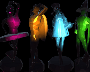
A boardgame about cursed magical girls (WIP)
Submitted by weckar — 10 hours, 56 minutes before the deadline
Add to collection

Play game

Flux!'s itch.io page

Results

CriteriaRankScore*Raw Score
Graphics#83.4823.636
Originality/Creativity#93.7433.909
Polish#152.4372.545
Theme Interpretation#152.7852.909
Magical Girl Concept#152.6112.727
Overall#162.5862.701
Engagement/Fun#171.9152.000
Audio#191.1321.182

Ranked from 11 ratings. Score is adjusted from raw score by the median number of ratings per game in the jam.

How does your game fit the Magical Girl Genre?
The playable characters tap into magical abilities through played cards, such as teleportation or spells.

Which theme(s) did you pick?
STONE ocean

How does your game fit the theme(s)?
The main characters have been turned to stone game miniatures. Had I been able to finish a tutorial/story mode, this would have come across better.

Were the graphics/audio assets for your game made during the jam?
Mostly. Some photosampling was used for the textures.

Leave a comment

Log in with itch.io to leave a comment.

Comments

(1 edit)

I do love deckbuilder games and eurojank, and I think you have a solid design here, so I hope you continue to improve on this. Can't help but feel you got mired in the polishing though. It was cool to see all the camera sweeps and card flipping the first time but they quickly got in the way of playing the actual game. Being a digital game means you don't necessarily have to simulate every single board game component being moved, especially when it becomes detrimental to the experience (e.g. not being able to see card descriptions in the back row of the shop). Most of my complaints are similar UI related nitpicks, most of which boil down to "speed up the animations" and "let me see more information at once".

I have board game experience so I was able to understand the rules pretty quickly but I did have a couple rules I was confused by at first (namely killing monsters in the shop and being restricted to claiming only the first victory token you touch). I thought the deck designs and different win conditions were super cool. Not sure what the incentive is to heal other players when you're competing though, especially when outside of Tomo's self-damage and easily avoidable red spots there doesn't seem to be any health risk in the game. Tomo also moved frustratingly slow, and I realize it's because she focuses on killing monsters but the need to collect at least one victory token means she felt pretty frustrating. My highest frustration was being forced to play that one card that randomly teleports you. Not sure what that was about.

I can see very high potential in this game with a more filled out design, better balance, and the rest of the bells and whistles like music and AI and such. I really hope you continue work on it!

Host

Before I say anything I think I should say that it is a good thing that you have made this game, and submitted it, so I hope you won't feel disheartened by the rest of the stuffs I am going to say.

I suppose this one is an unfinished game. Graphics wise it looks cool but I'm not sure what I was playing. As someone else said this may have some potential as a demo but this is not quite playable yet XD

I think you did say you were very busy at the time, so this is understandable. But I think I do have some advice: For future jams, be it MGGJ, or not, I think better planning and determining priority is very important. The first thing you should aim is playability; forget about extremely cool graphics and animations and stuffs those can come later, but make sure it is playable first and that people can understand the game easily first. Considering you are busy, and you know you are busy, you may also want to aim for smaller scale, less complex games next time -- don't you think the mechanics of the game is a bit too complex to both make and for players to understand? Don't you agree that some of the features you were planning to put like AIs are too ambitious when you know you have a busy schedule? Creative and fun games don't have to be too complex with tons of features. I hope I don't sound too preachy, but those are the kinds of advice that I can give.

In any case though thanks for participating! I hope you had fun.

Developer

You sound very preachy :P

But you're not wrong. I don't really do small games though. The genres it generally allows for just don't interest me.

Submitted

Even if i trigger fullscreen, the game view somehow doesn't scale up, so i basically can't read the text on cards. Sorry. i can't figure out the rules. I feel you run out of time. If it was me running out of time, i probably would just make a tutorial size game with smaller map and only 2 characters, and then polish it enough to show the gameplay.

However i like the idea of magical girl themed boardgame. It's rare so unique. And if it's good, it can be converted to a physcial version. Crystal like miniatures are also stunning

Developer

I didn't realize I was running out of time until I was at scale. Thanks!

Submitted(+1)

Looks very interesting. From clicking a few buttons it looks like a lot of care has been put into it already, but in its current state the rules and mechanics are simply obscure, because there is no tutorial and way too little instructions for the amount of things you can do. It's not playable, as a tech demo it looks nice, it looks like it has potential to be fun and interesting.

I don't feel I can give it an informed rating, but I'll rate it in its current state anyway just to be fair.

Submitted(+1)

I think it's a fine technological base for something, and maybe even a mechanical one (though it's difficult to assess game balance as a whole given the state of it). It is possible to play through a game from start to finish and I sort of understood at least the basics of 'draw a hand, spend move points, get victory token, and return to start' - at least after reading the description a few times.

I don't understand if there is any strategy eg to the card aspect of it. Did you have to play the full hand as soon as you drew it? Can you save cards for next turn? I think active flux/move/atk reset between turns, but did the cards? Was there a way to see what was in your deck as you bought cards as you went on?

I liked the feeling of it being a boardgame; it sort of brought to mind somewhat the minatures level in the original Psychonauts, if you've ever seen that. But this was pretty rough.

Developer

Yeah, you basically nailed it. The only thing is that in places it can be advantageous to play a few cards -> move -> play the rest of your cards. Though this mostly holds with the base decks of the Pink and Yellow characters.

Submitted

This is a cool start! I love the idea of a magical girl boardgame. The graphics work well, and I especially like the depth of field effect. Really highlights the "miniature" feel of the game.

Without a tutorial, it is a little confusing at first, but I think I made sense of most of it by the end. I didn't really understand the "flux" element. I did one full run, with the pink character winning.

One thing happened a few times that was either a mechanic I didn't understand, or a bug. A few times, when moving, the character would seem to teleport instantly to a distant place on the board. It's possible that was intended, but I couldn't really tell.

I hope you keep working on this! An AI mode would be fun to play against.

Developer

Did you play the teleport card on the yellow character?

Submitted

You know, that's entirely possible.  I guess I didn't read all the cards closely enough.

Submitted

It's always hard to rate and evaluate unfinished games. There's a lot here, but there's also a lot missing.

Graphically, this is super nice. The strong depth-of-field works really well here, the visuals are consistent, and everything has that feel of miniatures on a tabletop.

I found the gameplay extremely confusing as it stands, and the fact that some features aren't implemented or are partially implemented didn't help. In all fairness, I only skimmed the instructions and re-read them after I played, and they did clear some of it up. Still, I would have preferred more guidance in game.

I'm still not sure if Flux is the blue diamond symbol or not. The number of blue diamonds on the cards often don't match the Flux mentioned in the text description when both are present.

I had no idea how the new cards thing worked at all. Sometimes I clicked it and it didn't seem to do anything.

Having a hand of cards feels pointless if all cards must be played anyway, and though the animation is really cool the first time having to go to your hand every turn really slows down the game. It might have been better to just present the dealt cards at the beginning of the turn.

I think this game was supposed to be multiplayer or have AI? Playing it alone isn't really fun. Most turns are just moving across the board with very little to break it up. I can see this being a lot more fun as a competition between players.

I am impressed by how much flavour (if you will) the game already has. Even with just their visual designs, each character feels distinct. The cards have fun, creative names and interesting flavour text. The camera pans and zooms around, the characters hop like pieces, and enemies go flying off the board when they die.

Overall there's a lot of potential here but it's really rough in its current form. Are there plans to finish it in the future?

Developer

There might be continuance in future, but I'd have to see if anything fundamentally broken is found during the rating period :)

Submitted

text is really hard to read on the cards for some reason

Developer

Hard how? Flicker? Too small? Bad font?

Submitted(+1)

Oh it looks better if you go fullscreen, its pretty hard to read at the size that is on the page.

Developer

Thanks for the feedback. I developed it for fullscreen, so I didn't get much testing done in the smaller screen.

Submitted

The game looked really cool, but then it crashed hard. It was kinda confusing how to play. I couldn't see what any of the cards did. I also didn't know where to go. 

Developer

Did the text/icons on the cards not show? I agree that a tutorial is really needed :)

Submitted(+1)

There was something on the card, but it was too small read.

Developer

Strange. I will look into it. May be a resolution thing, always tricky to test for.