Play game
魔法猫ミッカ~! Magical Cat Mikka and The Fallen Star Kingdom's itch.io pageResults
| Criteria | Rank | Score* | Raw Score |
| Magical Girl Concept | #12 | 3.214 | 3.214 |
| Audio | #12 | 2.786 | 2.786 |
| Theme Interpretation | #12 | 3.143 | 3.143 |
| Overall | #13 | 2.867 | 2.867 |
| Engagement/Fun | #14 | 2.429 | 2.429 |
| Originality/Creativity | #14 | 3.286 | 3.286 |
| Polish | #14 | 2.500 | 2.500 |
| Graphics | #14 | 2.714 | 2.714 |
Ranked from 14 ratings. Score is adjusted from raw score by the median number of ratings per game in the jam.
How does your game fit the Magical Girl Genre?
The main character is a magical catgirl. She dresses like one and she also perform magic shows with her family.
Which theme(s) did you pick?
Battle Tendency
Stardust Crusaders
Diamond is Unbreakable
Golden Wind
Stone
How does your game fit the theme(s)?
1. The game designed around battle. You have to defeat a specific number of enemies before you can continue so you can't simply run past them. It's very hard to heal and defeating enemies is one of the only way to do so 2. Phyllodia is a devout crusader who was born from the dusts of stars when they collided during 'The Great Emergence' 3. The enemies with diamond shield can block all attacks that hit the shield. It also cannot be broken in any way. 4. One of the enemy types, the Goldborns' body is composed entirely of gold. They also move very fast. 5. One of the enemy types, the Stoneguards' body is entirely composed of stone. They are hardy and enduring.
Were the graphics/audio assets for your game made during the jam?
Most of the graphics are from the RTP with some of them being from free sources, and I also created some during the jam. All audio assets are from the RTP and free sources.
Leave a comment
Log in with itch.io to leave a comment.


Comments
Very ambitious to try making a realtime combat game in RPGmaker. Got some cool ideas and enemy designs too. However the stretch marks of the engine show in the clunky controls and hit detection. The enemies are too fast, tanky, and numerous to handle at all. I was able to hold my own in Slow mode Easy but that was about it, and the currency gain was too slow to really make me interested in upgrading myself. I can see it working out if balanced for a linear game as you seem to be intending to, and I'm interested to see if you can make it work. Good job!
This game seems interesting, but I can't make much progress in it. I'm not a fan of wall of text tutorials that don't let you practice what you learned before the next step, but I managed to understand what the game was about and how to play. However, the character shoots so slowly that I keep getting cornered and dying, even on easy mode. Also, it feels like there are just too many controls. Why do I have to aim when it would be much easier if I could just hold down a single button...
I think if you make the beginning part of the game easier to understand and less difficult, it would help me get into more difficult sections of gameplay.
Oh, and I found a bug: if you get hit by an enemy whilst against a wall, you get pushed into the wall and can go out of bounds.
I don't think anyone is a fan of text tutorials LOL. I'll fix this problem in the next emergency update that will come today. (along with a boss fight map) Also, yes, you COULD just hold down a single 'Z' button while shooting. You only have to press 'A' once to enter aim mode, then press it again to exit.
That's not a bug, it's a feature. You get a fleeting 'invulnerable frame' after you get attacked, and you'll be able to walk through enemies to escape, in case you get cornered. Unfortunately, you can walk into walls during this frame too, which can be remedied by using 'Return' item to teleport back to where you started....but it's not in the game yet. I actually wrote this concept into the tutorial, but you probably (understandably) ditched it XD.
Thanks for playing and commenting!
Wait....the character shoots too slowly? NO WAY. I actually amped up the speed a lot in this version, so if you think it's still too slow....then I'm glad you didn't play the launch ver. LOL. If I were to make it even faster....you probably need to have insane reflexes to even play it XD.
This game was pretty hard to get into. I played the web version. When you're put in that room with a million tutorials and the dreaded perk room, it's very tempting to go straight into the game.
OK, let's pick easy mode, then! I'll learn the mechanics while playing! Well, it turns out easy mode is pretty hard. Try again and die a few more times.
Let's read some tutorials! OK, so you have to hold A to aim while attacking, unless you're in claw mode, in which case... you can walk while attacking... Why are the controls so complex? That's asking a lot of me to remember all that.
I read it all one more time to make sure I got it. Nope, I shouldn't have to read about special abilities yet, I don't have any of those, right? Let's just try again, this time I'll pick the slow mode. I manage to shoot an enemy twice. Proud of my achievement, I quickly notice it hasn't died yet. I run around for a while, trying to use the scratch ability and managing to fire two more shots, but so far no enemy has fallen. The enemies surround me from all sides, and defeat me in an instant.
I think the problem here is the amount of depth in the game, which you're exposed to from the very start, without training wheels. I think if you simplified the controls to start with, hid away the perk room and the character customization, and introduced one concept at a time in a series of linear training missions (with waaaay weaker enemies), then even I could learn to play this game. Right now I can't do it. It's like asking a cat to play badminton.
Easy mode is still hard? LOL. Tbh I DO NOT know how hard my game is to other players because I can play it just fine. I think why it was hard for you was because you ditched the tutorial, though. (which was VERY important because aside from controls, there were core concepts in there too that will help you out a lot). Okay, I will make a graphic, intuitive, easy-to-understand tutorial...TODAY.
Also, you DON'T have to hold 'A' while attacking. You just have to press 'A' once and hold 'Z' to shoot, then press 'A' again to exit aim mode. You CAN walk during aim mode but not run, but you can run while in claw mode. (wait, that's pretty confusing.)
Those stone enemies are resistant to scratch attacks, so it'll take about 20 hits for them to fall from it. However, if you shoot them with magic they'll fall in 4 hits (or 3 hits in the next version, which probably would come out today with better tutorials.). Additionally, you get a fleeting 'invulnerable frame' after you get attacked, where you'll be able to walk through enemies and escape, in case you get cornered.
It was that way in the downloadable version (you get a tutorial only where you need it without dumping them all in your head.). Unfortunately, that version also contains loooooooooooooooong cutscenes that apparently made most players bored before they could even get into gameplay. I think I'll just cut out all cutscenes, dialogues, and story from that version and put it into the browser to replace the current one. That way the problem would most likely solve itself.
Imo that analogy is pretty bad though. You could eventually learn how to play a game no matter how hard it is to get into, but a cat couldn't play badminton even if it tries all its life. (unless it transforms into a human or something XD)
Thanks for playing and commenting!
Ah, you're right it wasn't the best analogy. Maybe this is better...
Teaching players to play your game is definitely one of the hard problems in game design, and I can sympathize. A new player launching the game will want to start playing immediately, but to enjoy it they first have to learn how the game works. If it takes too long before they can start playing, the player will get bored and give up.
But don't worry too much. Sometimes you don't get the difficulty curve right, especially as a rookie dev. Learn from those mistakes, keep trying, and eventually you'll be making games that everybody calls "easy to learn, hard to master".
I couldn't for the life of me figure out the controls. I pressed every button before dying 6x. Sorry, wish I could have given more feedback.
Wait, what? Where'd that come from? I put the control keys both in the game description AND in-game tutorial for players to read. And when I was playtesting for hours it worked just fine. Do you mean that you couldn't press attack AT ALL or do you mean that the control keys are unintuitive and should be adjusted? If so, how do you think I should go about it? Press something else to attack maybe?
I figured out the claw attack, but it didn't do any damage. I couldn't figure out any other attacks. I'll give it another try today
I got it too shoot, but it won't consistently work. Also it takes a lot of hit to kill one guy and moving while holding a and z is pretty difficult. I'm going to chalk this up to I'm not very good at your game.
You don't have to hold 'A'. You just have to press 'A' once and then hold 'Z' to shoot. You will exit aim mode if you press 'A' again. I guess I didn't make it clear. I'll make a better tutorial next time.
Even though I already amped up the speed, enemies taking 4 hits to defeat is still too much? I made it only takes 3 hits in the next version, though. That should fix up this issue. You can also take perks to boost your damage as well.
LOL. That will do it. Let me try again
There's a lot here and it's the sheer amount is impressive, but the pacing is atrocious. Not only is there a lot of cutscenes before you get player control (and that's even before you get a tutorial), but it's all... so very... slow and meandering, and there's like 3 starts (village, then the kingdom/rebels, then the magic show, then you play as Mikka for a while longer?). If I wasn't do the jam rating I would have exited out already really early on. It's more exciting to either throw people into the action right away to let them understand what kind of game they're in for, or give them an immediate hook. To then get a joke about having to wait a long-ass time for something to happen was like getting a slap in the face at that point.
To be perfectly honest, going through all of that to get to the actual gameplay was... a disappointment. An action game being made in RPGMaker is very cool, but actually playing it was mostly an exercise in tedium. I got to the bit where you're being chased by zombie stone enemies that just keep getting up again and quit. I know I'm supposed to get the circle, and if you kill enough enemies paths will open up, but at this point why? I'm not having any fun, I've spent 20+ minutes on this already, what's even the point?
I'm not saying I hated the game; if anything, I'm impressed by the amount of work put in. But I think it could have been put to better use if planned around what a first time player's impression would be. Everyone's project is their own special creation, but what is is that makes it enjoyable is something you have to actively show to other people, and this doesn't do that very well.
The pacing is too slow and boring, and you have to wait too long to get into gameplay, got it. I think your comment about 'throwing people into the action right away' part is a bit subjective, but I do appreciate the feedback. It's really hard to balance the pacing so it doesn't fall in the extremes like 'too slow and boring' or 'too fast and confusing', though. (I think my game somehow fell into both of these categories, being too slow and confusing XD) Since this is my first time doing this, I'm still learning how to get it right.
The gameplay was disappointing? How? Was it because the slow animation when you press aim? If that's the case, then it's already been fixed, but not released yet. In v.0.1.2 you will instantly go into aim mode without having to wait for the animation to play.
Or was it because the enemy keep getting up? Then I don't see what the problem is. It's literally just an enemy respawning system, but instead of making them disappear and reappear at the corner of the map, I made it this way to show that Mikka didn't actually kill any of them.
Or was it something else? I can't read minds, so I can't improve my game if you don't tell me what the problem is. If you don't want me to improve it, then why wrote that part of the comment in the first place?
I'll try to patch up the pacing and narrative problems in v.0.1.3 so it doesn't take 20+ minutes to get into the gameplay anymore. Would it be better if you can move around and talk to people to advance the story instead of using cutscenes?
Tbh I enjoyed the gameplay part so far in the playtesting process, but that's probably because I'm the creator. If even I can't have fun playing my own game than other people's not gonna have it. I hope the next version will be more fun overall, though, after the combat's been fixed.
Thanks for playing and commenting!
Tbh I think this comment kinda ruined my day here. But thanks for giving me the first taste of harsh criticism since I'm sure I'm going to have to deal with it a lot in the future.
It won't stop me from doing what I want to do, though.
That's good! I don't want to stop creators making stuff, I want to help them make it better. But if you want to get genuine feedback, there's no point me sugar-coating that I enjoyed it if I didn't.
If you want specific criticism of the combat, aside from it taking far too long to get to, it'd be something like this:
a) I didn't feel like I was being effective. The point of taking out enemies is to stop them from preventing you achieving a goal, right? If they just get back up again, I don't feel like I was really achieving anything in that regard. If the goal in that area was to kill a lot of enemies to unlock the next bit, then I don't feel that was very apparent; perhaps a kill counter or some kind of feedback that killing them is what you're meant to do. Instead what it felt like was that I was trying to get to a goal, and when I got to the end of the map and realised there was no path 'up' to the circle and got cornered by like a dozen zombie rocks, I just felt dispirited.
b) The combat itself is clunky to control. This is to some extent because it's been put into a engine that's not really built for it, and to be honest having the strafe option really made it work better than I would have thought, but it mostly meant that I was just kiting enemies into a straight line then backpeddling while firing. Over and over again. Again, if I only had to do that once or twice and then the next map opened up, that's more paletable, but I felt like I had been doing that for quite a while to no effect.
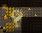
c) This is a more minor thing but I found the giant explosive FX that you got on a successful hit to be a mismatch for the apparently tiny amount of damage each shot actually did.
Returning to the story for a second, there's aspects I like. I thought Mikka as a literal cat turned human was cute, the weird magician dad was fun, the animation scripting for the cutscenes reminded me of old-school Harvest Moon cutscenes, it was all sort of cute. But again, the pacing was just extremely long. Even the intro cutscene with villagers, that cutscene alone, the exploration of peaceful life before the lightning strikes - I was already anxious to get going by that time the lightning hit. Especially in game jams, where the people playing are often looking at a whole bunch of games in a row, I think it's important to grab people's attention quickly and effectively.
a) You have to defeat a specific number of enemies for the path to appear. Since it apparently wasn't obvious, I guess I'll add an 'objective' texts that will tell you what to do. (Along with number of enemy required to defeat in order to move forward)
b) This version I'm working on should fix the clunky combat to some extent. Also, after I read your comment I also went to find a way to make combat faster, and the result was.....spectacular. Once I upload it I bet no one will complain about this issue ever again.
c) Each shot actually deals 200 damage. Since the stone enemies have 500 HP, you'll be able to defeat them in 4 hits (1 extra hit because of my shoddy programming XD) So I don't really understand where this problem is coming from, and you're also not the first to report it. I think it's more because the combat was so slow that the enemies seemed tougher than they actually were. Again, the next version will fix this problem.
I'm glad there's some aspect of the story that you liked. Apparently, even the initial 4-minute cutscene was still too long? Hmm...I think I know how to fix this. How about you immediately get right into the action after that cutscene? That'll fix the slow pacing, right? I need to modify the story a bit this way, though. Actually, this seems like a pretty good idea, I'll do this in v.0.1.3.
Not to say that v.0.1.2 will be a trivial update, though. Rather, it will be something that'll certainly fix up the slow pacing and combat issues quite a LOT....though not in a very conventional way.
Tbh I had a pretty negative view of you before, but now I've got a lot of ideas on how to improve my game thanks to you. So, thank you for taking the time to review!
For better or for worse, this game is a lot of great ideas that just don't quite work, at least not in their current form.
The game started off really strong. It's got an intro explaining the premise and setting things up. In a jam game, that deserves props for just having it! It's got detailed environments and lots of animation, too, which really helps sell the whole thing.
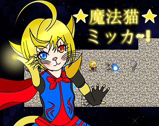
Minor nitpick: the menu would look better without the screenshot of the game in the background. You've got that wonderful graphic of the title character, emphasize it!
The RPG Maker stock graphics and music are whatever, value-neutral at best, but they're used pretty well here, and with some of the effects make for some scenes with a surprising amount of audio and visual appeal. Of particular note are the initial market scene and the transformation sequence.
At the end of the prologue I was left with more questions than answers, though. I was following along with the idyllic village that gets attacked and the magical cat getting transformed, but then it jumped to a completely different place, talking about some empire and a bunch of rebels (by the way who are the good guys here?). Then we're back to the cat, but in what seems to be a completely different context. Then back to the empire and the rebels and some guy who I think is supposed to have some significance but I don't know. I'm still not sure what the catgirl was doing on the roof or how "watch a meteor shower" went to "fighting monsters in another dimension".
It almost feels at times like the intros to three vaguely related games were mashed together. I get that they all tie into each other, but I don't understand how, and they don't flow smoothly when put together either.
The prologue is also really, really long. I would have liked to have meaningful gameplay a lot earlier. With that being said, this would be much less of an issue with the full-length game as the intro would then be shorter relative to the rest of the game.
Once we got into the game, well... I don't want to say things went downhill fast. I'm a fan of hyperbole, but that's excessively negative, even for me. But a lot of the aspects that were very strong in the intro were not as strong here.
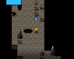
The dungeon feels really generic. Rock textures, random layout, a handful of stock props scattered around randomly. It really has that feel of a dungeon for a sake of a dungeon. It doesn't help that due to the aforementioned issues I'm not exactly sure what that place is supposed to be or why we're here.
The tutorial images were blurry. This is probably an RPG Maker limitation, and I'm not sure if it's something someone without a Retina or 4K monitor would notice.
Lampshading what seems to be a technical limitation as a game mechanic is funny for a bit, but it doesn't make said technical limitation disappear.
There's an extremely heavy emphasis on combat, which makes sense given the themes of the jam, but that means the game basically lives or dies by its combat, and the combat isn't quite good enough to carry the game.
Having a real-time, overworld battle system in RPG Maker at all is impressive in a "I can't believe you accomplished x in y" way, and I applaud that. On the other hand, it's super janky, and doesn't play all that well. Neither movement nor attacks are very responsive. In particular, it seems you have to wait for certain animations to play, during which you have no control. The control layout is kinda awkward, and I kept going in and out of aim mode by accident. Finally, having to stop to shoot sucks.
While not a technical issue, I'm not a fan of how bullet-spongey the enemies are.
In the first combat section, I kept defeating the enemies, and they kept getting back up. Eventually after defeating one of them again, they all died and there was a cutscene. I have no idea what happened here, if it was a glitch or intentional, or why.
The second enemy swarm was a bit ridiculous. I would have struggled with the sheer number of enemies in any game, and the clunky controls and general awkwardness turned it into a frustrating mess here. I ended up backed into a corner, got swarmed, and died.
If the combat could be tightened up and some of the gameplay issues solved, I think it could make for a really fun game. If that's not possible, it would probably be best to rebalance things so combat is shorter and easier, and maybe deemphasize combat in favour of other aspects as well. The narrative, too, is messy as it stands but could be cleaned up with some fairly minor rewriting.
Thanks for playing!
Whaaaat, that picture actually looked good to other people? I thought it was kinda bad XD
I only used stock music 3 times on three separate occasions (always when you encounter a new type of enemies or traps, as something of a gimmick but I can change it if you don't like it). Do note that the music used during the market and transformation scene were not stock, there were 'Freshing your EYE' by koosin486 and 'Rapid3' by PeriTune.
Yeah, I think the storytelling is pretty confusing, but I honestly don't know how to tie these scenes smoothly together. I'll try harder next time, though. Also, the intro and the prologue were supposed to take place in a completely different time, like months apart, but I guess I didn't make it clearer in the game. In the rooftop scene she was trying to get a better view of the sky but there were people blocking it.
That dungeon was taking place in the Argetrai with its inhabitants fighting you for reasons that will be revealed later. I guess I'll change the layout into some kind of a road that the Stoneguards were traveling on, so it'll serve more purpose than being just a dungeon. I think I'll add some notes that you can collect to read more about the lore as well.
The tutorial images were blurry? That's weird, I thought it looked fine. I literally just press printscreen and use the image as it is without changing size, resolution, or anything.
I think there were 2 technical limitations that you may be talking about, one is where you can get stuck in a wall during invulnerable frame and other where you can't use the teleportation after the first dungeon. The first was a legit technical limitation, but the second was something I could fix given enough time. Do note that it wasn't lampshading for fun, but as a guideline to the player so they'd know what to do in case they encounter these issues.
Yeah, I thought the frame where you're preparing your aim made it too slow during playtesting too. I think I'll remove that frame in the next version so the movement will be smoother. (Which is a shame since I spent some time making that frame, but it seems that it has to go) I'm actually planning to do a combat overhaul in the next arc of the game (not the next version, the next ARC) with WASD control and mouse to attack. And also maybe learn some JavaScript to create custom plugins for it.
The scene where they all died were....well, it's kind of a long story. Let's say I didn't know how to do stuff quite well while making the first dungeon, and that scene (and the other one a bit after that) was a demonstration of it. This problem was solved in the next dungeon, though. I think I'll remake the first dungeon to make it less janky.
Wow, your comment gave me a lot of ideas and feedback I desperately needed to improve my game. Thank you for taking the time to review!
I did really like the picture. I don't know if it's actually good from a technical/artist point of view, but it's big, bold, colourful, and visually appealing.
The choices of music were good, and I couldn't really tell what was stock and what wasn't, so that's all good.
I kind of guessed that there was a timeskip involved and the two parts with the cat were supposed to be tied together, but it's not really clear. We need a better indication of how long the timeskip was and what happened in the meantime. Clearly there was some major cataclysmic event that we missed, but there's no indication of what that was, we just skip to the magical cat girl being exhibited as a curiosity for reasons that are not given. I think that scene really threw me;
I think interleaving the Argetrai scenes was a mistake and they should have been grouped together, though this is somewhat subjective. In order to tie it into the rest of the story, it needs to be made clearer that this is some other dimension that slammed into the main one, or at the very least that this possibility exists, around the time it is introduced and not in an infodump later.
On that note there is certainly a risk of making the prologue too long and infodump-y. Arguably it's already at that point. A more crazy suggestion: do we really need to know the story of Argetrai right away, or can this come later? It might be better, it might be worse, but it's worth thinking about.
I should mention I briefly thought this was the idyllic kingdom we were just in, but I did figure out that it was something else entirely fairly quickly. This might be more of an issue for other players. I'd wait for more feedback on this one.
I would definitely prefer a road to a dungeon. I much prefer environments that are supposed to be something that serves a practical purpose. I think others who are more into dungeon crawls might disagree with me on this, though.
To be honest I'd just chalk up blurry tutorials to RPG Maker weirdness and leave it at that.
Are you planning to change up the combat mid-game? I'd recommend against that for a few reasons. One, it's really going to throw the player that combat is suddenly different, and they're going to ask why it does that. Two, the beginning of a game is very important for getting players hooked, and you want to put your best foot forward here.
Ah, glitches, the bane of every game jam game.
You know what? That's a good idea. I'll remove all info dump about Argetrai in the prologue out and instead focus on introducing the characters and some backstories there instead. I think I'll put the story of Argetrai in after the first dungeon, where the player would have already gotten to play around for a bit first
This will probably have to wait until v.0.1.3 though since I want to focus more on character arts, presentation, and fixing up combat issues in v.0.1.2. Cutscenes also tend to take very long to create, and it seems like I have to create several new ones here.
No, I want to change the combat system in the next game (each game tells a story about one arc, this one is arc 3). We're going to stuck with this one for a while XD
Interesting RPG Maker game- I think it's the first time I've played an action game built in RPG maker. You have an impressive amount of content for a game-jam period. It feels like there's a lot of lore and story in this game, with more to come! It started off a little confusing, but made sense as it continued on.
There are a lot of well-scripted cut-scenes throughout. The long open cut-scene in particular helped build a certain mood, before the inevitable disaster struck. I do think that there might have been a little too many cut-scenes... at some points I was itching to have some control. But I'm glad they're all scripted with effects and movement onscreen.
The combat itself interesting. I was pretty bad at it at first, but once I started using the strafe key, it definitely went better!
I made it through the prologue, and during chapter 1 I failed several times at the start of the battle stage. Between the number of enemies, obstacles, and traps, it started to feel more frustrating that fun. And having to repeat a fairly lengthy dialogue didn't help. I may go back and give it another spin later when I have more time.
I did encounter one bug... sometimes, my character could shoot during cut-scenes if I used "Z" to advance the dialogue.
Overall, great work! I can see you have a lot planned for this game, I hope you keep working on it!
Thank you for playing!
The combat system was inspired by old RPG maker games I played as a kid. I thought it was really cool, so I decided to use it in my game.
Yup, there's actually a lot of lore about the 'other side' but unfortunately couldn't put a lot of it in due to time limitation. (You may notice that the cutscenes before dungeon two were very rushed. There were actually supposed to be a few character-defining moments and storytelling there. But I thought the cutscene I made was too long and I didn't have time to fix it so I cut it off entirely.)
The intro cutscene probably took the longest time to make out of any cutscenes, so I'm glad you liked it. But is there too many? Cutting that cutscene off was the right choice then. If I made it so the player has to move to interact with people to continue the story instead of using cutscenes would it be better?
I agree that the first battle with the Goldborns was waaaaay too hard (Even I got beaten up several times during playtesting XD). They were much stronger than I'd thought. I think I'll remove one of them along with some obstacles so It'll be easier to pass. But if you want to win in that battle in its current form, wait for the enemies to line up and then use the burst attack to hit them all at once.
Got it, so that's one more bug to the list.
Thanks for taking the time to review!