Play game
Star Valkyrie Rising's itch.io pageResults
| Criteria | Rank | Score* | Raw Score |
| Magical Girl Concept | #13 | 3.385 | 3.385 |
| Audio | #13 | 3.077 | 3.077 |
| Overall | #19 | 2.859 | 2.859 |
| Engagement/Fun | #19 | 2.615 | 2.615 |
| Gameplay Polish | #21 | 2.462 | 2.462 |
| Originality/Creativity | #23 | 2.846 | 2.846 |
| Aesthetics | #23 | 2.769 | 2.769 |
Ranked from 13 ratings. Score is adjusted from raw score by the median number of ratings per game in the jam.
How does your game fit the Magical Girl Genre?
It is a game about 4 Magical Guardians who lost their powers ten years ago and are now teachers at a school
Which theme(s) do you pick?
Kitten of Great Fortune, Smoking Dragon, Ore from the Age of the Gods, Where is that bustling marketplace now, immemorial marketeers
How does your game fit those theme(s)?
Kitten of Fortune- The mascot of the team is a cat.
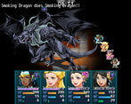
Smoking Dragon- They talk about how they fought a smoking dragon in their youth and then battle the dragon later on as magical girls.
Ore From the Age of the Gods- Their regalia is made with ore from the Age of the gods.
A bustling Market - The city has a bustling mall district and is very open.
Marketeers- The memory of the guardians is talked about by collectors in the mall and the magic girls are not too impressed with how it is going.
Were the assets for your game made during the jam? Elaborate as you see fit.
The art assets were made by my team. The animations and music were purchased. Most of the assets are coming from RPGmaker with a strong use of overlays and animations.
Leave a comment
Log in with itch.io to leave a comment.




Comments
I wasn't able to play as much as I wanted due to my schedule currently, but I did get in a good chunk of time. I enjoyed that the main characters were all working adults... that's something you rarely see in the genre. There were a nice variety of characters, though it seemed like the portraits were based off the same template, which stood out to me as the faces changed back and forth, and yet still matched a little too much.
It seemed like there was a good variety of gameplay... battle, story, exploring areas, investigation. I wish I had time to try more, but what I did play was good!
One other nitpick I have is that I found the dialogue font a little tough to read... and considering how much dialogue there is, that was a bit of a problem for me.
Anyway, it's clear you put a lot of time and work into this! Great work, and I'll try to play more when I have time. :)
Okay, I was stuck in an infinite loop so I didn’t play too much, so I’ll just post my findings so far and then edit my comment later as I progress. I will also give my notation once I see more of the game.
Bug:
Pacing:
World:
Battle
Oops, that podcast you got stuck on is the beginning of the next chapter. It's not supposed to be input yet, so that is definitely needing to be boxed for now.
Thanks for the rest! I was thinking about downplaying the skills or possibly adding more to the Star Dust tutorial at the beginning to explain things like the Ultimates and I can add cast time to that too!
OK, you can leave this for the first real battle though. In Xenoblade they split the tutorial like this: the intro show battle tells you about the very basics of using skills. The first real battle tells you about advanced mechanics like making the enemy fall.
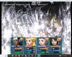
In this case, there seem to be a vulnerability mechanic, but I couldn’t see skill description explaining which skill increased vulnerability to what. So at the start you could just have normal damaging skills (or the vulnerability would happen but you don’t need to understand that to win). Then the next battles would go into detail in those.
If you fix the radio show, will I still be stuck as I wasn’t supposed to be there, or just trigger an event I wasn’t suppose to see at that point? As long as you leave the door open for me to exit back to the city, it should be fine!
Or if you make the intro battles faster, it’s also fine. Finally, if I can change the mode from Easy to Difficult mid-game, I can also use fast to quickly finish the intro. Just tell me once you updated it!
The door wasn't supposed to be active to go into the studio yet. I can add something to toggle the difficulty (it just toggles a switch on and off).
I can add some dialogue to explain things at the beginning of the fight. The vulnerability system is gone over in the intro, but a refresher never hurts.
I need to do a full playtest in the browser to make sure the text is fitting in the resolution (I've done full tests in the regular app mode, but the browser has some problems that pop up)
It was a fun experience.
However I got stuck after leaving school. It didn't allow me to do anything, neither walking nor opening the menu. But seeing as you have said it should be around 2.5 hours I think it is safe to say that it is a bit too long for a jam in my opinion. A couple of typos here and there but a good entry otherwise.
Thanks!
Did you play the browser version or the download? And, can you remember the typos? I'm very severe with typos and I would like to know where to remove them.
Yes, browser version. I walked out of school and went to the right. I saw Policemen and two other people walk along the road so I assume the game didn't crash.
As for the typos I don't remember exactly anymore. Sorry.
I have mixed feelings about this game. I definitely liked the concept, and I'm normally a sucker for story driven RPGs. There's several aspects that are well executed, and there's clearly a lot of work that's been put into this game, but there are also some flaws, and it did turn into a bit of a drag.
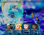
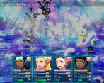
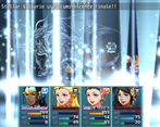
The intro was excellent and served well as a hook. It's got tons of energy, it's well presented, and the battles strike a good balance between having enough challenge to be interesting while still being something the majority of players can easily make it through.
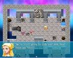
The world design is rough, and falls into some "average RPG Maker game" traps. The choices of textures for walls and floors is often odd, and often garish and hard to look at. Some areas are weirdly laid out, particularly the house in the beginning and some of the classrooms at the school. There are some places that look like they should be walkable but aren't, and a few that look like they shouldn't be but are. There's not a lot of interactivity, with some NPCs you can't interact with or even bump into.
On the other hand, the train station and some of the shops looked pretty good.
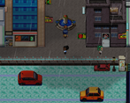
I found the city section annoyingly long and hard to navigate, with inadequate signposting. If it's an area we come back to later, maybe it'll be worthwhile, but it took me a while to get to the end (not least because you can't run in this section) and there were a lot of places I could go into that seemed to serve no purpose. Maybe these places could be closed off with the explanation that it's early in the morning and they're not open yet.
There are also some... I guess I'll call them visual issues because I'm not sure if they're glitches, odd design choices, or engine limitations. The train isn't animated as moving but I saw two sets of tracks with one sliding over the other. The parallax background for the school makes it look like a bit like the previous scene is bleeding through.
I got to the beginning of the investigation section and stopped. Some of this is because I just don't have that much time to play through each game, but to be honest, I was kind of bored by that point. I actually liked the idea of going around and investigating as different characters, but I just didn't really feel motivated enough to do it. I'm not sure exactly where it falls down, but the pacing is just too slow. Once you get to the school, the game really feels bogged down dealing with unimportant things. Which is probably intentional, and works with the themes of the games, but at that point there isn't really anything to keep me engaged. It's not a particularly witty game so it can't ride on humour, and the overarching plotline isn't yet introduced at this point to push me forward.
The writing quality is generally good, but the dialogue could use some proofreading because it's sometimes awkward and hard to follow. Related to the pacing issues, I think that too many lines are spent repeating things that aren't important and not enough making the immediately important parts clear. I wasn't actually sure what I was supposed to be investigating, exactly. There are also quotes around each line for some reason, which I found distracting.
The music works great for the intro but doesn't fit the city section well. Once again, I'm not sure if this is a bug or a weird design choice.
With all that being said, I may come back to this one after the jam when I have time and perhaps some improvements have been made.
I'll revisit some of the music.
The game follows slice of life style and I plan on growing and expanding it, which is why the city is a little big right now. The people you can't talk to are in through so they don't block pathing and they are all randomly generated from ten different people. If I have more time, I'll go back in and add different faces to each.
I have no idea why the bar has path blocking at the very beginning and may have to delete that map and redo it.
Like I've said before, I have a hard time with RPG Maker games, I just find them boring.
Overall this game looks good, but I was playing it late at night and I was falling asleep.
I managed to get past the first two fights and managed to get to the school, but was pretty lost, bored and sleepy by that point.
Sorry. If I find some time I'll try to play it when I'm less tired.
That would be appreciated
I think the difficulty scaling in the intro is off. I had a hard time getting past the vampyre fight, even on easy difficulty.
The music was really fun and energetic, but maybe not the right fit. That was the most pumped I've been for a tutorial in a while though lol
Let me try to tune the Vampyre fight down a little then! The debuff might stack a little too much to make fire damage do to much