Play game
Armored Soul's itch.io pageResults
| Criteria | Rank | Score* | Raw Score |
| Relevance to the theme picked | #10 | 4.122 | 4.700 |
| Sensory | #21 | 3.245 | 3.700 |
| Overall | #23 | 3.052 | 3.480 |
| Metroidvania | #24 | 2.631 | 3.000 |
| Execution | #24 | 2.719 | 3.100 |
| Enjoyment | #25 | 2.543 | 2.900 |
Ranked from 10 ratings. Score is adjusted from raw score by the median number of ratings per game in the jam.
Theme Chosen
Revival. My interpretation is that the character instead of dying, its soul is taken out of the armor. So the soul can retake the armor to "revive"
Engine
Unity
Team/Developer
Kruko, Solid Dogor, Saturn and Just Me
Prizes eligibility
PlusMusic: Best Overall Soundtrack
Reference info
kruko
Leave a comment
Log in with itch.io to leave a comment.


Comments
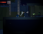
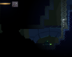
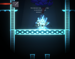
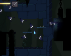
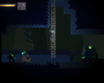
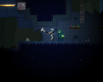
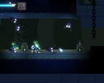
There are a lot of really great pieces here, but they didn't quite coalesce into a fun game for me. The pixel art and animations are simply beautiful, and the game has a really nice sense eerie atmosphere to it! The conceit of the character being a possessed suit of armor is really cool and allows for some impressively thematic gameplay elements, like trying to retrieve your armor upon death and leaving your armor to dodge. My main piece of feedback is that the game as a whole feels really aimless. I was not sure where to go or what my goals were, and the map seemed to loop back upon itself and offered very few landmarks to tell whether I had been there before. I hope you continue working on it, I'd love to see how the game turns out with more iteration and polish. This is a really interesting start!
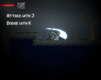
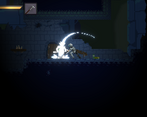
Art and sound design was excellent, my one issue is that the footsteps don't match the walking animation. I love the dodge animation, really creative use of your possession premise. Combat is a bit limited, it would help if we could attack while jumping. Other than that, lots of fun.
Nice work! This was quite the challenging game!
-I really enjoyed your artwork - the tilesets, parallaxing backgrounds, and animations were all really well done and established a strong mood.
-The armor recovery system is neat, though can be almost *too* difficult but it's VERY satisfying when you recover. The system itself is very cool and I really enjoy that idea
-procgen is very neat and adds new life to the areas, but makes navigating a bit difficult. I wasn't ever sure what my objective was, and with the areas always changing without a map, it made it tough for me to feel like I was ever making progress, especially when I'm frequently dying
Great entry! I had a lot of fun with this one and I enjoyed my time with it
Thanks for the feedback! There was actually a map but it doesn't work completly as intended and I didn't mention anywere at all so I understand if many have missed it. However even with that map navigation can be really hard. I'm happy that you liked the armor recovery system altought as you said probably should make it a bit easier.
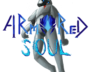
One little nitpick that has nothing to do with the game itself... what's up with that cover art? You have some really good pixel art in the game itself, feels like you'd probably get a lot more eyes on your game if you used that to represent the game instead of some what looks like a random stock photo...
As for the actual game... its an ok start but it needs some work. The dodge move feels really awkward and with it halting your movement at the end it often feels like it gets you into more danger than it gets you out of. The lack of significant i frames when hit makes fighting multiple enemies at once painful, and enemy gauntlets feel really spammy even aside from this. It doesn't help that it's hard to tell when I'm even taking damage as the knockback and hurt animation only seem to occur during certain select animations - they never seem to interrupt the attack animation, most significantly.
The game also felt a little aimless, where I wasn't really sure where I should go or what sort of things I should be looking for. Admittedly I didn't play for very long so maybe this problem solves itself with time but I feel like the combination of a very open map and procgen is probably contributing to this as well - while a carefully crafted or largely linear map can very easily guide the player to interesting areas, something like this is probably going to struggle a little more. I'd suggest maybe making rooms a little smaller and making points of interest a bit more frequent, as well as including some in the tutorial so I have some idea of what to look forward to.
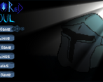
Thanks for the feedback! You're right It was kinda a desperation move before deadline I should just screenshot the intro and put it as the cover art. I'm aware how aimless this game can be, this is probably what needs the most improvement overall as of now it's mostly completing "events" found in the dungeon to get keys for a single door.
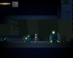
The atmosphere is great, with some good lighting. The pixel art is also great, and fits the Souls inspired setting.
Some thoughts:
- The sound design feels a little clunky. An example is the footsteps of the player and the knight. The footsteps are too loud. When there's 3-4 enemies on screen I can barely here anything else!
- The game could have started a little easier and in a smaller area to introduce the player to the core mechanics before falling into that big area.
Definitely keep working on it!
Thanks for the feedback! It's true that sound is clunky as it's what I spend less time on, it really helps to know which sounds should be tuned down. Regarding the starting area, I would really like to expand it with its own enemies and boss so it can introduce the core mechanics better. It's something I'll be working on in the near future.
The art looks very nice. I like your lighting effects. I found the attacks a little slow which gives a souls-like feel rather than fast and punchy combat - but if that is what you were aiming for then well done. The jump could be a little higher too perhaps. I had trouble returning the way I came when I felt I should be able to make the jump, but then I realised there was a ladder there, so maybe that's just my fault.
Thanks for the feedback, it helps a lot! Yeah this game takes so much inspiration from souls-like games so it's meant to be slow however some enemies do have some quick attacks, probably it can be better balanced and you're right about the jump, it should be higher.
I love the art style. Gameplay can be punishing too early. But I get the vibe that was designed
Thanks for the feedback! It's true, altough I wanted it to be punishing, I didn't have enough time to test how punishing it can really be at the early stages. This really helps to balance it later.
Cool concepts and Design!!! Loved it, has a lot of Potential ✨