Gliding was so fun! Like the graphics and music too :D
Play game
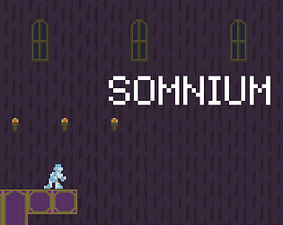
Somnium's itch.io pageResults
| Criteria | Rank | Score* | Raw Score |
| Metroidvania | #8 | 4.000 | 4.000 |
| Overall | #13 | 3.525 | 3.525 |
| Relevance to the theme picked | #14 | 3.875 | 3.875 |
| Enjoyment | #17 | 3.250 | 3.250 |
| Execution | #17 | 3.250 | 3.250 |
| Sensory | #20 | 3.250 | 3.250 |
Ranked from 24 ratings. Score is adjusted from raw score by the median number of ratings per game in the jam.
Theme Chosen
Grow and Shrink, Recurring Dream
Engine
Unity
Team/Developer
Nevermind3476
External assets
Music by leiirue
Comments
Loved the artistic direction on that one, especially on the audio department. SFX were great and the music never got repetitive. As for the environment, I did wish it was a little less repetitive, but that's just minor. I loved the fact you thought about a gliding ability, it sets the game apart from the traditional double jump or wall jump abilities you'd see often. And it balanced quite well too: I was able to avoid the knights and the slimes, but the crows were still in my way.
Sick backflip / 10
That's quite a good game. I liked the float mechanic, it was fun. I did get the platforms mixed up with the paintings sometimes. Maybe changing colour or contrast or something might help. The music was atmospheric and well chosen. Well done.
The small/big thing was pretty excellent. There is a lot of exploration potential here just with the possibility space from the few powerups that got implemented. You could easily make this a fuller game for SMVM if you were so inclined.
The bad:
* Controls and screen transitions while moving are awkward; in particular, held inputs don't seem to transfer, and I at least *can* do a weird air-jump if I'm gliding?
* Enemies in later areas had a bit much in the way of health. It sometimes seemed like they would get knocked back in an unintuitive direction.
The good: pretty much everything else tbh
[Edit: Reaction video below:]
That bug with the inputs not transferring bothered me so much while testing! I have no idea what causes it, based on my testing I think it's a Unity bug but I didn't have time to look into it deeper. It doesn't seem to occur in the web version which is probably why you're the first one to report it.
Enemy balance definitely needed a bit more work, lots of people have complained about that. I was going to reduce the health of those red crows but it slipped my mind before submitting... Knockback is based on the enemy's relative position to the player which is definitely not the most intuitive way of implementing it. I'll probably try to base it off the actual attack direction in the future.
I don't have any active plans for SMVM unfortunately, but I'm glad you liked whats here!
Cool game. The dynamic between small and normal size was pretty cool, I really enjoyed the feeling of launching myself up while small and then shifting mid-air and spin kicking my way across an entire room - the mid-air shift gave me Ant-Man vibes in a very fun way. I also really liked the animation on the spin kick, I grinned the first time I saw it, it's so simple but feels flashy and powerful. The music is creepy as hell and really sets the vibe for an abandoned manor, and the checkpoint spacing felt pretty forgiving (although by the end I had so much health I don't know if I could have even died).
Areas where I struggled -
- The hit box on the kick feels way taller than the animation suggests which always left me feeling nervous when fighting those pesky crows (I was pretty sure I'd hit them, but not entirely sure).
- The knockback was enough that for the weaker enemies I could spam kick and generally be okay, but for enemies with more health the knockback didn't feel like enough cause they'd just charge through it and body you, so combat against later game enemies became a bit tedious as I'd have to jump in and jump out - something like a roll for the player (for added variety) or a brief pause after each knockback on an enemy might help with this.
- I never felt too lost and I think there are actually two paths to the ending (?) which is good in case you miss or forget about one of them, but the lack of a map or any sort of context for the size of the manor can be daunting at times.
Overall pretty satisfying game. Short, sweet, a fun power set - the glide is super fun to use, the kick is hilarious to me in a good way (especially while you glide across a room), and the shrinking and growing mechanic had a cool trade-off and felt like it was utilized well for the amount of time it appeared. I think there's a lot of potential for more development on these mechanics. Great job!
Thank you! Yeah I'm really happy with that kick animation. The hitbox for it is indeed larger than the animation, I had hoped that would make it more forgiving so I'm surprised to hear it had a bit of the opposite effect, I'll try to tone that down a bit next time. Agreed on the knockback and health issues on the late game enemies, as everyone's been pointing out those crows could've used a lot more balancing work. There are indeed two paths to the ending area, a map screen is always good but I just didn't have time to implement one. Thanks for all the feedback!
That was pretty cool!
My only complaint, which seems to have been pointed out by some people already, would be that some enemies felt very annoying to deal with, mainly the crows and the knights. And considering they don't drop anything, I just felt that attacking wasn't really useful at all in most levels; avoiding or running through them was easier most of the time (save for some dead ends).
Other than that, the controllers felt good and exploration was fun. The art and environment are quite consistent and I loved the atmosphere, specially from the sound design. The music was an excellent fit.
Great job!
Thanks! Yeah, a lot of people have complained about those crows, they definitely needed to be better balanced... I do like keeping it so you can avoid most enemies but the game definitely could have used some health drops and enemy gauntlets to push people to engage with the combat, I just didn't have the time to implement them... Glad you enjoyed the game overall, though!
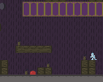
Simple game but well made. I found the color scheme a bit confusing and platform being the same color as other elements is sometimes frustrating.
*I posted half of my comment due to some tab mixup while posting my rating, here is the second part xD*
Really enjoyed the different enemy and the overall balance/challenge was on point.
At some point I felt that dying and getting back to the spawn point was faster so I may have abused that.
Overall I had fun and really liked the overall atmosphere.
Congrats !
That was really neat. The artstyle is very charming and the gameplay is fun. The moveset flows really well despite being essentially just attack and glide for most of it.
I don't really have any real complaints about it, aside from nitpicks like, I wish the player char had a bit more of knockback when getting damage, and I also missed some kind of telegraph for when the knight guys are gonna stop charging, because I got hit a lot of times due to them just stopping suddenly (Allowing me to headbounce enemies would've both fix that issue and would've also felt just awesome too, combined with gliding and such)
And I guess that's it. The game is very competent, but also still pretty simple so I can't really think on anything more to say tbh. I recorded my playthrought but nothing super interesting happened on it so I don't think it's worth posting here, but if you wanna see it anyway I could send it if you ask.
Yeah, I kept things very short and simple since I'm still a beginner and I wanted to make sure I didn't overscope. A telegraph for the knight stopping their charge wouldve been good and I feel a little dumb now for not thinking of it... oh well. I would actually like to see your playthrough, I haven't gotten to see any playthroughs of the game yet so I think it'd be very helpful even if nothing seemed to stand out in it.
Yeah, the fullscreen wasn't working on the web version so I ended up just disabling it... the downloadable one does have fullscreen, though. I see what you mean about the knights now, I think the bigger issue was that I didn't really make it clear that the rusty knights weren't designed to be faced head on and were meant to be snuck around... it looks like you figured that out for the tower area at least but that first fight with one was definitely rough. Maybe I should have made them immune to damage entirely?
That one collision bug ~15 minutes in is pretty odd, I had something like that happen once but I thought I'd fixed it. It seemed like it happened because of how fast you were falling so maybe adding a terminal velocity would help.
to be really honest, I just really wanted to kill that first rusty knight by sheer stubborness, because I did know I could just sneak past him x3
But yeah, if you want to avoid players like me doing stupid stuff, you should have made him immune, altought honestly, this would take some fun out of him really. I didn't feel like that fight was rought at all (aside from the surprise brakes), I was legit just messing around for the sake of messing around
Pretty fun little game. The audio and look of the game work well in tandem with each other.
A small comment: I wonder if the player's squish footsteps could be less squishy and maybe a combination between a thump and a squish? Also those crows were pretty rough.
Great job!
Thank you! Yeah it seems like everyone had trouble with those crows... I considered nerfing their health a bit at one point but it slipped my mind before submitting. They probably need a few more changes than just that anyway...
Sound feedback is interesting, I do like the current sound but it could probably be better... honestly I didn't do much for that particular sound it's just a muddy footstep sound that I found and thought worked well enough.
Very fun game! Nice art and complimenting music. Overall, it definitely could use a bit of polish here and there and some more content, but great nonetheless. It was quick to beat but fun all the way though.
...I am curious how many hp orbs (moons?) there are, I got 7. How many did I miss?
Nice entry! I had a lot of fun with this! The movement felt fantastic, especially once I could become small and glide. I also found myself jumping just to see my lil guy do backflips, hah
The exploration aspect was really great in this as well, combined with the fun movement, I found myself backtracking and zipping around enemies just for fun/secret checking.
The final boss room message is also a BIG MOOD. Great work!
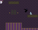
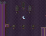
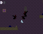
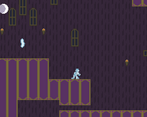
Hey what a nice game! Looks nice and consistent, good progression and alright combat. For the art, I like the characters and environment, I just kinda wish you went more crazy with colors, could work with a dream world, right now the purple wallpaper is very empowering. I like that you tried adding stuff on walls too, like windows and portraits, but there wasn't too many of them and it kinda looks like random stuff dotted around. I was very happy to see charging enemy, nice to have some refreshing stuff, slimes and ravens were alright too, classic chasing drones, red ravens were slightly obnoxious to fight against with how much hp they got. Movement felt good, no nitpicking there, glide was fun, small form too, good job on that! Overall I enjoyed it and I appreciate the honesty in the end section haha
The art is simple but visually pleasing. The environment is maybe a tad bland but honestly kind of works with the dreamy feel when the music is playing with it. The characters look neat, I like the night a lot.
Somewhat of a nitpick, advice I've gotten before has been to make things the player can't do (at least yet) more obvious. At certain points I kept trying to get onto certain platforms before giving up after realizing I probably needed to unlock something to get there; if they were obviously to high or far for me to jump it'd be less likely that I aimless try.
The SFX were a nice touch too, like when the crow attacks or the walking sound of the knight or the squish of the player.
Nice entry.
Thanks for playing! Environment probably couldve used more varied/frequent decoration but I did what I could with the time I had. Which platforms were giving you issues? I'm guessing the one right at the start with the health upgrade on it was one because that one's very close to being reachable with no upgrades, but were there any others?
Heyyy, very nice game you've got here! Nailed the exploration/metroidvania aspect, also a good difficulty curve and a comfortable number of checkpoints. I really like how all upgrades restore your health, makes the game much smoother to get through. Great work!
Love the eerie, dreamlike atmosphere! The music and sound effects were especially compelling. The level design had some nice loops to it, with inaccessible areas being teased at a nice rate so that I could look forward to the new abilities that would get me there. My biggest piece of feedback is to focus on making the combat feel weightier, so that the player feels more in control. Things like increasing the damage range, giving the enemies more knockback, and maybe having them flash when they take damage would all go a long way towards making the player feel less like they have to take damage any time they encounter an enemy. But overall, really great work!
Really nice... I'd have love to have seen a Boss if you had of had the time... but the game was great and had a nice variety of enemies and power ups and a really cool vibe to it"
Very nice! I loved the soundtrack, it's very ominous, and you made some really cool skills/unlocks. All in all a great game, you should be proud!
Solid entry! The level design was planned out well, the music had a dream like quality to it which lends to the theme. The few rooms leading to the shrink ability were pretty brutal. As mentiond below the crows were definitely unforgiving haha. I would suggest a knockback to them to give the player some spacing. It felt like if you engaged a crow, you were going to take at least one point of damage no matter what. However, that may be my only criticism of the game. Congrats!
Cool game! Definitely feels like a classic metroidvania. I like that my little guy does a backflip every time he jumps. Really lets everyone know how cool I am without trying 😎
That being said I'm really bad at metroidvanias, so I would have loved if there were easier but slower paths to the power up. I also like the enemies, but found the crows to be a little unforgiving based on my skill level


Leave a comment
Log in with itch.io to leave a comment.