Play game
The Clocktower Letter's itch.io pageResults
| Criteria | Rank | Score* | Raw Score |
| Sensory | #31 | 3.231 | 3.231 |
| Execution | #37 | 2.846 | 2.846 |
| Overall | #47 | 2.731 | 2.731 |
| Enjoyment | #48 | 2.538 | 2.538 |
| Metroidvania | #59 | 2.308 | 2.308 |
Ranked from 13 ratings. Score is adjusted from raw score by the median number of ratings per game in the jam.
Engine
Unity
Team/Developer
Hulvdan, Barbara Ester, ManOfStories, Oddcase
External assets
Lazy Fonts Library by Lazy Fox, 2D Camera by Cyber Boss Games, Metroidvania Controller by AisuKaze Studio, FMOD, FMOD Studio by Firelight Technologies Pty Ltd.
Leave a comment
Log in with itch.io to leave a comment.


Comments
The game is very short, but the graphics and music are good. The physics of the platforms is really very beautiful. Keep developing, I think it will make an interesting game.
Thanks for playing. I worked on the art and I'm happy with how it turned out.
Hi! Thanks for appreciate my work with music. :)
I like the tiles and the physics based platforms! The game also has a good premise for a longer game. Here's a recording, at timestamp: 2:05:57
Thanks for playing! Playing through a lot of entries in the video is pretty impressive.
The atmosphere is the best part. Music, and art are all very lovely and evocative. Even the writing (though the game is short) is quite effective.
The jumping works well, but I found the wall jump incredibly awkward. I'm not even sure how to describe it. Sometimes you turn around, sometimes you don't. And when you do you do the smallest of juts outwards and stop dead. Plus it was really easy to get snagged on ceilings.
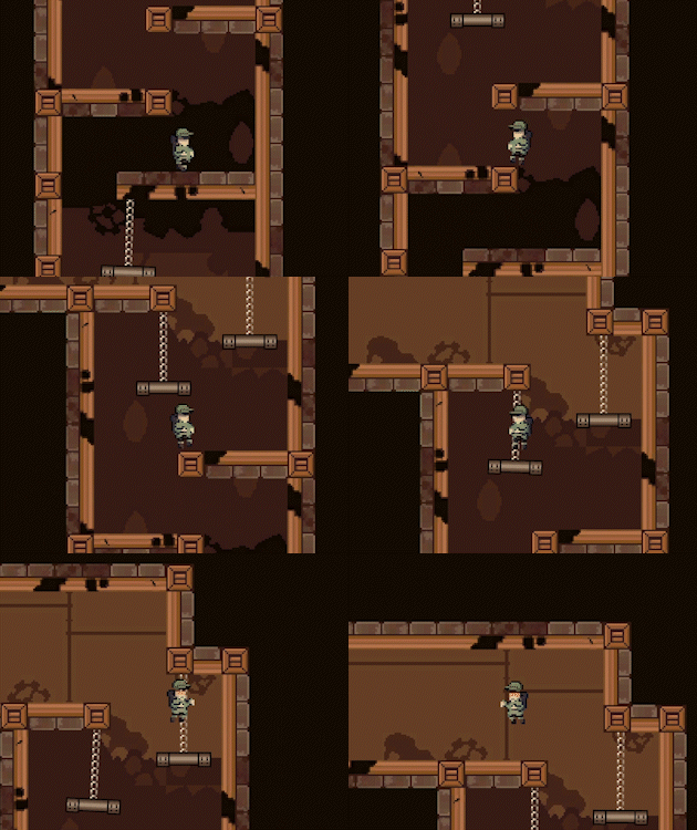
I do appreciate the real time physics of the chain dangling platforms. They didn't really present any gameplay mechanics but they were still nice.
And I think the camera over shoots when you land and then snaps back up on the next frame. Not a major deal, but if you can get it to stop a frame before it would look nicer.
I'll post my record when I upload it.
EDIT: Here it is - MM21 - The Clocktower Letter
Thanks for playing and all the feedback! It was my first time creating art for a 2D game, so I'm glad with how the art assets worked out.
Hi! Very thanks for your attention and appreciate my music in game and feeling the atmosphere. I feel like the mission has been completed! xD
Props and art are nice. Great job!!
Thanks! It was my first time working on tilesets, so I'm quite happy with the outcome.
A nice simple entry. I think it would have benefitted from some more upgrades and exploration to really solidify that metroidvania status
Thanks for playing!
Game felt smooth and responsive. I enjoyed the simplicity of it. Great job!
Thanks for playing!
soundtrack and art were pretty nice, my only grip was it was kinda hard to move around at times as I kept bumping my head and failing a jump, specially for the beginning areas... regardless still a fun game to play
Thanks for playing. I worked on the art, and I'm quite happy with how it turned out.
Very thnaks for like the soundtrack! xD
Nice work and attention to detail. Especially liked the technical realization and the inertia of the camera. It's a pity the father didn't turn out to be the villain who destroyed the tower at the end
The animations overall were a nice touch to the gameplay! The swinging props added to the challenge! Maybe there could be some instructions on the controls at the beginning as the double jump ability was a bit confusing. Overall a well-executed game!
Thank you so much, Charlie! I really appreciate that! I’ll take note of this confusion for future design decisions.