Play game
The monster's rebirth's itch.io pageResults
| Criteria | Rank | Score* | Raw Score |
| Enjoyment | #1 | 4.545 | 4.545 |
| Metroidvania | #1 | 4.545 | 4.545 |
| Overall | #3 | 4.227 | 4.227 |
| Execution | #13 | 3.909 | 3.909 |
| Sensory | #15 | 3.909 | 3.909 |
Ranked from 11 ratings. Score is adjusted from raw score by the median number of ratings per game in the jam.
Engine
Godot
Team/Developer
FunnyGameDev
Leave a comment
Log in with itch.io to leave a comment.


Comments
Solid art style and gradual introduction of new mechanics. I also appreciated that rooms felt well-composed and mixed up which abilities I needed to progress. It's easy to get that wrong and let the experience become boring. Your monsters help mix up the pacing, too, and you do a good job introducing them with AB design. Skylar is officially my homie my life is better for it.
Not sure why the blood splatters bounce you high into the air. These could use another pass taking inspiration from Nintendo's tendency to make function follow form; something like a spring would read much better.
Your damage sprites are super cool, and I'd love to see this with more game feel stuff (particles, screen shake, explosions, more knockback, whatever makes sense in your context). Also, thank you for using fair hitboxes, that's often overlooked in game jams.
The lock and key layout in this is smart, as a lot of the times in these jam games, I'd hit a dead end and have literally no idea what to do. Yours was clean enough and limited my options just enough to give me something to try while still not feeling lost or restricted. Nice!
I wasn't a fan of the backtracking back from the portal/double jump as it's boring. In level design, my mentors taught me that if you need to send a player back the way they came, send them down a different route or change the level in some way to keep the experience fresh. I suspect part of the reason for the backtracking here is scope (can only do so much in a month), but something to keep in mind for future projects. (I'm glad you included the portal later on.)
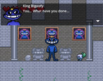
I think the Bigoofy boss could use another iteration. All I need to do is stand where there's no hole in the ceiling and I don't get hit. One idea to improve this: you could start the battle this way to teach the players the basic strategy, then after doing some damage have it spawn shockwaves that travel the length of the floor. This would force you to have to dodge even when under cover. You could take it even further by introducing some sort of projectile to keep the player on their toes as to whether they need to jump or stay grounded.
Excellent eye signifier on the ghost boss. Loved that. This one was simple and proved a fun challenge.
I was going to complain that for a combat system this simple, the regular enemies with 3+ HP felt like too much unless you included a damage upgrade. Then I got the damage upgrade. xD Well done! I would've preferred you gave me a little more time after that upgrade to introduce even higher health enemies, though, so I could enjoy the power.
I truly appreciate your difficulty curve. It is measured and fair.
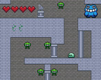
The map system is simple but conveys just enough to be useful when trying to figure out where to go next or secrets I might've missed. Designing a useful map system that doesn't get in the way is hard and I think this is the best I've seen in this jam.
Nice final boss design!
Fun little story overall with some really solid design choices. This is definitely one of my favorites.
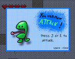
I found myself enjoying the artstyle in particular. Must have taken a while to draw up all those ability cards, and I quite enjoy how every upgrade changed the character's appearance and face sprite. Would have been nice if bosses had some sort of health bar to help keep track of the damage you have dealt, but other than that I'm left with no complaints! You even managed to have a working dialogue system and were able to implement a sort of story. Great game!
Hello,
Wonderful game, 5/5. I think that level design is particularly shining here.
The rest is also fantastic: physics, art, music. Even the hints the Boss give to anticipate their attacks, it's all great. You developed an amazing game with some of the most basic abilities in the Metroidvania genre. That speaks volumes of your understanding of the genre and its game design.
Congratulations!
Cheers
PS: it looks like you are meticulous and you understand the details of level design. If that's the case, please don't hesitate to play our game and let us know what you think :)
That was pretty! Loved how you progress from a mere slime to a powerful monster. And everything is fixed with the magic of friendship. Nicely done!
Wholesome game, reminds me of my old MVM game where you had to obtain legs, mouth etc. The attacking could use a little improvement, as you can attack while moving but can't begin moving while attacking and the attacks also affect your backside for some reason. Good size for the map and a good amount of things to find, the enemies are very basic but I enjoyed the different bosses! One minor gripe, I felt like the dialogue box didn't fit in with the other graphics as the character portraits, while cute and funny, were drawn with a different style and the font was also blurry. Overall well done though, kudos!
Great game! There is a variety of environments & enemies included. This game reminds me of one of my favorite platformers, Gex. This is because of the tongue attack and the appearance changes when unlocking new abilities. The controls were simple & felt good. I suggest you change the controller layout though. A more standard control scheme, with A to jump and X for attacking, would be an improvement. More SFX for player actions, such as jumping & dashing, would greatly improve the game too. Overall, Great entry!
This is very well done! I played through the entire thing, the bosses were very well telegraphed which cannot be said for most bosses ive fought in other games so great work on that! The story was cute, I like the skeleton character and the design changing of the mc as I got more abilities was a nice touch. The artwork was solid overall. I think if you had like an atmospheric fog overlay in some areas that would be really cool. There was this one part in the bottom left area in the central room on top of the ground with the giant face where my jumping got really messed up so you may want to look at that. Great work!
Really funny, silly enjoyable game I love the humor and sound effects were cracking me up! Level design is nice and movement feels satisfying. Main criticism is I would have liked for the attack control to be on a more coinvent key than 'J' but well done :D
Really solid entry!
This was such a sweet little game!
The art, especially those character portraits and powerup illustrations are super cute. Tiles, enemies, all look amazing.(I like the implication that all the dead bigoofys turned into gosts and can now live happily :))
I really liked the music! It added so much charm with the recurring instruments and melodies, I wouldn't mind if you uploaded the soundtrack to youtube, it's quite a bop!
I have no gripes with the gameplay either, some rooms might be a bit ridiculous, and some boss attacks felt a little silly, but overall it's just a super solid metroidvania!
Great little story about a monster, good job on making this!!