Play game
Inhuman Lands: Dead Zone's itch.io pageResults
| Criteria | Rank | Score* | Raw Score |
| Sensory | #43 | 3.004 | 3.800 |
| Metroidvania | #48 | 2.846 | 3.600 |
| Overall | #52 | 2.569 | 3.250 |
| Execution | #61 | 2.214 | 2.800 |
| Enjoyment | #69 | 2.214 | 2.800 |
Ranked from 5 ratings. Score is adjusted from raw score by the median number of ratings per game in the jam.
Engine
Godot
Team/Developer
Nagy Sándor Ádám (The Storyteller)
External assets
Sounds and ost from several purchased packs
Leave a comment
Log in with itch.io to leave a comment.


Comments
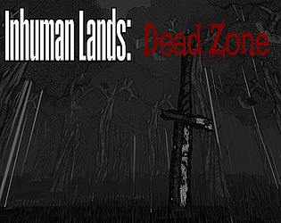
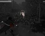
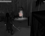
I love the atmosphere you were able to create here, definitely captures the post-apocalyptic, foggy, depressing mood of the story. I thought the combat was good although it was a bit funny when I could run by the guards sometimes and they wouldn't notice me, but other times they could see me. Hey kill that guy! XD
I almost got stuck behind some boxes but was able to find my way out again. Good job!
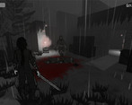
I dig this art style! It’s pretty unique. Sometimes it was hard too see where I was going, which may be due to the very low contrast and brightness, but I liked it overall and it fit your story and writing pretty well.
I actually don’t mind these kind of 2.5D graphics. However, like the other commenter said, placing the character at the center of the camera would’ve felt much better. It also seemed like all interaction prompts appeared depending on whether the actual character sprite was facing the items, instead of them appearing based on the direction of the camera.
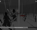
Jumping was a bit floaty, but in this particular instance I didn’t mind too much, as platforming wasn’t the main focus of your game. Combat, however, was indeed its focus and it could see much improvement. The only strategy I ever used was getting close to the enemies, slashing, dodging backwards, repeat. More enemy variety, attacks and abilities would have helped a ton.
I liked the sniper boss fight, but it felt like you were forced to make him not shoot the player when he got close (or maybe it was a bug on my end?). Also, the gun could have used a dedicated aiming mode instead of having a “laser” appearing when looking at enemies, but I think you did what you could given the time constraints.
With more polish and combat variety, I could see myself playing a longer version of this!
Thank you so much for the feedback! It is indeed a little hard to see, the colorpallett could've been a little more varied up - but I was watching the game for so long that I lost the ability to realise it during development. Also, there was an idea to place the camera behind the character, but I was worried it would be hard to see what's infront of the player.
I also planned for mutiple types of enemies, but had to limit myself - drawing the characters, backgrounds and props took way more time than I thought it would. Aim mode is great idea also :)
The sniper is most likely a bug - he was very deadly and agressive, so I toned him down a notch, and it had some unintended side effects :D
The combat system was something I actually really liked working on, but lost a lot of love for it after I implemented the 2D spitework. It lost a lot of "kick" - but the parry was still fun, shame I hid it so much :D
This was definitely something different. I like the gloomy style but I've just never been a big fan of the "2D sprites in a 3D world"-genre since it looks weird when everything is facing your screen especially if there are big objects like trees. It works with the enemies though, makes them look more intimidating even though they were rather easy to deal with. The character should be in the middle of the screen imo. Not many metroidvania elements, except getting the gun, that boss was the best part.
Thanks for the feedback! The 2.5D semmed liek a good idea, both time and design-wise but in the end wasn't as easy as I would've liked - and I also feel what you are saying, the threes do look a little wierd, maybe a fixed camera would've been better. As for the metroidvania thing, I palnned more, but settled on the gun, double jump and parry (from the optional boss, and also hidden on one of the levels. I'm happy you liked the boss, the three bosses were some of the most fun to create designwise :)
It seems I missed the double jump and I see where that would have been useful, but I did get past that part even without it!
Wow... I must test the game more, that should not be possible :D
Edit: Tried it, it sure is possible... thanks for bringing it to my attention :)
Here's my review and feedback
Thanks for the feedback, and thank you for playing! A few things I'd add:
On the buttons and controls: you are completely right, soem turoialisation or even a menu is needed, it was planned, but I did not have time to implement the system.
The map: it's my biggest "regret" with this project that I could not finish the map system. I wanted to add it, and even implemented it halfway, but could not get it to function properly, so one hour before the deadline I decided to axe it.
The 1 is the starting point, but the map should've been rotated to be more clear with the directions. Unfortunately, the time limit got to me (not an excuse, but I have a full time job as a teacher, so I was rather limited).
The packs are rigidbody, but I messed up the collision a little bit, so they are unmovable (different layers). I tried to circumvent that, but then the loot flew away at the speed of sound :D
Also, sorry for the nuclear barrel - it was also one of the last touches, and I failed to tweak the light. There are a few things like it.
On the sniper boss: he hits hard (maybe too hard) but if you can reach him, you hit him harder, balancing the experience - in my head, at least :D
Again, thanks for the feedback! It was nice to see how others play this, I looket at it so much that I cannot really tell if it's good or not anymore :)
No problem! No worries about what you couldn't implement or didn't have time to balance out. I have participated in MVM's 15, 16, 18, 20, and 22, and there's always things that I wish I had caught/improved or had time to polish. And yeah, not everyone has the time to put in an absurd amount of hours into development. That's one of the great things about MVM though, its a very liberal jam compared to others and having a whole month helps to get at least something playable ready.
I fixed a few things, and managed to setup a basic map (it was alreadyí finished, it literally needed an elif rather then an if - I think I was too tired to realise friday.
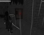
Hey great visuals and lore/setting, it took me a while to realize I had to shoot the buttons lol, corpse collision breaks the combat a little as enemies get stuck on it. Polished game overall and the 2.5D + third person is interesting.
Thank you so much! The shooting was gonna be more obvious, I even coded and made sound recording for "tooltips" then I completely forgotten to put them on the levels themselfs. The deadline almost ended me :D